Using Selective Color to Create Black & White Images in Photoshop with Unmesh Dinda
Want more information on this article? Get access to video content and additional supporting images. Launch the September 2017 issue of the magazine by logging in or signing up for a free account. Shutter Magazine is the industry’s leading professional photography magazine.
Kill the saturation, and your image becomes black and white. Well, technically it does, but artistically, it’s a boring flat image with no colors. Black-and-white conversion is an art, and the art is in determining how each color is rendered in black and white. Say you have an image of a beautiful landscape with a deep blue sky full of fluffy clouds. When we convert that to black and white, the blue sky loses its color. Now, I have a question for you: How will the blue areas look in black and white? Will they look light gray? Dark gray? White? Or maybe light gray with a slight gradient of dark gray?
Making these decisions for how each color will be rendered is what makes black-and-white conversion fun.
If you have ever used Lightroom, Adobe Camera Raw or the Black & White adjustment layer in Photoshop, you already know that when you perform the conversion, you are provided a set of sliders, one assigned to each color. There is a slider each for red, yellow, green and so on. If you play with these sliders, you will find that they control the luminosity (the perceived brightness based on visual spectral sensitivity—or, simply, brightness) of each color. Suppose you move the red slider to the left; everything that was red in the image (before you converted it to black and white) will become darker. But what if you wanted to add more dimension to the red? Make some areas of the reds darker and some areas brighter?
The problem is that we have just one slider for each. When it comes to black-and-white conversions, the more controls you have, the better. How about having four sliders? In the following steps, I will show you how to utilize the power of the Selective Color Adjustment Layer to better control how colors are rendered. I also have a bag full of nifty tricks to spice up your image and give it an exquisite film look. Let’s get started.
Step 1: Import
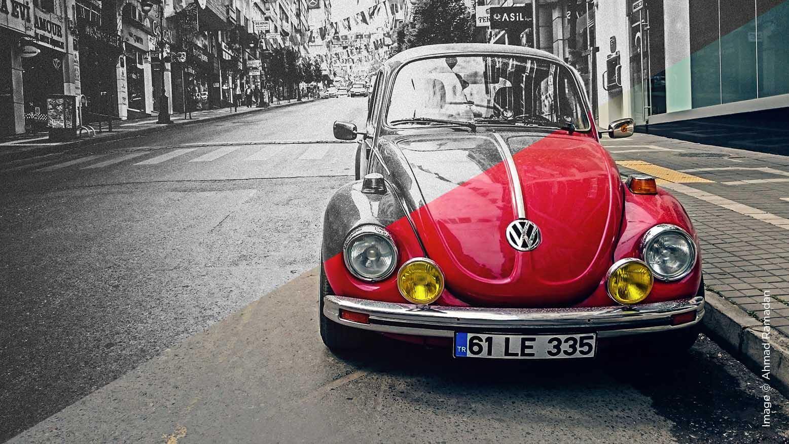
In Photoshop, go to File > Open. Locate the image and hit Open. (Download the sample image at https://www.pexels.com/photo/red-volkswagen-beetle-parked-at-road-side-near-pedestrian-lane-131811/.) You can also minimize the Photoshop window, locate the image in your system and then drag and drop it into Photoshop. If you already have another image open in Photoshop, do not drag and drop over that canvas, as it will open the image as a layer above the previous image; drop the image outside the canvas (release the mouse when the cursor shows Copy or Move).
The exception is that if you are importing a Raw image, it will open up in Adobe Camera Raw. In that case, perform your adjustments or leave it as it is. Hold the Shift key. You will notice that the Open Image button has now changed to Open Object. Click on Open Object. The image will now open up as a smart object. If you double-click on that layer, it will again open Adobe Camera Raw, with all the settings you made intact, in case you want to change something.
Step 2: Add the Grunge
- Make a copy of the Background layer by making sure that the layer is selected, and press Ctrl/Command + J, or simply drag it and drop it into the new layer icon in the layers panel (the one beside the trash can).
- Name this new layer “Details” by simply double-clicking on the text of that layer.
- Skip this step if you had opened a Raw image. With the Details layer selected, go to Filters > Convert for Smart Filters. A dialog box will pop up. Click OK. You can also right-click on the Details layer and choose Convert to Smart Object. Converting to a smart object means that any adjustment or filter you now apply to the layer is nondestructive, so you can simply go ahead and edit that later.
- Go to Filter > Camera Raw Filter. (For Raw, just double-click the layer thumbnail.) This might sound a little odd, but it will make sense later: Increase the Clarity all the way to 100, then click OK.
Explanation: In this image, we want to draw the attention of the viewer to the car; one of the things that determines where the attention goes is details. We don’t want the viewers to focus on the background, do we? We achieve this by creating a mask. - Hold the Alt/Option key and click the Mask button, as shown in the image below. This creates a negative mask, which you can see beside the layer thumbnail.
Explanation: Right now, it might seem that the Details layer is gone, but it’s actually still there. Masks allow you to control the areas where the layers appear or disappear. In a mask, black are the areas where the layers disappear and white are the areas where the layers appear. Since the Details layer has a completely black mask, it is just not appearing. - With the mask selected, select the Brush Tool. Make sure the foreground color is white; if not, press D to reset the swatches and Press X to toggle between the foreground and the background color.
- Decrease the Opacity to 100% and Flow to around 20%, and paint with white over the car (with the mask selected, not the layer thumbnail). This brings out the detail in the car. Make the Details layer more visible at the area you paint. You can then paint with black over the areas where you don’t want details to show up. Too many details in the number plate make it look funky, so I painted black over it.
Explanation: As said before, white are the areas where a layer appears and black are the areas where a layer disappears. We just painted the car area white, and that’s why the details are showing up.
Note: You can also use adjustment brushes inside of Camera Raw to increase Clarity (details) selectively, but this method allows you to do it in real time since we later might have to look at the complete image and adjust it.
Step 3: Put Layers to Work
- Create a Selective Color adjustment layer above the Details layer by making sure that the Details layer is selected. Click on the adjustment layer icon (to the right of the mask button) and choose Selective Color. You can also create this by clicking on the Selective Color icon in the Adjustments panel (if you cannot see it, go to Windows > Adjustments).
- Without making any adjustment, create another Hue/Saturation Adjustment layer on top of that by clicking on the adjustment layer icon and choosing Hue/Saturation.
Explanation: We normally use the Selective Color adjustment layer to selectively target a color, and manipulate it by using the four sliders. In this case, we will do the same, but here’s the trick. We will take away the saturation by using the Hue/Saturation adjustment layer. So the color manipulations will show up, but only as black and white. To simplify, we are using Selective Color to manipulate the colors and Hue/Saturation to take away the colors and leave the manipulation. - Open up the properties of the Hue/Saturation adjustment layer by double-clicking on the layer thumbnail if it’s not already visible. (Tip: To open up the properties of any adjustment layer, double-click the adjustment layer icon in the layer thumbnail.) Take the Saturation slider all the way to the left to –100.
Step 4: Process the Colors Using the Selective Color Adjustment Layer
- Open the properties of the Selective Color adjustment layer by clicking on the Selective Color adjustment layer icon.
- Let’s have a better look at the panel, from top to bottom.
- The top two icons allow you to toggle between the properties of the mask and adjustment layer.
- If you move a bunch of sliders, you can save your settings as a preset. It will appear in the Presets drop-down list.
The Colors drop-down list is very important. It allows you to target a color in the image. Click on the drop-down menu, and then choose from a bunch of colors, like Reds, Yellows, Greens, Cyans, etc. If you chose Yellows, now it is fixed and targeted; whatever you do with the four sliders happens to only the yellow areas of the image.
Turn off the Hue/Saturation adjustment layer for a second to understand what’s happening here. Do this by clicking on the eye icon beside the Hue/Saturation adjustment layer, and get back to the properties of the Selective Color layer. - The Four Sliders: Select Red in the Colors drop-down list (see the above step). If you take the Cyan slider to the right, it introduces more cyan into the red areas of the photo. If you take the slider to the left, it introduces more red in the red areas. That’s because red is the opposite of cyan.
Remember: RGB is the opposite of CMY, where R (Red) is the opposite of C (Cyan), G (Green) is the opposite of M (Magenta) and B (Blue) is the opposite of Y (Yellow).Similarly, moving the magenta slider to the right introduces magenta in the red areas because we have chosen Red as a target color in the Colors drop-down menu. Moving it to the left introduces green because green is the opposite of magenta, and so on. Turn back on the Hue/Saturation adjustment layer.Moving the black slider to the left makes the red areas brighter; moving it right right makes it darker. (Note: it is equivalent to the luminosity sliders in Lightroom, ACR or even in the Black and White adjustment layer, given that the Hue/Saturation layer is turned on.)
- You can choose Relative or Absolute as a setting. Relative is subtle, Absolute is aggressive. Play with the sliders with both settings to see which one works for you. For this image, let’s choose Absolute (Image)
- Let’s start with Reds. Choose Reds from the Colors drop-down list, and start playing with the four sliders. This is not rocket science. I could go on and on about which sliders to move and why, but more often than not, we find ourselves accidentally moving a slider and doing a thing that instantly makes our images amazing.
- Select the next color and repeat the same. My favored settings for each color are as follows:
Reds: C = +55, M = –30, Y = +18, B = –2
Yellows: C = +35, M = –5, Y = –100, B = –15
Greens: C = 0, M = 0, Y = 0, B = +100
Cyans: C = +50, M = 0, Y = 0, B = +20
Blues: C = +20, M = 0, Y = +5, B = 0
Magentas: C = 0, M = –100, Y = –60, B = –10
Whites: C = –100, M = –70, Y = –20, B = 0
Neutrals: C = +10, M = 0, Y = 0, B = +4
Blacks: C = +20, M = +30, Y = +8, B = 0 - Now, you might notice something interesting. Apart from all the regular colors, there are three things that might look striking in the Colors drop-down menu: Whites, Neutrals and Blacks. Whites target the bright areas, Neutrals target the midtones and Black targets the dark areas of the image. Simple enough?
Step 5: Special Effects
- Create a new Curves adjustment layer between the Hue/Saturation and the Selective Color adjustment layer by clicking on the adjustment layer icon in the layers panel and choosing Curves.
- Open up the properties of the Curves. Note: In this image, I have brought the Curves properties aside for a better view.
- In the RGB channel (selected by default), just click and drag at several parts of the curve to brighten up the highlights, darken the shadows and make the blacks a little brighter to give a faded film look.
Explanation: In Curves, to the right, you have bright pixels. To the left, you have dark pixels. If you want to make the bright areas brighter, pick a point on the right and drag it up. If you want to make midtones darker, pick a point in the middle and drag it down. - To add extra shine, create an adjustment layer above Curves but below Hue/Saturation. It might sound odd, but create any adjustment layer. To avoid confusion, let’s create a Levels adjustment layer.
- Change the blend mode of the new adjustment layer to Screen. Everything brightens up. But we want to limit the effect to particular areas of the image. We do that with masks.
Remember: Screen is a blend mode that brightens. Multiply is a blend mode that darkens. Overlay increases contrast. Soft Light creates a little contrast. - Since adjustment layers come free with a white mask, we just need to turn the white mask into a black one. Select the mask and press Ctrl/Command + I. This inverts the white to black. (“I” in this keyboard shortcut stands for Invert.)
- Select the brush and make sure the foreground color is white. If it’s not, press the letter D to reset the swatches and X to toggle between the foreground and background color. With the Flow at 10%, paint around in the areas where you want to bring out the highlights.
- To add more drama to the highlights, double-click on the right side of the layer or right-click on the layer and choose Blending Options. This opens up the Layer Styles dialog box.
- Push the slider of the underlying layer from left to right. This automatically removes the shine from the areas that are already dark. But the selection is quite harsh. Hold the Alt/Option key and click on the slider to break it apart. Push the slider farther to smooth the transition between the areas that are visible and invisible.
- To make the “film look” more realistic, let’s darken the overall highlights. Create another Levels adjustment layer just below the Hue/Saturation adjustment layer and above every other layer. Push the bottom right slider to the left, as shown in the image.
Note: In levels, the bottom left slider makes dark areas brighter. The bottom right one makes bright areas darker. The top left slider makes dark areas darker. The top right one makes bright areas brighter, and the middle one controls the midtones.
Step 6: Add a Vignette
- Create another Levels adjustment layer and name it “Vignette.” Take the bottom right slider to the left.
- Select the mask. Select the brush with black as a foreground color, Opacity and Flow at 100%, and Hardness of the brush at 100% (increase the hardness by holding the Alt/Option key and the right mouse button, and dragging it downward). Click and leave a circle right at the middle of the car, as shown.
- Press Ctrl/Command + T to Transform the vignette into any shape or size you want. I have made it oval and placed it a little bit to the right from center. Hit Enter.
- Open up the mask properties by selecting the mask of the current Levels adjustment layer. If you don’t already see it, go to Windows > Properties.
- Increase the Feather of your mask to whatever number you like, depending on how smooth you want your vignette to be.
- You can still transform and move the vignette.
- You can also go back to the levels adjustment layer properties and add some contrast to the vignette. These are the settings I liked.
Step 7: The Final Effect: Film Grain
- Select the topmost layer (the Hue/Saturation adjustment layer).
- Press Ctrl/Command + Alt/Option + Shift + E. This creates a new merged layer, a single layer comprising everything you see on your canvas right now.
- Convert this layer into a smart object by going to Filter > Convert to Smart Filter. Click OK. We did this because we wanted the layer to be nondestructive. Anything we apply to this can be changed and modified.
- Again, with the layer selected, go to Filter > Filter Gallery. Under the Artistic tab, choose Film Grain. Make sure you’ve selected just one filter.
- Play with the three sliders to see which values work best for your image. It isn’t rocket science. My values are as follows:
Grain: 5, Highlight Area: 6, Intensity: 2 - Click OK when you are satisfied. Anytime you want to change the values, just double-click on Filter Gallery under the layer.
Save the file as a PSD. Go to File > Save As and choose PSD as a format in case you want to work on it later. Save it as a final JPG or PNG by going to File > Export > Export As and choosing your desired settings.