Using Multiple Lights to Create Maximum Contrast in Black & White with John Gress
It’s very popular right now to create really soft Rembrandt lighting with lower contrast and decreased saturation. These subtle tones look great in color, but if you convert them to black & white, you’ll have a muddy gray mess. When you’re shooting for monochrome, contrast is key.
There are a number of ways you can create contrast in the studio. I love to use multiple lights, sometimes with hard modifiers, and then refine the look with negative and positive fill to create a full range of tones and make my images pop.
I am going to show you three variants of the same basic setup that will let you get a trio of distinctive looks, and then we’ll finish things off with a creative film noir setup filled with contrast.
My Not-So-Original Idea
Back in 2008, I figured out that I could create a white background that also lit up my subject by placing a large softbox right behind the person I was photographing. I remember thinking that I had discovered something new (and would never show it in a behind-the-scenes photo on the then-popular Model Mayhem). Thankfully, over time I became more confident in my skills and stopped being so secretive. But really, I noticed a lot of people were doing this and my original idea wasn’t so original.
Here’s how it works: You put the person about a foot from the softbox. The modifier will not only create a white surface, but it will also wrap around your subject and give off the equivalent of two edge lights and a hair light. Then, you can use whatever modifier you would like to light the person from the front. I found the trick is to only have the softbox in the back, when metered right next to the face of the diffuser, about one stop brighter than your camera’s settings. Anything more and you’ll get haze; anything less and you’ll see the wrinkles in the diffusion fabric. Keep in mind that cheaper or older lenses and filters will haze more than new ProGlass filters.
You could just bounce light back from the front with a reflector to create your “main light,” but you’re going to spend a lot of time finding the exact position to put the subject in with their particular skin tone. So, I would suggest adding a second light in the front.
Let’s get started with our first setup and we’ll go from simple to more advanced.
My favorite modifier to shoot against is my Elinchrom190 cm indirect outbox, mostly because it is so large. However, I also have some very old and moderately inexpensive Chimera 4 1/2 x 6-foot softboxes that I will use as well. You could also just use a large umbrella with a diffuser.
Setup 1
I placed the model, David, in front of the softbox and then boomed a white beauty dish directly over my camera. This was to create a really dramatic headshot that looked like it was taken with at least five lights—two edge lights, one hair light and one main light, plus one or two on the background. I also used a 20×30” piece of white foamcore below his chest and just out of the frame to fill in the shadows.
A white beauty dish is a great choice whenever you want to show off a models angles, because it is directional, yet forgiving. It created great light on the top of his cheekbones, which then fell off the sides of his face, leading to darker tones which would then transition into the edge light coming from the softbox behind him. This setup will create a lot of contrast because you will have a full range of tones going from white to dark on your subject’s face.
The shadows under his chin were too dark, so I just added a small white card parallel to the floor just below my frame to remove some of the contrast.
One of the things that I hate seeing in photos is light from my edge lights spilling around onto the sides of the model’s nose. So, if that happens in this set-up just move the model closer to the camera and that will increase the angle of incidence and it will eliminate the problem. Because the model will be farther from the rear softbox you may need to increase the power output of that light.
While using a softbox background is a great choice for creating a simple white setup, it doesn’t allow you to control the brightness of all of the lights hitting the model’s features. During a commercial shoot, I will use a white paper backdrop lit by two lights, one or two hair lights and two edge lights. This way I can have total control over each aspect. I might also just want a colored or black background.
Setup 2
I started off by placing a V-Flat, black side facing me, in front of my background softbox so that it was centered in the middle with part of the white surface visible on both sides and the top. A homemade 4 x 8-foot V-Flat is probably going to be too large—that’s why I like to use ones from V-Flat World, which are 40 inches wide and 80 inches tall. If you don’t have either one you can use a piece of black foamcore from an art supply store; you’re just going to have to find a way to mount it or maybe just lean it up against the face of the modifier. Black fabric would work, too. The point is that this black surface is going to be our background for this look.
Then I placed the model, Akshay, directly in front of the V-Flat and had him turn to the right with his left side facing the camera. Then I had him turn a little more to his right so the light escaping from the left side of the V-Flat wrapped around his nose and illuminated his left eye. I then moved myself over to the left so that I was basically perpendicular to him, not the softbox. In this example, I photographed the model shirtless and cropped the shot just above his pants to give the illusion of nudity.
Using my light meter to read the brightness on the model, I set up my camera at the metered exposure. While tethering to a computer, I corrected my exposure on the camera or light until the brightness of the light was just right to create a perfect silhouette. Depending on the subject’s skin tone, this could be an underexposure or overexposure, so just season it to taste.
To frame your shot with more of your subject’s body, a low light stand always helps. I usually use an aluminum kit stand rather than a C-Stand, because a C-Stand is often too tall. If at any time you feel that the top of the model’s head needs more light, just raise the light stand a little bit and that will increase the spill over the top.
If you are in a room with a lot of lightly-colored reflective surfaces, you may need to set up black panels (V-Flats, black side towards the model) around the front of your subject and possibly on the floor to block light from reflecting back into your shadows.
Setup 3
Now let’s go to our next setup: a very dramatic headshot. I shot this by posing the model, Amir, in front of a 120cm softbox with a 20 x 30-inch piece of black foamcore in front of it. I didn’t use a V-Flat or a larger softbox because I already had the 120 set up and I was being lazy. Shooting on such a narrow background was a challenge.
I lit Amir from the front using a Nicefoto SN-29 Optical Snoot with a vertical strip gobo. When I use this specialty modifier, I like to use an LED modeling light so I can see where the stripe of light is going to land and can keep the modifier from overheating, which happens with a halogen modeling light. This particular modifier is a generic brand and can be found on Amazon with a Bowens mount, which can be modified to other mounts easily, for about $200. If you’re interested, I have a review on my YouTube channel.
To finish the look, I added a V-Flat, white side out, on camera left for fill. The light falling on his hair from behind is probably 1–2 stops darker than his face. You’ll just want to adjust the power of your lights so the rim light is noticeable, but not too bright.
Setup 4
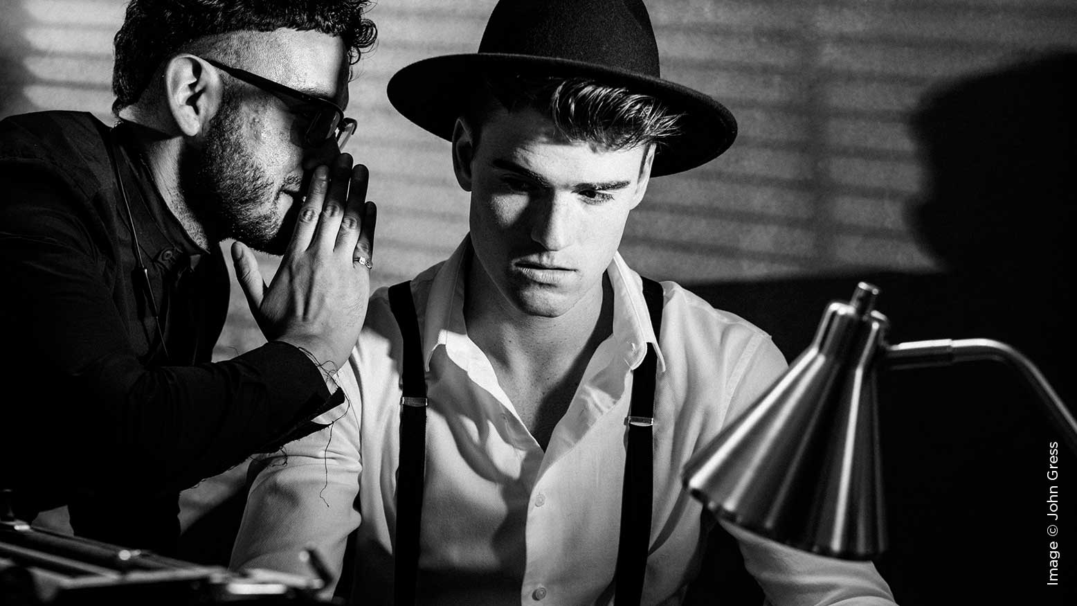
For the fourth setup, I created a film noir look reminiscent of old Hollywood detective movies.
To light up our model, Spencer, and our stylist, Pablo (the whisper was his idea), I used a standard reflector with a 10-degree grid for my main light so the light would be focused only on them creating contrast.
Then I added a 3-foot strip softbox above the background to create a rim light. The selection of this modifier was probably a mistake because I feel the softness coming from it lacks the proper grittiness for this scene. If I were to do it again, I would use a standard reflector with a narrow grid to increase the specularity of the highlights coming from the source. The light falling on the top of his head from this modifier was probably equal to the light coming from the main light.
Next, I boomed a regular snoot over the scene to illuminate the model’s magnifying glass and to simulate the light coming from the desk lamp. This particular generic brand modifier was fairly inexpensive on eBay. If you don’t have one, you could substitute a standard reflector with a very narrow grid. The exposure of the light landing on the table from this modifier was probably the same brightness of the main light.
To finish the look, I added my optical snoot on the far left with a mini blind gobo to give the photo a late-night feel. If you don’t have an optical snoot you could also use another reflector with a grid fairly far away from your model and then place real mini blinds in the middle. The closer the mini blinds are to the light the sharper the shadows will be.
Post-production
Finally, I prepared my images in Lightroom and added a lot of contrast and clarity with a little grain to finish out the look.


