Unleash Your Creativity With Skylum Luminar 2018 with Dustin Lucas
Of all the editing tools at our disposal, not all of them make sense for every task. Lightroom is not the end-all/be-all program—even though I use it for almost everything. It’s important to try out other programs, especially when you want to push the envelope and unleash your creativity. To bring out structure and details in an image, I have always relied on plugins like Macphun Intensify (recently renamed Skylum Intensify).
With the release of Skylum’s Luminar, I can now edit with all the tools I need in one place. Once I have finished selecting my best shot of the shoot, I am ready to launch Luminar and get working. Let’s get set up and familiar with Luminar to get a better feel for how we can attack this image.
A Quick Look at Luminar
Right out of the gate, it was simple to download and install a trial version of Luminar. My first impression was that it has a simple, clean interface. Now let’s open our images (rather than import them, like in Lightroom).
I have some quibbles with this software. Working in Luminar Version 1.1.1, I can view just one image at a time to edit. There is no filmstrip of images and you can’t sync develop adjustments between multiple images. Another option is to Batch Process with a preset. Hm, that doesn’t sound good at all, does it? Breathe deeply. Exhale. This software is constantly morphing, and is looking to incorporate a digital asset manager, or DAM. Much like the Library module in Lightroom, you will use it to organize, tag, apply keywords and apply global develop settings and presets. Be on the lookout for this update in the near future.
We can select multiple images to open, similarly to Photoshop, and cycle between them by holding Command and striking the single quotation mark key. You can also view all images as tabs like in a web browser. To do this, go to the menu bar and click Window < Merge All Windows.
Now things are starting to look familiar to Photoshop users, and we’re ready to get started. You’ll notice there aren’t multiple modules or workspaces to cycle between. There are workspaces, but not in the same sense as Lightroom. At the top there are tools for zooming, previews, history, crop, transform, clone, erase, presets and filter panel.
As with Capture One Pro, you can customize your workspace to fit your editing needs and quickly recall tools to apply to each image quickly. As you’ll notice, you can choose either Add Filters or Tool Panels, or click the arrow next to Workspace to choose a prebuilt one. There are quite a few combinations of filters per workspace. Quick & Awesome, which caught my eye as the second option, has quite an interesting filter called Accent – AI. When I lift the Boost slider to 100, it automatically adjusts the image based on the content. This compares to applying Auto-Tone to the same image in Lightroom; it does a nice job of pulling details and tones for the landscape, but makes the subject look rough.
Remove this filter, and our image resets so we can explore the other workspaces or create our own by clicking Add Filters. Now that all filters are listed, you can sort by Favorites, Recent, Essential, Issue Fixers, Creative, Professional and Utility. With the information button turned on by default, you can hover over each listed filter to read its description.
Rather than go through each one, I want to share similar filters I use from Lightroom as well as some more creative ones. The RAW Develop filter gets what the Basic Panel does minus vibrance and saturation. It also includes manual Lens Correction and Transform, although it would be nice to have a default correction automatically applied. Similar to the Develop module in Lightroom, these are available in other filters as well: Curves, Sharpening, Denoise, HSL, Split Toning and Vignette. Users of VSCO and other custom camera profiles will need to research LUTs, or “lookup tables.” I will circle back to this later.
When you are finished editing in Luminar, you can export your Raw into a JPEG, TIFF, SD, etc. Unlike most Raw processing programs, Luminar does not offer a sidecar metadata file to sit alongside your Raw file. Instead, a proprietary image file is created containing all the history and workspace adjustments. This is important when you’re working on large groups of images that fill up your hard drive. This software is valuable to anyone who wants more creative control and wants to stay away from Photoshop—but it’s not for everyone.
Push Past Presets and Create Your Style
There are countless prebuilt presets to help guide your creativity. For portraits, especially those focused on skin tones, I am not impressed with the defaults, but we can apply filters, tweak the sliders and save a custom user preset to use on other images. Much like saving a custom workspace, these two options cut down on editing time per image. Let’s look at the creative tools for an image like this.
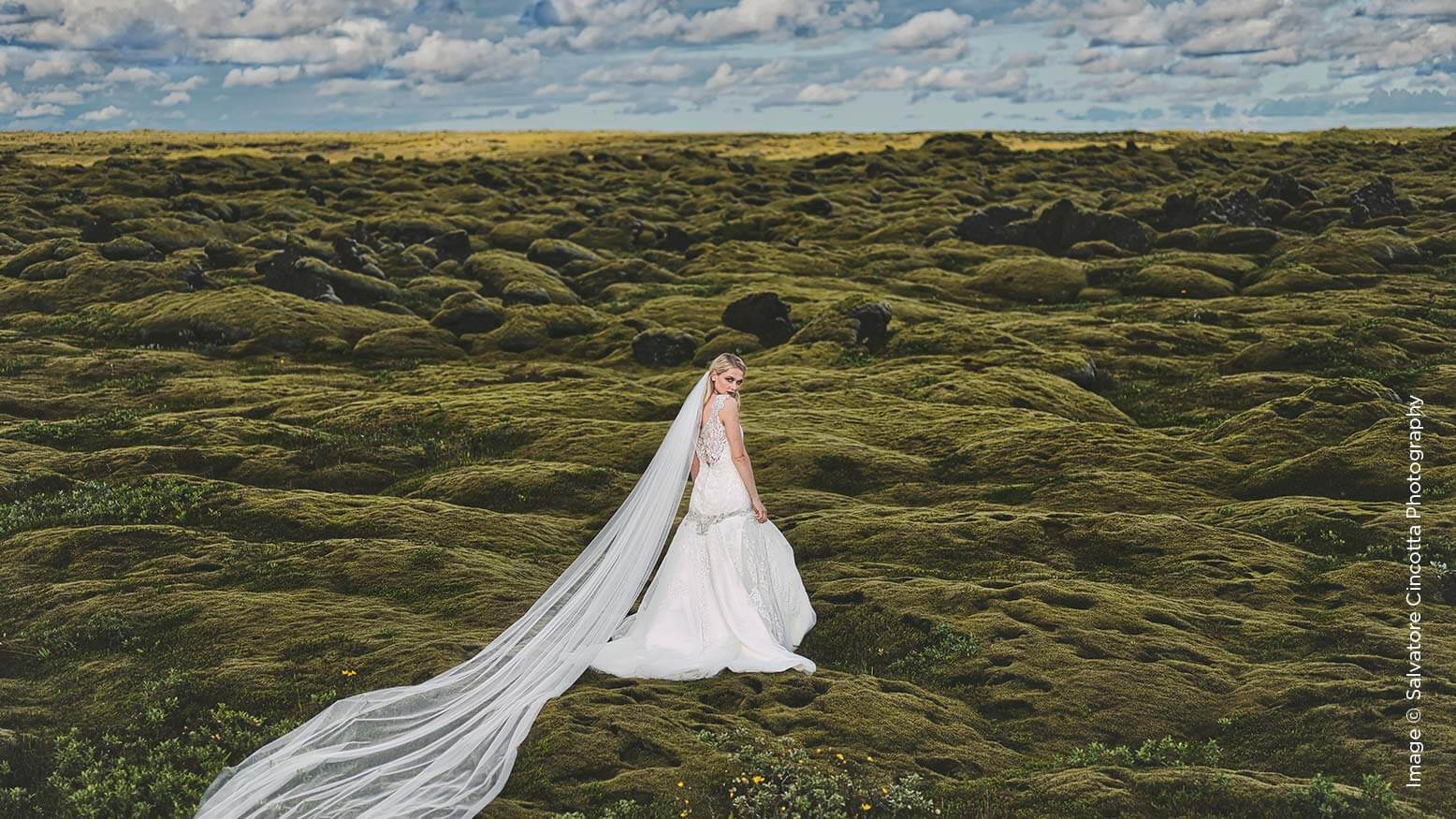
The creative filters include Structure, Matte, Advanced Contrast, Adjustable Gradient and Dodge & Burn. I’ll throw in a B&W Conversion from time to time, but these are my main filters. Using Matte and Structure together achieves a nice effect. You can see that the ground has a lot more bite than the sky—not to worry, because we can duplicate the Structure filter and mask out the ground. You can fill or invert your mask depending on the area you need to paint out. In this case, I chose invert to turn the entire mask black, which removed the effect and allowed me to paint in the areas I wanted to.
Click on the brush icon, and you have the choice of Brush, Gradient or Radial Mask. For a sky, I lean to a gradient mask because it gives me a natural feathered edge at the horizon line. Simply click at the top of the image and drag to the horizon line to apply the effect. We can even change the level of feathering and end point of the mask. This is way better than painting with a brush. Another useful filter is the Adjustable Gradient, which allows me to offset effects independently for the top and bottom of the image. It’s a two-in-one tool: I don’t have to paint one mask for the top on a filter—just add another and paint the lower mask. I highly recommend using this for ground/sky images and any bisected images that need different applications of exposure, contrast, vibrance and warmth.
I’m a huge fan of the NIK Collection. It allows contrasting into tonal areas, which give me a lot of flexibility in editing. With the Advanced Contrast filter, I can adjust Highlights, Midtones and Shadows separately. Along with Structure and that old faithful Dodge & Burn, these filters are a major part of my creative editing. Experiment with filters in Luminar to unleash your image.
Much like in Photoshop, Luminar’s Dodge & Burn filter works as a dual adjustment on a single filter. In Photoshop, you’d make a new layer, change the blending mode to Overlay and check Fill Neutral. This allows you to paint on a single-layer mask to dodge and burn in one fell swoop, toggling white and black as the foreground color. Luminar makes it even easier to Lighten, Darken or Erase the effect. Using the brush couldn’t be any easier—just toggle the “X” key to switch between modes.
I save most of my burning until the end, when I can see hot spots and where my eye naturally leaves the subject. Brighten up the face and skin, and we’re done.
Dial In Your Creativity Layers & LUTs
Masking is pretty straightforward, with options to fill, invert, reset and choose the right tool for painting. This becomes flexible for localized adjustments with filters as well as duplicating filters. There is even a luminosity mask that targets brighter or different opacities of light.
Tune in for future Shutter Magazine articles for more info on how to utilize this feature. Blend modes offer a lot of interesting effects, and, with the addition of true layers, we start to see the Photoshop advantage in completing our creative workflow.
Adding a layer is easy. Click the “+” icon next to the Layers panel and choose New Adjustment Layer, New Image Layer or Create New Stamped Layer. The best practice when working with layers is to never, under any circumstances, manipulate your base (background) layer. You should always duplicate this layer, make a blank layer or add an adjustment layer. Of course, you are probably laughing since I have fully edited my image on the base layer like a rookie. In this case, my best option would be to duplicate the background layer and clear the workspace. This would double the file size but get me to a nondestructive image.
Let’s move on to those “lookup tables,” or LUTs for short. These come from video post-production during the color grading of movies. What does this mean for our images? We can convert Lightroom presets into LUTs. That’s right, you can use your purchased and prebuilt presets from Lightroom. This means the color, toning and pixel-based effects from Lightroom can be applied in Luminar. First, you will need to Google “lut generator” and research how to convert your Lightroom presets to CUBE files.
Once you’ve found a LUT app, you can generate a HALD PNG file, import it into Lightroom and apply your preset to it. Then simply export the file as a JPEG in sRGB at a resolution of 72dpi. Launch your LUT generator app and choose to generate a CUBE file that will be acceptable for Luminar. Choose the newly exported JPEG from Lightroom. Now add a LUT mapping filter in Luminar, drop down the LUT choice options, choose Load Custom LUT File, select the CUBE file and click Open.
The effect is at 100% right out of the gate, so dial it back to 50. We have the same masking and blending tools to tweak this image. (38ab) Lastly, open the image into Intensify, apply a custom preset and we’re done. You’ll notice this automatically creates a separate opacity layer that can be turned down or off altogether.
The Results
There’s still more to come with this software. Download the trial and give it a spin. This is a powerful Raw processing application, and it’s not going to run at the expected efficiency of Lightroom. You have to come to the table looking at this as an all-in-one utility. It runs sluggishly on my 2016 MacBook Pro, but these aren’t built for heavy lifting. You have to save the proprietary file while working nondestructively, just like in Photoshop, saving as a TIFF or PSD, but it’s just massive in size.
So to whom is this software marketed? Much like ON1 RAW 2018, this is for users wanting an easier interface with a majority of heavy lifting Photoshop can perform. If you are a diehard Capture One or Adobe Camera Raw to Photoshop editor, this software seems like an easy pass. Everyone who wants to unleash a portfolio image with the ease of prebuilt filters, presets, layers and LUTs should get Luminar today. It’s only going to get better with the launch of a new DAM and improved performance.


