The Key to Basic Beauty Lighting with David Byrd
Let’s talk about the word “beauty” for a second to get our journey off on the right path.
The definition: “A combination of qualities, such as shape, color, or form, that pleases the aesthetic senses, especially the sight.” Seems pretty straightforward—we see something beautiful, and we admire it because of those elements mentioned above.
As a photographer, ask yourself this question: how often do you break down a session into those key elements? Our creative path is usually inspired by other images we see, images that evoke the desired adjective of “beautiful” and also conjure the phrase, “I want to shoot something like this too!” You get all the necessary components together and start photographing. But are you replicating what you saw as your inspiration, or are you returning to the basics of beauty—the definition of the word?
SHAPE
To define shape, we can of course think about the pose of the subject, but the lighting pattern that we choose can alter that pose and create an interesting new result or something that doesn’t hit the trifecta of what a beautiful image is. A common lighting pattern to use in beauty imagery is Butterfly Lighting. This involves using one light source that is placed directly in front of your subject, then raised up into the air, so it is slightly above your subject’s head. Now the light has to be tilted downward, at a 45-degree angle, so a wealth of light will actually fall on your subject. Because the light is in front of your subject, higher than them and tilted down toward them, it will cause shadows to form under all of the protruding elements of their body. This creates shape and helps to sculpt your subject. It also evokes a feeling, more so than just a flat light pointed directly at your subject with no elevation or tilt.
The butterfly moniker derives from the shapes caused by the shadows the light produces, specifically under the nose of a human subject. The shape of that shadow resembles a butterfly and evokes that sense of beauty, adding a touch of drama to the image. Their jawline will also gain a significant shadow, helping to define and sculpt your subject.
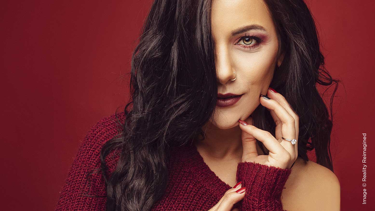
In the first reference image of our model Kiarra, you can see that the shadow under the jawline is strong, and this helps to frame her face and give it shape. The shadow under her nose is not as strong, because I had her turn her head slightly away from the light and therefore it fell off a bit.
This first image is a decently dramatic beauty image with a lot of great, defined shadow—my preference for any beauty work that I create as a photographer. This can be achieved with one light source; in the case of this image, I am using a single strobe with a 47-inch octabox attached to the front of the light. The diffusion provided by the octabox gives the light a softer quality and controls the direction of the light, and that is the key. You can produce similar results with a continuous light source like an LED or a lamp if you don’t yet have your first strobe or flash unit. However, the control of the light will vary, and that is why modifiers are absolutely essential in sculpting light to help define shape.
SHADOW PROBLEMS
I love introducing shadows into any image, as they define shape and create mood, but they can also produce some major issues when it comes to retouching the image in Photoshop. The first area where butterfly lighting can cause an issue is with the subject’s eyes. If their eyebrow ridge is too pronounced or if they have large, heavy eyelashes, then the light coming from above will cause too much shadow to fall into the eyes, and you’ll lose too much detail. It can be recovered in Photoshop, but to varying levels of success, making it sometimes too risky for the shoot. This is where you need to introduce a second element to the lighting setup: a reflector or eye lighter.
In this second reference image of Kiarra, I have placed an eye lighter directly in front of her, just out of view of the bottom of the frame. This U-shaped device is essentially just a reflector, and the shape helps to “point” light back toward your subject. If it were flat, then a lot of reflected light would be lost out to the sides; the curve helps shape the light back toward your subject. As you can see in the image, the shadows are reduced significantly under her jawline and around the other areas of her body. They are not eliminated, but rather reduced to a point where we can see more detail and the image becomes brighter, which changes the emotion. I also chose to use the soft white material for the eye lighter, rather than the silver material indicative of a typical reflector. The white material reflects a softer light into the scene and doesn’t cause as many specular highlights as a silver piece of material can.
This effect can be produced by other methods beyond using an eye lighter. You can set an actual reflector under your subject, place a small table in front of them with a piece of white poster board, or even bring in another light source, down low and pointed up toward them (the mirror opposite of your main light) to create a lighting pattern called Clamshell Lighting. As long as the light being directed into the shadows is minor compared to the power of light from above, and you’ll gently fill in the areas of the subject where detail may be lost.
COLOR
As you’ve noticed by now in the images, color plays a large part in associating the word “beauty” with the image. I chose to have Kiarra wear an oversized sweater because the temperatures in Phoenix have dropped a bit, and it’s quite cold (for us) in the mornings and evenings now. When she arrived on set, she had a maroon sweater and I made a choice as an artist to choose a background that stayed in that same color family.
I challenge you again—do you think about the colors of the clothing and the background you photograph your subject against? Do you think about the color harmony you are introducing into the image with those choices? There is no right or wrong answer to this question, and your choices are your own. However, making strong choices about associated colors is just as vital as the camera, the lighting, and anything else that goes into this beauty image.
I could have chosen a gray paper to photograph her against, something so neutral that her sweater would become vibrant and draw focus. I asked myself, “What feeling does that evoke in this image—will it be too bland?” I then looked at the color wheel and looked at the opposite color of red and immediately declined, because those two colors are often associated with the winter holidays.
Her sweater is maroon, though, and not a base red color. Maroon is created by red inching ever closer to the blue side of the spectrum. So, I considered in my mind’s eye what a blue paper would look like behind her. My assumption was that the image would become too “busy” and the viewer’s focus would be torn between looking at the model, the maroon sweater and all of that blue pushing against it. Blue is my favorite color though, so it was hard to not try setting it up.
In the end, I chose a deeper red paper for the background because I trusted that with all of the red of the scene being in play, the viewer would then take in Kiarra’s face and pose faster than they would from the other choices.
FORM
This final element of the definition of beauty is the perhaps the most vital—and, I would wager, usually where most of us struggle with our photography. There are so many rules about what is proper for a good pose, especially in the world of beauty imagery. Don’t show the back of the hand—no wait, don’t show the palm of the hand. Okay, fine … don’t show their hands at all, but you need to be able to see their hands. You should be able to see all five fingers on both hands, not just the leading one. One shoulder should be higher than the other and the lower one should connect to the hip that is popped.
I’ve heard so many theories of what is “right,” and they can conflict quite a bit. Rather than trying to remember an entire library of “do’s and don’ts” for every shot that I take, I fall back to feeling. I guide the model to a feeling and give them a subject to connect with and convey their emotions to. This of course adds to my workflow in the session, but it also helps the model connect to the shoot and sets a goal that we both have to achieve. By the end of our session together, the model feels a sense of achievement rather than just being told, “Okay, do your poses ‘n stuff and I’ll just take a bunch of pictures.”
A source of pride that I take in my work as a photographer comes from this collaboration. Many times in my travels, I have had models (both new and professionally signed talent) tell me, “I love the way you direct on set—it gives me a path to follow.”
When the right feeling is found and the model evokes it, I take a brief moment to stop and evaluate the image in front of me. When you do this, minor things suddenly begin to jump out at you. You can only see four fingers instead of five. Their palm is turned too flat toward the camera, and a minor rotation of the wrist will lessen it and create more mood. Follow your feelings in the image making, and the model will do the same.
With that being said, if you have the chance to work with a professional model who is signed with an agency, then you can expect that they will have a library of poses that they will flow through during the session. Explain the lighting pattern you have chosen, the color choices you have made, and the feelings you want to capture. They will know how to play to the light, how to secure the right poses to create the emotion, and you can sit back and just worry about the camera, the lights, the Photoshop work, the deadlines, etc.
FINAL THOUGHTS
In this last example, I introduced a third light source by placing another strobe above Kiarra’s head, using a 27-inch beauty dish that was positioned so that most of the light would fall behind her and illuminate the background. The rim of light that fell onto her head helped separate her a bit from the now brighter background, and I had her alter her pose to add to that effect.
I also brought in two V-flats to the scene and placed them as barriers on either side of her. This has the effect of pushing any available light from the strobes back into the scene, to further soften the shadows and illuminate the subject. V-flats are wonderful tools to have in your kit as a photographer and are relatively inexpensive. They can block light in outdoor scenes or guide light strategically back into your image. Reflectors can do the same job, and depending on the material used, you’ll get a wonderful variety of results.
Beauty imagery always relies upon those core elements in the definition—shape, color, and form—to create a foundation that, with a bit of guidance from you, will make a beautiful picture.


