The Art of the Black & White Commercial Portrait with Moshe Zusman
Want more information on this article? Get access to video content and additional supporting images. Launch the September 2017 issue of the magazine by logging in or signing up for a free account. Shutter Magazine is the industry’s leading professional photography magazine.
I’ve heard wedding workshop instructors say more than once, “If the white balance is off and the lighting is horrible, just convert it to black and white, boost the contrast and grain, and call it photojournalism.” That always bothered me. I learned from my mentors that a black-and-white photo should be black and white from initial conceptualization, from creation to delivery.
When you think about creating a black-and-white photo, ask yourself, why black and white? Some clients simply want it for a particular marketing look or just for the love of black and white. Either way, you should know why you’re shooting in this style.
In this article, I focus on a recent black-and-white project I did for a commercial client.
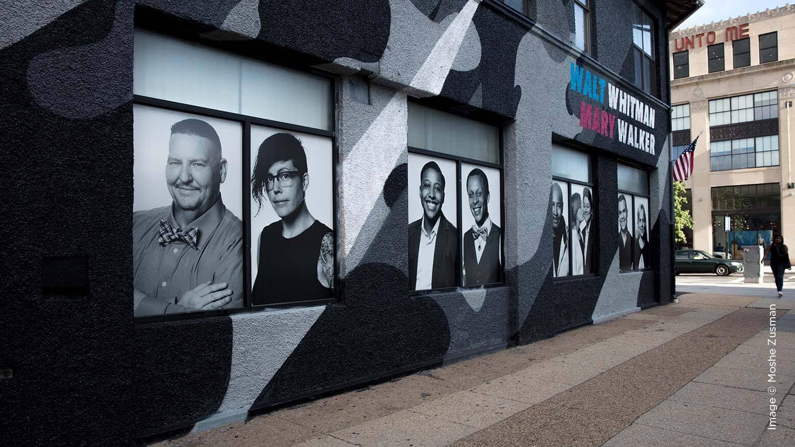
Whitman Walker is a healthcare provider focused on the LGBT community. They found me through a black-and-white series on my website, at https://www.headshotdc.com/black-white/.
The client showed me a mood board that demonstrated an attention to details, light and contrast, especially high contrast. Black-and-white photography is great at emphasizing these things. After brainstorming with Whitman Walker, we determined that the most important element for the campaign featuring volunteer patients of the provider was the natural feel and look of people and their expressions.
We scheduled the patients to come in and out all day in groups of one to three. We photographed them fairly quickly so they wouldn’t get even more nervous about the process while waiting. I spent five or six minutes photographing each person or group, and then I spent a few extra minutes showing each person their images on the big screen. They wouldn’t get to pick their images—that was the job of the PR team—but I love getting my subjects excited about a project.
The most important element in the campaign was to make people look real, natural and not like models. My lighting had to be simple and versatile, with minimal adjustment of contrast and exposure between sittings. I used the Profoto D2 Air 1000w/s and a 3×4 softbox about 2 feet camera right and 3 feet above camera. A second moonlight was behind my subjects, lighting the plain white backdrop. Then all I had to do was direct people, make them feel comfortable with me and the camera, and encourage them to have some fun.
There are many way to convert a Raw file to black and white, but this article is not about that. You can use presets, actions, plug-ins or even do it manually. After the PR team selected the final images for the campaign, we reverted them back to color. My retoucher cleaned up the images and we presented them to the client. After their OK, we converted them back to black and white. I created a preset in Lightroom that worked perfectly. I had to adjust exposure and contrast where needed.
The images were to be printed on a large scale for use on buses and buildings, so I used all 50 megapixels my camera had to offer, which pleased my retoucher.
It’s awesome to see your work printed so big, and used for a great cause.
4 Tips for a Successful Black & White Commercial Portrait
Tip 1 – Identify the style and concept with a mood board.
I hate wasting my clients’ time and my time. Setting the general idea and look helps me focus on what I need to do.
Tip 2 – Create contrast—not in post, at least not yet.
Create it with light. When you photograph black and white, contrast is key. Light your images with more contrast lighting than normal. Feather the light differently or create a greater ratio between your key and fill lights.
Tip 3 – Focus on the eyes.
You don’t have color in your images. The viewer’s eye is more drawn to shapes and lines, but the most known shape is the eye. There are always exceptions, like when people don’t look at the camera or laugh with their eyes closed. But for the most part, the eyes are extremely important in black-and-white portraits.
Tip 4 – I shoot in Raw.
That means we shoot black-and-white photos in color. I create a quick preset in Lightroom and show the client the proofs in black and white, even when I tether in the studio and show them the images on the spot. I don’t want to distract them with color. I want them to visualize the images already in black and white.
Good luck on your next black-and-white project, and check out this video for more.


