Shooting Homes for Interior Designers with Amy Bartlam
There are a lot of moving parts in shooting a home, and while you may be acquainted with what it takes to shoot a house for real estate, shooting for an interior designer or magazine brings a slightly different set of requirements. Here’s my guide to shooting an interior with an editorial slant.
Equipment:
- Tripod
- Full-frame DSLR
- Lenses ranging from around 17mm to 70mm (or a zoom lens with a similar range)
- Laptop
- Tether cable
Walk-Through
The first thing I always do is walk through the home with the designer and make a plan for the order to shoot the rooms in. It’s best to avoid sunlight streaming directly through the windows, which can create hot spots, so I use the compass app on my iPhone to check the direction of the windows in each room and plan accordingly. Obviously, overcast days eradicate this problem, but those are few and far between in Southern California. The walk-through is also a great opportunity to learn about the project from the designer. I find out which aspects of the project they love and which are important for them to showcase, which helps me prioritize what to shoot.
Setup and Settings
I use a tripod, low ISO, small aperture and very slow shutter speeds, and I tether to my laptop. It’s important to use manual mode because you need control over all your settings; you’ll find in-camera metering is generally way off for interiors, especially if you’re in a room with windows in just one wall. A small aperture (such as f/18) is required for full-room shots. I use a bigger aperture (such as f/4) for tighter vignettes and details. Live view gives me a rough idea of whether my settings are correct. Aperture and shutter priority modes don’t work well for anything other than detail shots, but I recommend using manual for those too.
Live view drains your battery fast. Always bring a couple of spares. On a full-day shoot, I go through three or four batteries.
Level
A common mistake I see with interior photography is images that have been shot at eye level pointing to the ground, resulting in converging lines and distortion. An important part of an interior shot is having all your vertical and horizontal lines parallel, which means you’ll need to shoot perfectly level and at around waist height. I use live view, grid and the levels on my tripod to get this as accurate as possible in camera. I also use the Upright adjust tool in Lightroom and the Skew and Warp tools in Photoshop to correct any wayward lines. If you’ve got the budget, a tilt-shift lens will help get this more precise in camera; for a more affordable option, buy a level with a hot-shoe mount.
Angles
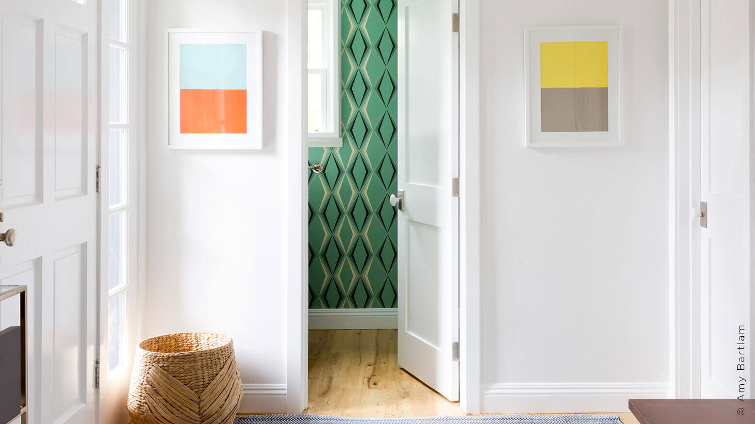
When deciding which angle to shoot a room from, I try a straight-on first, which design magazines and blogs often prefer. I find severe angles a little distracting. This isn’t always possible—sometimes the room layout literally backs you into a corner and sometimes a client pushes for it.
When shooting wide/full-room shots, stand as far back as possible and zoom into the shot, which minimizes distortion and avoids the overly wide feel common in real estate photography. This is helpful in shooting exteriors too (since it helps avoid the toppling-building feel) and also bedrooms: Beds are big and fill a room, making them prone to distortion. If there isn’t enough space for me to stand far back and zoom in to get a wide bedroom shot, I use a strong vignette instead; a favorite is to take a vertical shot straight on of one side of the bed, incorporating as many features as possible (headboard, sheets, pillows, rug, lamp).
Portrait vs. Landscape
If you’ve shot real estate, you know landscape shots are generally preferred. While it’s not uncommon for my clients to request a few horizontals (since these fit a lot of website templates nicely), I shoot more portraits. Magazines prefer verticals because they fit the page better, and Pinterest and Instagram, which both favor portrait shots, are key platforms for many of my clients’ businesses.
Turn Off the Lights
I always turn off overhead cans and lamps, which may feel counterintuitive, but having them on while using long exposures can get you harsh spots of blown-out highlights and odd color temperatures. It is also common in real estate photography to leave lights on, so it’s an aesthetic I try to avoid. I make exceptions for light sources the client wants to showcase.
Natural Light
There is a trend in the industry toward the natural light look. Open all shades and drapes to let in as much light as possible. Closed window treatments can make it look like you’re hiding something outside. I shoot entirely ambient light, but this is more a preference than anything else. You can light a space with strobes, but I prefer to bracket and work with layer masks in Photoshop.
Bracketing
Shooting a couple of stops under and over is always a good idea. You may need to shoot more than that depending on the range of light in a room. I use this method to recover window details or shadowy areas. If I have a client who wants some lights on in a shot, I shoot a separate image, exposing for the lights, and layer it in afterward in Photoshop.
Tethering
I use a five-pin to USB tether cable for my Canon kit. It’s worth investing in JerkStopper clips. Your cable will accidentally get pulled out of your camera from time to time, and the connectors can be delicate and easily damaged. JerkStopper clips prevent stress, dislodging and damage.
There are a couple of software options for tethering. If you have Canon equipment, you have a copy of EOS Disk Utility, a great option for tethering. You can use it to link up live view. Lightroom is commonly used as well but has a tendency to drop out for no reason at all; Disk Utility is more reliable. Some cameras aren’t compatible with Lightroom’s tether software, but Capture One also has tether capability. Check your equipment’s compatibility with the software before making a purchase.
Tethering can be a big help for a number of reasons. It gives you a better idea of whether you are exposing correctly. My clients love to see the images on a larger scale, and they can use it to check the positioning of furniture and all the nuances that make an interior shot go from good to great.
Details
Until I started shooting with interior designers, I didn’t realize the extent to which furniture and accessories are moved for each shot—from completely removing pieces to pushing a vase an inch. I move things to compensate for the foreshortening created by the lens. I may have to move tables and sofas into what seems like strange positions in real life to make them look normal in camera. My clients like to try different accessories and flowers until we get the perfect composition.
Keep It Tidy
Save yourself a lot of bother in post by tucking away unsightly items such as wires. I carry painter’s tape so I can keep wires out of sight. I wish I’d known this when I first started shooting interiors. Remember to also be wary of reflections. In an interior, there are often many reflective surfaces, even subtle ones like a gloss finish on a cabinet. Be mindful where you or anyone working with you is standing.
An important difference between interior photography and real estate photography is what the images are selling. With the latter, the aim is to sell a house, so making it look big and bright is paramount. With interiors, you are selling a lifestyle and showcasing high design and luxury, so that is what you need to keep at the forefront of your mind when you’re shooting.


