The Perfect Studio: How to Brand a Space that Sells You with Phillip Blume
When Ed Catmull, founder of the infinitely creative and beloved Pixar Animation Studios, was asked to take control of a stagnant Walt Disney Animation Studios in 2006, what do you suspect he changed first? Did he fire Disney’s disgruntled, failing animators and directors? Replace them with new talent from Pixar? Surprisingly, no—he retained nearly every employee, including his adversaries. Instead, this ingenious leader did something else. He remodeled the interior of Walt Disney Animation Studios.
What did Catmull expect to achieve through interior design? Pixar and Disney had struggled through a contentious partnership for years; frankly, everyone expected them to part ways. Yet Catmull understood something important about branding a workspace. A strategically designed environment inspires us with new feelings and ideas. It can either nourish our emotional and psychological needs, or stifle them. Within a year of transforming Disney’s segregated, hierarchical offices into an open floor plan to foster human interaction and candor, Disney transitioned away from box office flops like Treasure Planet and, once again, began producing world-class hits like Tangled and Frozen.
Are there design elements you can incorporate into your photography studio that will inspire greater success? Yes, there are. And those elements don’t necessarily require a huge financial investment. They will, however, require you to invest careful thought and time in determining your brand. Once you can define your brand clearly in your own mind, you will want to communicate it through your studio design. If done correctly, the emotional effect your studio has on your clients will be as powerful as the effect a beautifully created photograph has on its viewer. It will create a sense of connection and desire.
That translates to demand. Let me explain.
An Ideal
As I write this article, I’m sitting on a comfortably firm, newly upholstered sofa in the warmest corner of an open, brightly lit space. Through a long bank of plate glass windows, I’m watching rain fall outside, while light from the fireplace flickers on white 10-foot-high ceilings. We mounted the oak mantelpiece and applied the final coat of white paint to the brick walls just yesterday. Every detail was painstakingly considered.
I’m in love with the brand-new Blume Studio, and so are our clients. We’ve been hosting them here already for the past month as we finished construction. I’m a perfectionist, and I constantly have to fight the urge to hide my progress until a project is “perfect.” (There’s no such thing on earth.) And in business, the most important lesson I’ve learned is to be a man of action, fail fast and make adjustments along the way.
We’ve understood for a long time that communicating our brand via an experience is a huge key to success. So we’ve used whatever was available to us—first our own living room, then an unfinished basement and finally this studio—to communicate that brand. It hasn’t always been as refined as now. But it has always worked like a charm. So let’s use Blume Studio as a model while we discuss three practical steps you can take to begin branding your studio today.
Define Your Audience
Your first step is to define your ideal client. Whom do you want to work with? That should be your audience. Marketing to them is the endgame you must keep in mind. Write down a bulleted list of descriptors for your ideal client. Frame that list. Then come back to it for a cold, swift kick-to-the-pants reminder every time you begin drifting in terms of the jobs you accept.
We all start somewhere, and it’s OK to take whatever work you can get. But be especially critical about the work you show. Specialization is key. Remove the tagline “specializes in weddings, newborns, landscape, architectural and fine art photography” from your business card. Discerning clients (those who can afford to keep you in business) don’t trust that kind of babble. In our case, we are wedding photographers. Yes, we occasionally photograph seniors, newborns and families, but you won’t find them on our homepage.
Seth Godin, in his book Tribes, describes the immeasurable marketing value inherent in creating community around your brand. First, he says, you have to make a connection between your client and yourself. If your client can’t relate to you, it’s a hard sell. Biologically, we make instinctive judgments about people based on the environments they inhabit. Make sure your studio environment describes you as someone your ideal client wants to connect with.
Godin explains it is crucial to connect your “tribe” to a shared purpose. Frankly, that purpose can be shallow or deep. It doesn’t matter—as long as the purpose is something your ideal clients can all sink their teeth into. For example, if your clients are the Real Housewives of Beverly Hills, by all means make every effort to flaunt your success. Diamond-encrust the heck out of your studio! The purpose your clients relate to may be crude material gain. Financially successful people (or those wanting to appear successful) love to network and connect themselves with other success stories.
In Blume Studio’s case, our nearest city happens to boast America’s highest poverty rate. (Immediately after we started Blume Photography, we probably helped contribute to that statistic.) Not the ideal market, right? Fortunately, the relatively small population of wealthy families here are also charitably inclined. Personal humanitarian work is a passion of ours, and we naturally desire to connect with clients who both share our values and have more disposable income. So while our studio speaks of quality, it is also simple, parsed down, and mementos of our humanitarian work are kept on display as conversation pieces.
Determine the Details
Once you define your audience, you’re ready to design a space that speaks to it. Did you define your ideal client as “a hipster couple who value my epic or ‘fearless’ style of artistic expression”? Your studio needs to match those values. The last thing your studio needs is a “down on the farm” vibe, with soft lace doilies as drink coasters. Instead, go contemporary or modern. Your sign should flash your logo in glowing light, just like the eye-popping off-camera flash you use. Maybe your granite slab fireplace mantel should be asymmetrical, highlighting the unexpected composition of your photos and quirky personality of your clients. What they see in your studio is a reflection of you. If they love it, you and the unique experience they had in your studio will stand out emotionally above the rest.
Do you live in wine country? Our friend Mike Larson, of Mike Larson Private Estate Weddings, is a prime example of this niche branding. That business name is a mouthful, but the clients he once served were all over the map. Once he made the leap of faith and narrowed his sights on “private estate and vineyard weddings,” his business exploded. Mike and his wife are the world’s most down-to-earth people, but do you think Mike started dressing differently for his new brand? You bet. And do you think he stimulates his clients’ senses with a can of Coke from his fridge or fine wines in stemmed glasses? Imagine the leathers and high-end fabrics you could select to furnish a vineyard studio. If Mike brought his clients in and sat them on a tattered Ikea couch, he would lose all credibility as “the private estate wedding photographer.” I think you get the idea.
In the same way Starbucks aims to be a “third place” where you feel at home and happy to spend your money, we shouldn’t allow small savings or shortcuts in design to compromise our studios’ ability to be that atmosphere for our clients.
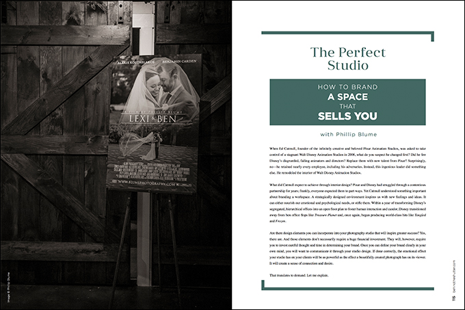
The Blume brand can be described in two words: storytelling and heritage. When we meet prospective clients, we talk to them about the authentic moments we capture and the finished artwork we specialize in—handcrafted books and display pieces that their grandchildren will one day find and treasure. Everything in our studio supports that narrative. The wood trim in our studio, our giant coffee table, workstation, and even our bathroom vanity are custom made by Sons of Sawdust, which specializes in building with reclaimed wood that has over 100 years of stories behind it. We willingly paid extra and waited longer for linen upholstery that wasn’t available in-store. Exposed brick and concrete lend a commercial feel, but more importantly relate to our photographic philosophy: that present reality is beautiful, and doesn’t need to be hidden under too much posing or touch-up. The same is true for our lighting fixtures, one made of an old tripod and the other an antique dentist’s lamp. Nothing in our studio is allowed to appear mass-produced. That’s because the artwork we want our clients to value is unique and handmade, too. How can they learn to value that if we don’t express the same values?
Yes, we want to appear modern and tech-savvy to a degree. But even our new iMacs sit on an old wooden workstation. Our cutting-edge theater, where we screen wedding films, has a sliding barn door. Our glossy magazine features are framed in old barn wood. We bought a Keurig machine for convenience for when our clients outnumber the size of our French press. But the cartridges we use are biodegradable, high-quality organic coffee. These are not purchases I would think to make for myself on a normal shopping spree. I think differently when it comes to our studio.
Start Small
I mentioned before that during Blume Photography’s early days, we likely helped contribute to our market’s poverty rate. I wasn’t joking. Our entire home at that time was fewer square feet than our current studio. Imagine approaching our home for a consultation. You look through your windshield questioningly. Can this be the right neighborhood? Lawns are overgrown. The road is in disrepair. As you approach our driveway, you hear the howls of 17 dogs from the small fenced yard next door. The next house is abandoned—literally charred black by fire. This is where we’ve come to meet the award-winning photographer?
Our situation wasn’t ideal. But once you walked through our front door, I can guarantee you would have forgotten the world outside. Our cramped living room was tastefully appointed. We cleaned it of our toddlers’ Cheerios and toys. Even the dining table (our then “packaging area”) was cleared. The aroma of vanilla candles hung in the air. Then, as now, you would have been served fine cheeses, loose-leaf tea or a Coca-Cola (strictly in a retro glass bottle, mind you). Brand-consistent music plays softly from a quality stereo. We paid the premium so you wouldn’t hear any of Pandora’s disrupting commercials.
Start where you are. Many of us dream of owning a physical studio. The worst mistake you can make is to view your studio as an end unto itself. You risk building a brick-and-mortar structure that has no soul—no purpose with which your client tribe can connect. Remember, you are your brand.


