Low-Powered Strobe, High-Powered Results with Michael Corsentino
Want more information on this article? Get access to video content and additional supporting images. Launch the December 2017 issue of the magazine by logging in or signing up for a free account. Shutter Magazine is the industry’s leading professional photography magazine.
It’s easy to fall into the trap of using strobes the same way every time without ever stepping back and asking yourself why. I know because I’ve been guilty of this. Does what you’re doing need to be done that way? Are there alternative routes that just might lead to far superior results? If you haven’t asked yourself these questions, you may be operating on autopilot like I was.
Despite the wide variety of effects I’m able to create in the studio and on location with various modifiers, lighting patterns and other tools, I’ve been in what I’ll refer to as an f16 rut. Until very recently, whenever I’d use strobe in the studio, I’d always meter my keylight for f16. That means I’d adjust the power on the strobe so that it generated enough light to allow me to shoot with an aperture setting of f16.
There’s nothing wrong with f16 or even f22. These narrow apertures are perfect for capturing fashion, catalog work, product photography, anything where detail is required. And detail is great. I’ve learned how to do it well. But it starts to get old and feel stale. If everything is always super sharp and detailed, there starts to become a sameness and lack of subtlety. We should always be evolving and exploring new ways of seeing. Creating something new is part of the joy of making art.
In this case, old is new again. Lately I’ve been thinking a lot about tintypes, daguerréotypes and other early 19th century portrait techniques. The photographs from this period have one thing in common: low light or no light. Photographers used natural light or low-powered powder-based flashes to illuminate subjects. This required wide apertures, which resulted in images with gorgeous focus fall-off from the shallow depth of field. Subjects also had to remain very still during exposures due to the slow shutter speeds. This is why the portraits look so stiff.
In today’s studio, the use of less light is kind of counterintuitive given the way we typically think about using strobes, where we’re adding light. The impulse is to throw as much light at subjects as we can, because we can. The pitfall is we tend to overdo it. The focus on creating enough light to achieve maximum sharpness becomes the driving factor and can end up turning everything we do into hyperfocused pictures with a strong digital feeling. Or at least that’s what I’ve been doing, and in the process leaving a lot on the table in terms of subtlety.
There’s something beautiful about the rapid transition from sharpness to softness (from eye to ear) in those old portraits. If everything is sharp from front to back, how do our eyes put it into a three-dimensional context? This is the beauty of wide apertures and depth of field: Objects closest to the camera appear shaper and those farther away appear softer. The wider your aperture, the more pronounced this becomes. The differences in sharpness and softness naturally instruct the viewer where to focus their attention.
These two portrait sessions were all about breaking my f16 habit in studio, going in the opposite direction and using extremely low-powered strobe and wide apertures to recapture some of that vintage portrait magic. I used the widest aperture available, f3.5, on my Schneider Kreuznach 150mm LS lens. On a medium-format DSLR, this is equivalent to approximately f1.4. Both subjects were photographed using the same two lighting setups, one with strobe only and one with strobe and constant lights. In each case, the strobe served as the keylight.
Strobe Only
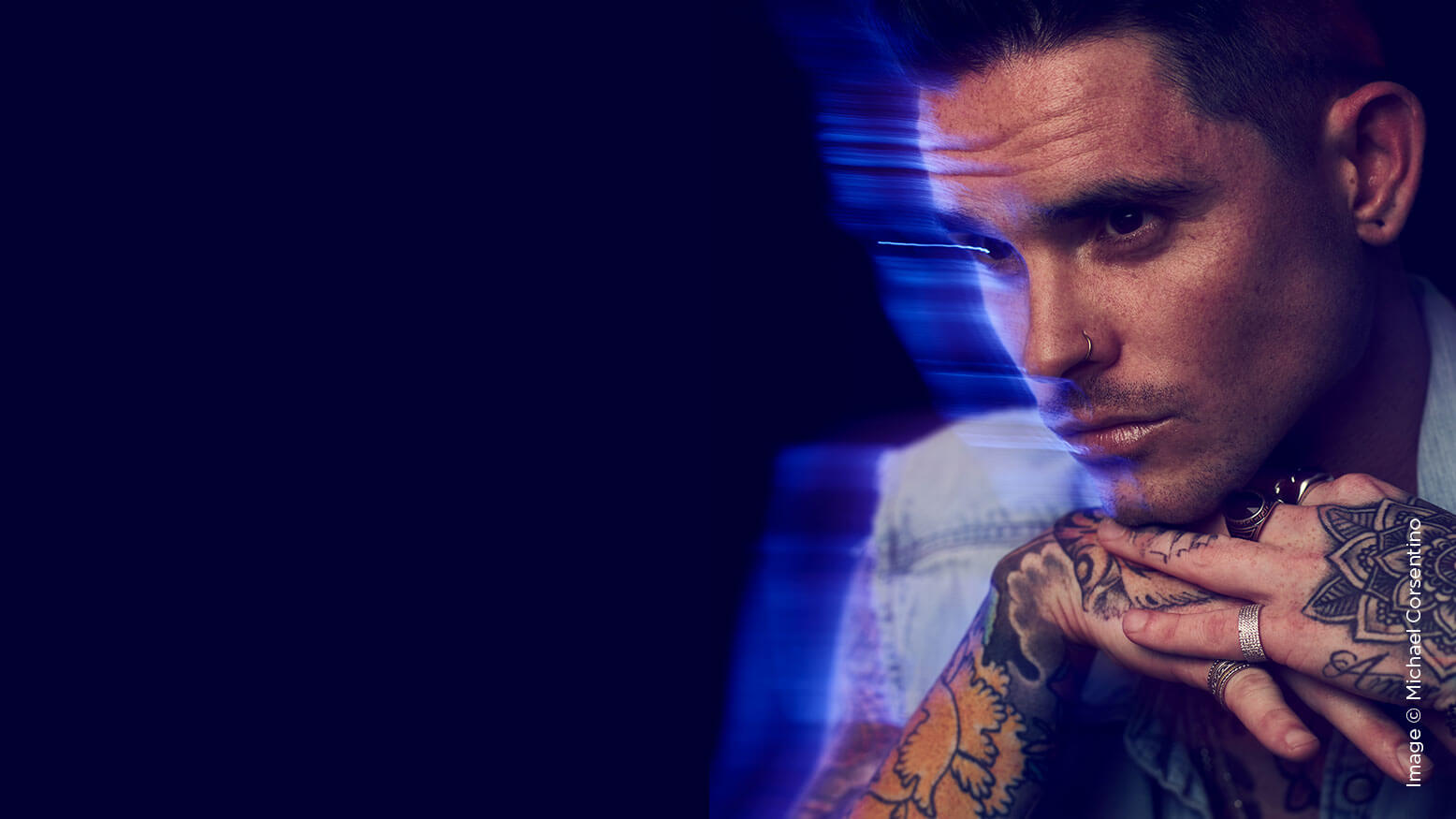
The strobe-only setup was designed to create a series of classic black-and-white portraits with an eye toward vintage photographs—plenty of depth of field and oodles of focus fall-off. The strobe and constant light setup was designed to introduce color and motion through the use of two daylight LED Fresnel lights, gels and long shutter speeds. Here, the strobe’s job was to freeze the subject momentarily, providing sharpness and detail. Then the constant lights and gels took over, creating color and motion as the shutter remained open.
In order to achieve an f3.5 meter reading, I needed to power down my Profoto 7B pack and head flash system to its lowest possible setting, approximately 30 watt seconds. In front of the beauty dish, I also had a Lastolite Joe McNally 3×3 Diffusion Panel to further soften, broaden and knock down the light. Even then, I was still metering f4. Granted, my keylight, a Mola Softlights Demi beauty dish, was close to the subject, so this made sense. I still needed less light, but I was as low as I could go on the strobe’s power. I could either move the keylight back or stop down the lens, neither of which I wanted to do. Instead, I opted for a sheet of –1/2 stop neutral-density filter gel placed in front of the beauty dish, and I was in business with f3.5. I also used two fill reflectors, one below each subject and one to the right or left, depending on the keylight orientation (refer to the lighting diagram for Setup 1).
As you can see, using an extremely low-powered strobe and a wide aperture allowed me to create a beautiful series of images with deep depth of field and maximum focus fall-off. Keep in mind when you’re working this way that the part of the image that is in focus versus out of focus is extremely close, so be slow and deliberate. Focus may prove difficult at times, but when you nail it, you’ll see magic.
Strobe & Constant Light
The second setup incorporated constant lights, in this case two Lupolux 650 watt Daylight LED Fresnels, in addition to the strobe used for the keylight, which we covered with Roscoe 12×12 gels to add color. Along with a much longer shutter speed, .6 seconds, we were able to capture motion. We employed the exact same aperture, ISO and flash power from the first setup. Only the shutter speed was lengthened considerably to capture motion via the constant lights and camera movement. The LEDs were each set at approximately half power. This was done because lower light output yields more color saturation with gels, another benefit of low-power light.
Because the shutter remains open for an extended period of time, you’ll need to work in a completely dark room. The only lights you want are those intended to contribute to the exposure. Here, again, focusing can be challenging. In most cases, the gelled constant lights, typically oriented as accent lights on either side of the subject, won’t provide enough light to accurately focus. You’ll want to use a flashlight to grab focus, shut it off and then make your exposure or have someone operate the overhead light switch when you need it. You’ll also likely need to flag or block the constant lights from spilling into the camera’s lens or onto the background. In the lighting diagram for Setup 2, you can see I’ve flagged for both. Black pieces of foamcore or even painted cardboard works perfectly. Without the flags, you’ll get a much more desaturated effect and possibly experience lens flare.
This technique requires patience. You’ll get more misses than hits, but when you nail it, you’ll be glad you persevered.
A note about creating the motion: Through a considerable amount of trial and error, I’ve discovered that moving the camera produces a far more dramatic motion effect compared to asking the subject to move. For these images, my camera was mounted on a studio stand with a pan and tilt head. I panned the camera to the right to create motion streaks on the left. You move the camera in the opposite direction of where you want the motion effect to appear.
No Excuses!
These techniques can be accomplished with minimal expensive gear. Use a speedlight for the keylight (you need a tiny amount of light), an inexpensive beauty dish or octabank, a shower curtain or pop-up diffuser to cut and broaden the keylight, black-and-white reversible foamcore to reflect and subtract light, a couple of incandescent flood lights (or, better yet, daylight-balanced LED lights) and a set of color and neutral-density gels, and you’re in business.
The big takeaway is less light and wider apertures in the studio. Get in there and experiment, have fun, swing for the fences. I can’t wait to see what you come up with. Be sure to post images on social media and tag me.
See you next month!

