Lighting for Conceptual Photography – 7 Tips to Shake Things Up with Jess Hess
Light is and has always been the most important aspect of a great photo. It can make, break or even define a photograph. Ideas on how one should and should not use lighting vary based on whoever you ask, and a plethora of lighting tutorials exist on the web. There are rules in photography, and there are rules in lighting as a part of photography. However, when you’re photographing conceptual work or fine art, you are largely expected to make your own rules. Only you know what is in your own head, and you have to bend any rules that stand in the way of making that vision a reality. This is why conceptual work can be hit or miss. Those who dedicate their time to perfecting their own rules can really wow us with their dramatic, interesting photos. To make an interesting photo, you have to have a vision in mind and then bend the light to meet that idea. You do not bend your idea to suit your situation. Great ideas can fail due to terrible execution, and that is why conceptual photography can be so difficult to master. Practice truly makes perfect. Being more mindful of what you want to capture and taking your time can make all the difference.
1. Make New Things Up and Try Them
While popular lighting setups are safe options, how is one to stick out unless they get creative? Sometimes you have to try something that you visualize in your head and see what happens. The worst that happens is you set up your light and it sucks. No big deal, nothing lost. With every test and trial, you will find things you like and dislike. You may even stumble upon lighting setups that people charge to teach, or that your idols are using. Nothing is cheaper than trial and error. Try mixing things up. Use one light when you usually use three, use a mix of bounce and direct lighting, balance ambient light with a fill flash, use a ring flash as a kicker light instead of a main light—whatever it is, just do something you wouldn’t normally do.
2. Shoot for Texture
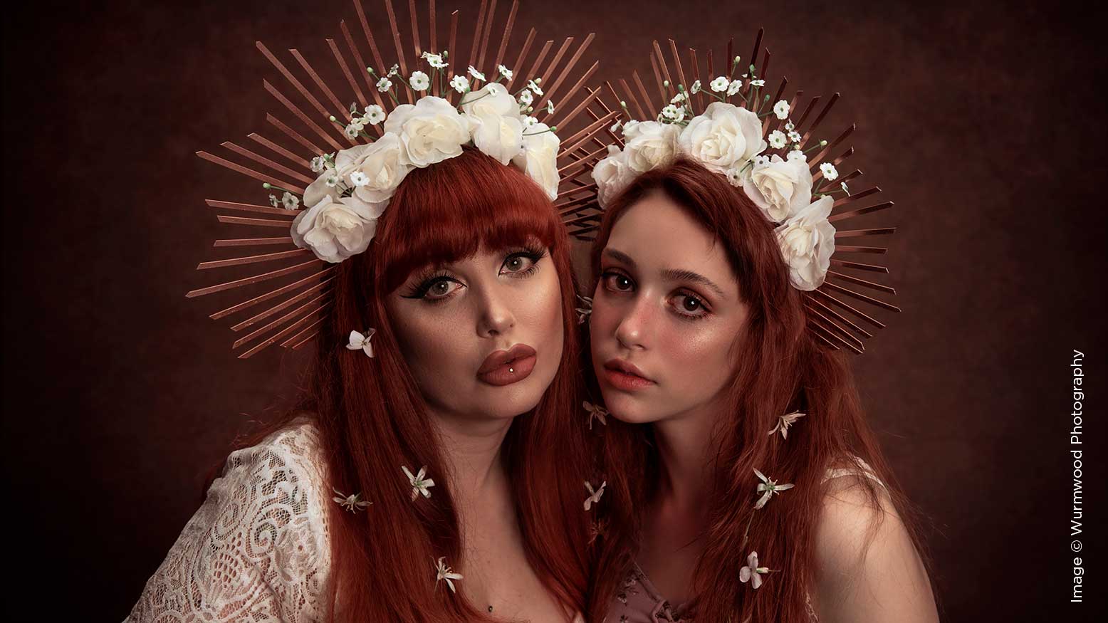
I love texture. Specifically, I love how texture adds something unique to a photograph. You can photograph red on red on red, and what differentiates the various parts of the image are the differing textures. Such monochromatic pictures are something I do a lot. Without differing textures, things could end up blending together leaving nothing to catch the eye. One way I shoot for texture is to position my lights at an angle instead of head-on. Not only is angled light more flattering to a face, but it allows the light to play off the texture, making it become shadowy and defined. A great way to further accentuate those shadows is to forgo a fill light. So long as you’re exposing correctly, you don’t always need to use a fill light. Don’t be afraid of shadows. Texture gives your photograph more depth and dimension, because there is just more to see and take in.
3. Accentuate Facial Features With Light
Ideally, we would look great in every light all the time, but life hates us all and just doesn’t work like that. We’ve all seen ourselves in unflattering light, and many of us don’t miss an opportunity to snag some selfies when we come upon good lighting. Light can completely change how a person looks. For instance, a deeper shadow typically indicates something is more debossed. If one has shadows just below their cheekbones, our eyes can look at a 2D image and figure out that the cheeks are in farther than the cheekbones. There’s a darker shadow, and the cheeks appear to go in even deeper. Shadows below the cheekbones, under the neck, on the sides of the nose, and on the hairline can make a person appear thinner. Highlights have a similarly strong effect in the opposite direction. A highlighted area appears closer to the lens. Even subtle highlights can completely change an image. Highlights on the tip of the nose, the cheekbones, the shoulders, the clavicals, and the upper lip can make an image appear much more dimensional. And while a highlight in the inner corner of your eyes doesn’t necessarily make that area look “closer” to the lens, it does brighten eyes and create a very beautiful look.
To control highlights and shadows, you’ve got to place your lights appropriately. A favorite of mine is to use a beauty dish and grid very close to a subject, about 45 degrees directly above them and angled down. This adds highlights to the forehead, chin and nose and also adds some shadow to the cheeks and under the neck. I sometimes also throw a reflector 45 degrees below them to get some nice specular lights in the eyes and to soften shadows just slightly. The grid helps to keep the light narrow, which makes the shadows more prominent and defined.
Another great tip for getting highlights is to use highlighter. No, not sharpie, but makeup. Highlighter is essentially a shimmery powder or cream that people use as part of their makeup routine to give them highlighted areas of skin. It reflects light and makes areas pop. These highlights aren’t just captured by a flash; you can see them on people as you walk around every day. You can make your face look completely different with contouring and highlights using makeup alone. The same concept should be applied to lighting. Even if you are shooting a model with absolutely zero makeup, having highlighter on hand can really help you capture an image with more dimension. Highlight the upper cheekbones, the inner corners of the eyes, and the skin just above their upper lip. Blend the highlighter so the light reflected is feathered. If you want to learn what light is flattering, watch makeup tutorials. It may seem silly, but makeup is related to lighting because contouring and highlighting change how light reflects off skin. Learning about makeup can help you understand what should be darkened and what should be lightened, and you can apply that knowledge to where you choose to place your lights or even how you choose to dodge and burn in post.
I would be remiss if I didn’t also mention the highlights created by moisture. Liquid is reflective, so while sweat can make the wrong areas stick out, water can provide lots of dimensional artistic highlights, and baby oil can make skin reflect enough light that all areas closest to the camera are highlighted. Experiment with these things—you might find something you like.
4. Play With Color
I’m sure we all know the joy of colored gels, though maybe some of us don’t. Colored gels can create intense, dramatic light with minimal effort. You can transform the entire mood of a location by changing the color of the lights you use. This means you can throw color on your main lights, on your fill lights, or even on your background. Colored light is extra fun to experiment with.
Colored light is great, but what about colored shadows? I love adding extra dimension in shadows by making them project a color. One way that I typically do this is to bounce a colored flash or shoot it directly on a subject with significantly lower power than my key light. If you let it just scatter over an entire image, it will show only in the shadows and not in the highlights. It’s a pretty cool effect and one that I stumbled on when I was trying random things one day.
I’ll say it again—try new things.
5. Don’t Be Afraid to Get Weird—Really Weird
I’ve mentioned trying random things out, but there are still rules, yeah? We want our subject to look flattering, we want our photos in focus, and we want our message to be easily conveyed. These things aren’t all necessarily true in the world of art. When you’re shooting conceptual portraits or fine art, you are making your own rules. It’s okay to get weird with it, and it’s okay to do something that a lot of people might not typically like. The world isn’t all daisies and cut abs; sometimes there’s sweat and muck and weirdos. I myself am a sweaty, mucky weirdo. That weird idea you came up with one random Tuesday morning over coffee? Shoot it. That guy with the crooked smile and weird tan? Take his photo. Let yourself try things that you want to try without worrying about whether people will find it particularly beautiful. You may hate the outcome, but you very well may not. Shoot only for yourself sometimes, and see what you create.
6. Take a Classic Lighting Setup and Add Something to It (or Don’t)
Take one of your typical lighting setups and add something extra in it somewhere. Add a colored hair light or some kicker lights in the back. Add just one or two more dimensional aspects to your portrait that you might not usually think to add. Really take your time and focus on how you want the light to appear when you hit that trigger. You can practice without feeling on the spot by photographing a teddy bear or your significant other’s terrifying mannequin. Place a light, test it, and move it if it needs to be moved. Don’t get impatient or stick with the first thing you try. Move things around until they look like you want them to look.
Classical lighting doesn’t absolutely need to be spiced up to be exciting. It’s classic for a reason; it looks good. Classical lighting setups can make images look historical, or vintage, or even romantic. Try photographing things with classic lighting setups that wouldn’t typically be shot in such a manner. For instance, light a little boy with a setup you would use for a Wall Street tycoon and make him look powerful, or photograph something mundane with theatrical lighting. Take a photo of an alien girl with Rembrandt lighting and tell me people don’t react to it.
7. Don’t Be Afraid to Tell Bokeh to Go to Hell
Bokeh is great, I love it, but it shouldn’t be utilized in every shot. It can be dramatic to show one scene in an image just as it can be interesting to have an image with no focal point and instead a huge scattered story. If you want to get creative, you have to mix it up. Bump up that f-stop up until you can see every wrinkle on your model’s face. I would say 98 percent of my images are shot on f/4. I zoom in if I want to blur the background a bit, or I shoot wide and capture the whole image. I really love having a lot of detail in an image. I want to see the pattern in the eyes and the texture on the shirt sometimes, and will often go up to f/8 or f/11 if I want. It’s certainly a different looking portrait than one taken on 1.8, but it’s only that: different. Not less than, not more than, just different. Since aperture is part of what controls how the lighting appears in an image, try lighting something how you would usually light it, but expose for that smaller aperture. Maybe separate your subject from the foreground and the background by lighting the background with a solid color instead of using aperture to blur it. There are endless options when it comes to producing a stunning photograph, and playing with your aperture in conjunction with more light is one great way to shoot something different.
When it comes to creating dynamic, interesting conceptual portraits, you have to step outside of your comfort zone time and time again. You have to try things that might fail, and you have to repeat winning setups over and over to refine them. Work is the necessary evil of life, and without it you won’t advance. Go do something different, right now.

