Invisible Light: Epic Flash That Feels Natural with Phillip Blume
As an exchange student at the Universitat de València in Spain, I discovered a world of quiet inspiration. I would venture out early onto the narrow stone streets of El Carmen, my 12th century neighborhood, on a pilgrimage to explore the city’s art galleries. Exhibitions were impressive. But don’t imagine expansive Parisian museums. The beauty of a Valencian gallery isn’t in its grandiosity, but rather in its heart. Inside the twisted, crumbling arteries of ancient Moorish architecture, I often needed to press my back against cold stone to properly view a large medieval tapestry, or to admire an original Picasso hung casually on the opposite wall. I was enamored. In those dim corridors with not even a security camera to break the solitude, I gave my eyes time to adjust and contemplated the priceless artwork before me.
But Picasso probably didn’t consider these works priceless. He was prolific and, like anyone, didn’t finish every project he started. One gallery’s walls teemed with early sketches by this father of the Modern movement. It struck me that he’d left them only half-painted, the other half abandoned in pencil scrawl and charcoal dust—bones forever waiting to be clothed in flesh. Picasso buried them. We value and display them now only because he was brave enough to abandon them. It takes humility to leave the old behind. Yet we tend to cling to what’s comfortable.
Isn’t that just like us? As a wedding photographer, I’ve wrestled with the temptation to create images that are “good enough.” After all, I’m working under a time crunch. Fleeting moments need to be documented. Just spray the scene with direct flash (or nothing at all!) and load it into the camera’s memory for your client, right? Who has time for art direction? If anyone criticizes our lackluster work, we stubbornly retort, “Well, that’s my style, and I’m sticking to it!” That reasoning, at best, is uninspired. As a result, our images are bare skeletons. Unfinished. Lifeless.
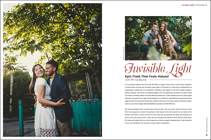
So how do you bring cold bones to life? Finish painting them—with invisible light! When I say “invisible,” I’m not referring to infrared or unseen light. Instead, I use the term invisible light to help our Blume Workshop attendees grasp the storytelling impact flash can have when you blend it seamlessly with ambient light for a better image. Stylistically, my goal is to draw the viewer into a story, not to distract him with the photographic process. A few subtle techniques can transform a poor lighting scenario into an ideal environment. Let’s explore some of them here.
Rescue highlights. It all starts here. Most portrait photographers begin their careers by placing friends in front of pretty backgrounds. At first they wonder why the exposure of a beautiful sunset came out so well, yet their friend became a dark silhouette. Or their friend is visible, but the blue and purple sky looks white in the finished image. Your camera can’t see the range of light your eye can. So beginners eventually learn to go manual: expose for the bright sky, then use a flash to illuminate the shadowed friend. The concept is simple and valid. So why do our subjects now look like cardboard cutouts against a fake background? The answer lies in light direction and ratios.
Direction. Direct flash from an on-camera strobe (by itself) can never create subtle, “invisible” light. Do you generally walk around with light shining out of your eyeballs? Most of us aren’t mutants, so images lit directly from our point of view look unnatural and flat, lacking shadowed depth. The solution is simple: Move your light off-camera! Notice I did not say, “Move your flash off-camera.” Yes, often your flash will need to leave its hot shoe and go to a stand. But, just as often, I find myself simply bouncing light—pointing my flash head (set at TTL one stop or so) away from my subject and toward the nearest lightly colored surface (it doesn’t have to be white). Here’s a tip: Change your camera’s default meter setting to “spot meter,” then be sure to move the focus point over the object you want to properly expose (usually the side of your subject’s face receiving the bounced light). Boom! Perfect exposure every time.
The light that bounces back is directional and softer, and, without being gelled, still picks up some of the environmental color. The resulting shadows sculpt your subject beautifully, but watch out. Even a little direct “spill off” from your flash may negate the effect. To make the light appear more natural, attach a solid card between your flash head and your subject. It seems counterintuitive since many photographers attach a card to the back of their light (or use expensive Tupperware) to fill in shadows intentionally. But only in rare indoor situations does fill enhance the natural look. I’ll touch on that later. In the meantime, just say no to Tupperware.
Logical direction. Another crucial thing about direction: If you’re going for the natural look, place your off-camera light intentionally so that it originates from the same direction as the natural/ambient light. Is the sun shining from camera right, casting long shadows across mountains and trees in the background of your image? Then it makes little sense to light your subject from camera left, casting a shadow across her left cheek, opposite to nature. An untrained viewer may not be able to put his finger on it, but even he will feel like something is amiss in this photo.
Likewise, you don’t want to rim-light your subject who is standing in front of a dark indoor wall. Why would a wall project light? You may, however, light the wall itself to create separation. Consider shining a second light toward it from the same direction as your keylight, perhaps simulating sunlight through an unseen doorway. Or simply move your subject closer to the wall itself, using one light to reveal both subject and background. It’s funny: Most amateur photographers I meet instinctively tend to light the darker side of a subject’s face. We want so badly to make dark things brighter. But it isn’t necessary, and too often looks forced. Just because a subject’s left cheek looks “already lit” to your eye doesn’t mean it doesn’t need more lighting. You can darken the exposure and, as far as your camera is concerned, that bright cheek is now dark. Paint where you like. You now have a blank canvas.
Ratios. The topic of lighting ratios is more complex and better left for another day. Suffice it to say, if you want every trace of your lighting setup to remain “invisible,” try not to underexpose your background more than two stops darker than your subject. That’s the line where things start to look “cut out,” or interior spaces begin to look like caves. I generally keep my ambient-to-flash exposure ratio even narrower. Indoors, that may mean pumping up your ISO to get an almost correct exposure, then merely supplementing with flash. Outdoors, it may mean thinking more like an “available light” photographer (choosing somewhat evenly lit locations). However, you will retain a lot more flexibility to show off the environment and to fight the sun. (In other words, if you’re armed with flash, you aren’t limited by light that’s “too intense.” You just want to avoid, say, expansive landscapes with irregular, high-contrast light patches you can’t fill.)
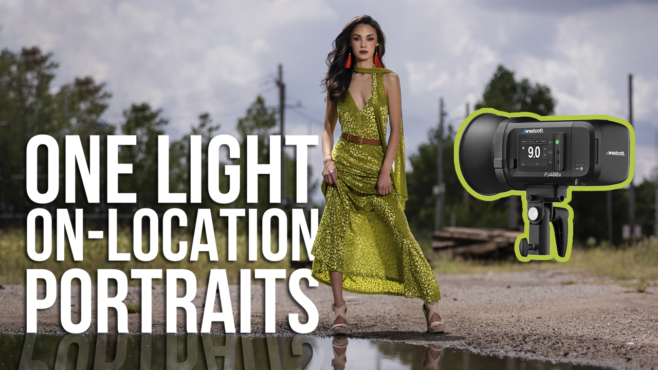
Fill light. Let’s talk more about fill in outside portraits. Maybe washed-out backgrounds don’t bother you, and that’s OK. (Hey, sometimes you want to hide an ugly background by overexposing it. I actually like the light, “airy” feeling produced this way.) But blown-out highlights become a big problem when they creep into your subject’s hair and clothing. That’s why I almost always use flash outdoors—often allowing the ambient light exposure to remain quite bright (i.e., some blown-out backgrounds). Yet I use a low-powered flash to soften shadows and add a catchlight in the eyes. In this way, I’m basically treating my light stand as “fill” lighting. It’s not super high key because I’m essentially just lightening unwanted shadows, but I’m doing so directionally rather than across the image. You can see how terms like fill light versus keylight get subjective as you approach this fine line.
Backlight. Even if you enjoy spending hours in post-processing, it’s just too easy to blow out highlights beyond recovery. For example, did you know light directed toward your lens appears at least a full stop brighter than the same light pointed away, toward your subject? That’s a big consideration when creating nondistracting light, since we almost always begin by backlighting subjects with the sun. Even at night, you likely place a flash behind your subject. Backlighting is smart and creates separation from a dark background. Generally there are no rules about how bright a backlight should be—it’s up to your artistic vision. But unless you want your bride to look like the divinely illuminated Mother of God, you should plan to set your backlight about 10 feet behind her at two stops below even exposure (as metered on your subject’s face). That should compensate for the unusual strength of incoming flash, while also keeping the rim subtly visible behind your brighter main light.
Blend mixed light sources. This is where I’m supposed to talk about gels, right? White balance is probably the first thing some of you thought of when I wrote, “making flash look natural.” It’s too broad a topic to fit here. So watch the video below. It may surprise you how I approach gels.
Reveal shadows. We began with highlights, so it makes sense to end with their counterpart, shadows. For outdoor portraits, I usually don’t need a second light. I’m going for a natural look, which means I leave my ambient bright enough to cut down on contrast. Indoors, though, contrast between light and dark can become high enough to feel unnatural. This usually happens with the classic “window portrait.” Ever wonder why your groom’s face goes intensely bright, while his black suit disappears into hotel room shadows just inches back? Or the front of your bride’s dress is blown out while her bridesmaid in blue looks like a floating head beside her? You may have chosen the perfect north-facing window with indirect light, but you forgot the inverse square law. If you want more even light with slower fall-off, you simply need to move your subjects a little farther away from the light source. Once they fall back from the window a bit, adjust your ISO accordingly and watch the results improve.
Hotel is too small? Don’t have space to move? In that case, I’ll aim my on-camera flash away from the window, letting it bounce back to fill the shadows just slightly (maybe -2.5 stops). The same goes for large groups: Place darker-skinned, darker-dressed people closer to your light, then back it off so that it’s relatively equidistant from each individual in the group. Voilà!
But why learn to blend flash with ambient light? Why not become an available-light shooter and leave flash out of the equation altogether? It’s easier. To be sure, available-light photographers (an odd term, since all light, including flash, is available for our use) don’t need to learn these techniques . . . if they can control the weather, order up overcast days on demand and guarantee every venue they work in will feature plate-glass windows and nonmixed lighting schemes.
I, on the other hand, am not a god. I can create the illusion of superhuman power, though. I can dim the sun, transform colors, or even place a rainbow in the sky—all within my camera, with the use of flash. Plus, flash lets me do it in a consistent and timeless way. Timelessness sets you apart from the ebb and flow of industry trends. As a result, this style tends to command higher dollar and complements a longer-term business strategy. So if you ask me, let there be light!

