How to Get Better Color with Canon in Lightroom Classic with Dustin Lucas
As photographers, we are always searching for better color results from software. At the end of the day it doesn’t matter how beautiful your images look on the back of the camera, processing a RAW file to match can be daunting and almost make you want to shoot in JPG. Well, let’s hope not. Having an understanding of color profiles is simple and when it comes to in-camera settings you might be previewing images in one already. The key is to match it on the computer—more specifically, in Lightroom.
In this article, I want to do a side-by-side comparison of Canon’s Digital Photo Professional 4 (DPP4) and Lightroom Classic V10.1.1 (LrC10). Then we can tweak our image in Lightroom to create a custom profile to dial in color, create a preset and sync away! Well, it’s not all that simple for every job, but we can at least map out our plan.
Let’s dive into DPP4 and LrC10 and start playing with settings.
DPP4 vs. LrC10
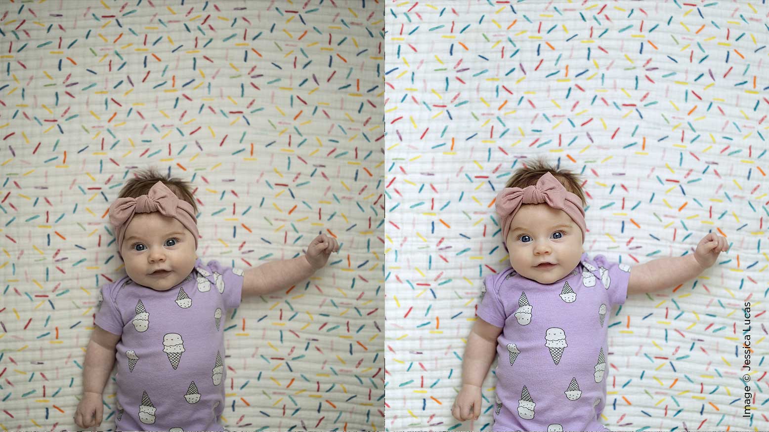
If you aren’t familiar with DPP4 it can be quite clunky to navigate. This is my first launch with the program so I might not be as technically proficient as I am in Lightroom. After shooting on the Canon EOS R I noticed quite a few things happening in camera that would alter my image on the computer, like display brightness and Picture Style. Be aware that your image will look different from in-camera preview to import into LrC10. (fig. 1) I dialed in the in-camera settings I liked and well after importing into LrC10, I have this warm and muddy image with a heavy vignette. Not to worry—we can correct these things, but it’s still annoying!
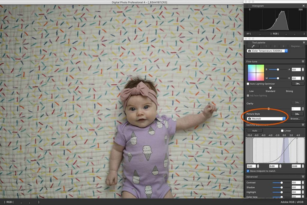
Opening the image into DPP4, the RAW was not nearly as warm and muddy, but still quite darker than back of camera. (fig. 2) Well, it dawned on me to check the display brightness settings and of course they were jacked up to full brightness. The silver lining here is it’s better to underexpose to save highlights vs. overexposing. After navigating DPP4 for a bit I was able to get the Tool palette to see the Picture Style. At capture I used Neutral to reduce the effects in preview, but you can honestly choose any of these. (fig. 3) I know it’s very popular to use Standard or Fine Detail, but in my opinion using Neutral lets you add more tonality later versus fighting too much contrast/saturation later.