How I Got the Shot with Sal Cincotta
This month’s shoot was, in a word, fun. I love having a creative group of people around me. This time, we had an internal debate about the direction and concepts for the cover shoot. We had two options that we just couldn’t decide on. So we did both. I know, a good problem to have.
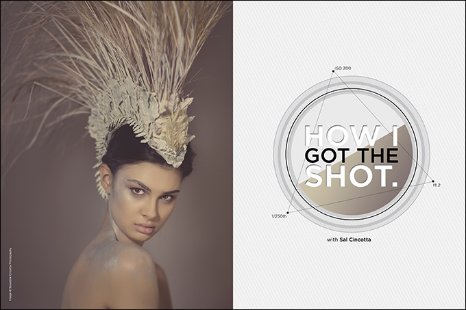
Alissa had this vision of a high-fashion metallic silver background. Krystal, one of my staff members, had created this killer headpiece from scratch. Both ideas were really cool and enticing, but only one would get the cover.
No spoiler alert here, but as you can see, the headpiece won out. It’s interesting how we all work creatively. It’s so important that the photographer “see” the vision. For the silver paint, it wasn’t my vision and I just couldn’t see it. As a result, I was not happy with the final shot. Admittedly, I didn’t do the best job shooting it. As artists, we see this a lot, don’t we? The free advice we get from those around us is always, “You should try this.” I want to smack people sometimes. Yeah, and you should try playing in traffic blindfolded.
My point is that vision encompasses so much more than the obvious factors around you. I have learned something about myself over the years: If I can’t visualize the shot beforehand, I’m going to have a very hard time taking the shot. I imagine this is true of most visual artists, and something to keep in the back of your mind.
Okay, back to the action.
Concept.
The concept here was all about the custom headpiece. When Krystal offered up the idea, I wasn’t onboard with it at all. I couldn’t see it. Her description didn’t knock me out: “Okay, it’s gonna be cool, with feathers coming out of the top, but the feathers will be gone, and I am going to spray-paint it too.” Huh? I was thoroughly confused. I couldn’t visualize it.
She put a lot of time into it, working away at the head of a Styrofoam mannequin on her desk. Watching it all come together was pretty cool. Suddenly, I had vision.
Altogether, I am pretty sure this piece cost us less than $40. Not that this is something you would wear out on a Saturday night, but it’s pretty damn cool for a commercial-style shoot.
Location.
Have hotel room, will travel. Not everything you do has to be on a large set or with tens of thousands of dollars’ worth of set design, staff, lighting, etc. We were in Chicago and had access to some talented people. First up, makeup artist Vanessa Valliant, signed with Wilhelmina, who has worked with the likes of Jennifer Hudson, Lady Gaga, Madonna and Kardashian Kollection. Suffice it to say, this girl knows her stuff.
Our model is an adorable law student named Kellen. What I loved most about Kellen was not her good looks, but her smartass personality. As a native New Yorker, I appreciate sarcasm more than you will ever understand. We spent the day laughing and making great images.
Lighting and background.
I know, you must be tired of hearing me talk about the Profoto B1, but it really is one of the best products on the market. It’s got the portability and the power I need. I am all about the right tool for the job. Sometimes that tool is a speedlight, and other times that tool is a B1.
We had two Profoto B1s, one with an umbrella and another with the portable 2′ Octa Softbox. Super light and super portable. Equally as important, in a small space like a hotel room, the lights and modifiers are easy to work with and, best of all, put off little to no heat compared to traditional heads.
The background, as you can see, is nothing fancy. Just an unlit white background. This will go gray, which I like for this shot.
Gear.
Profoto B1
Profoto Umbrella
Profoto 2′ Octa Softbox
Canon 1Dx
Canon 85mm 1.2
1/250th of a sec @ f1.2, ISO 200
Alternate shot.
Alissa had pitched another idea that didn’t make final, but let’s talk about it. The concept was a fashion-fantasy-meets-Tin Man-from-The Wizard of Oz commercial shot. It just didn’t knock me out. I couldn’t see it.
I can tell you this, though: It was pretty cool to watch it come together. Vanessa had to order special makeup, a metallic-silver body paint. And the background? That was pretty damn crafty. Now, I can’t take credit for it—credit goes to Alissa, who somehow MacGuyver’d it using aluminum foil and a cardboard box.
The lighting setup was a little different. If you look into her eyes, you can see the clever setup. We had the Profoto B1 with Octa Softbox on the right of the shot, and used the Profoto Silver Reflector on the floor, camera-left, to push light back up into the shadows. The main light was just bright enough to catch the crumpled-up foil on the background to give it some dimension.
The settings for this shot were 1/100th of a sec @ f2, ISO 160 using the Canon 85mm 1.2 and the Canon 1Dx.
While this didn’t make the cover, it’s still a neat shot.
Closing thoughts.
It’s all about vision. You have to be able to visualize your shot before you take it. Having some creative people around you for inspiration and collaboration is what I love most about working on shoots like this. You never know what you are going to get. You have an idea, a concept, a vision, but you never know until that shutter is released and the image made.
I learned a lot about how I work and see things. I hope my team learned as much about me as well. Challenge yourself every day. Challenge yourself to do something a little out of your comfort zone, even if you don’t initially see the vision. Create a vision and adapt. I promise you, you will be a better photographer in the end.
I am a wedding and portrait photographer, and shoots like this challenge me to think a little differently about what I am doing. Because of that, I have watched my knowledge and skill increase tenfold over the past year. So, where do you want to be as a photographer? Go out and make it happen.

