How I Got The Shot: with Sal Cincotta
Black and white—some of the most iconic pictures are presented this way. There is just something about black and white that sucks you into an image. It’s that absence of color that really gets the viewer to focus on the things that matter, the story being told. Color becomes a distraction.
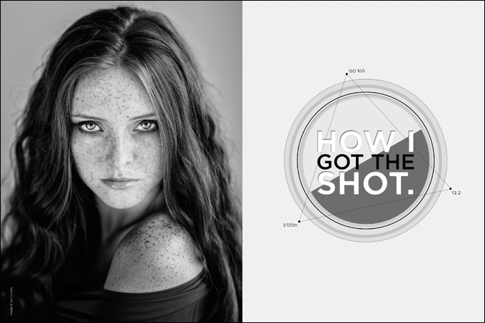
In honor of this month’s editorial namesake, “The Black and White Edition,” we wanted to blow you away with a beauty who really shines in that medium. Rachel, with her sublime freckles, was the perfect candidate. Yes, we used her for her freckles. We love them.
Concept.
While traveling in Scotland this summer, we ran across Rachel, who is as beautiful on the outside as she is on the inside. And let me tell you, this is one smart cookie. She is in the process of getting her degree, and wants to be an engineer when she graduates. Are you impressed yet? Well, I certainly was. While abroad, I wanted to photograph someone local, someone with a unique look, and she fit the bill.
Wardrobe was nothing fancy, just some gray chiffon. Ultimately, we wanted it to be about Rachel and not about glam makeup or glam clothing. We were going for pure beauty.
For hair and makeup, we used some local talent. We got to work with Angie and her assistant, and they turned me on to some local slang—and, of course, Cadbury Chocolate Buttons. (Um, yeah, I will eat these all day long. They were life changing.) They were absolutely amazing to work with, and fit right in with the team.
Location.
This particular day, we were shooting all over the Isle of Sky in Scotland, but this specific shoot was in the living room of our rental home (Image 1).
We had some great light coming in through the window, but it was directional and not very flattering. Beauty portraits don’t have to be overly complicated. In fact, sometimes the simplest of setups is all you need to create stunning portraits.
Lighting.
This is where things start to get interesting. The directional light in the room was not the look and feel I was going for with this portrait. If it were a man, maybe. I like harder light on guys sometimes, but for Rachel, I wanted a nice soft light.
In a situation like this, it’s really easy to start slamming light into the room and overpower everything. What is tough is to get the artificial light to match the ambient light in the room.
So, time to get out that light meter. First, take a reading in the room of the ambient light. That reading, whatever it is, is what you are working with in the room. The goal is to balance that light with a strobe. The key here is to start at the lowest power setting and push from there until you get the look you are going for.
For this shot, we used the Profoto B1 and an Octabox fired into the ceiling. Then we had a reflector pushing both natural light and the reflected light from the B1 up to provide some balanced fill. The final shot is exactly the look and feel I was going for. The light looks natural and soft, but it took a combination of several light sources and modifiers to get that perfect look.
Gear.
Profoto B1
Profoto Octabox
Reflector
Hasselblad H5D | 1/125th @f2.2 ISO 100
Hasselblad 100mm
Closing thoughts.
Lighting doesn’t have to be complicated, but sometimes getting that look you are going for requires you to put all your knowledge to the test. Creating a portrait that looks like it is naturally lit—but that is achieved through a careful balance of modifiers and lights—is an art form.
Don’t underestimate the importance of light and the light shaping tools in your arsenal. It can make all the difference in the world to your final results.
Finally, while this image was shot in color, I wanted to tell the story of Rachel by highlighting her unique features. I wanted to remove any distractions from the image and draw attention to her freckles. The final black-and-white treatment makes them pop.
As always, get out there and make some amazing images. Your best work is ahead of you.

