Glamour Photography in Black & White with Nino Batista
Want more information on this article? Get access to video content and additional supporting images. Launch the September 2017 issue of the magazine by logging in or signing up for a free account. Shutter Magazine is the industry’s leading professional photography magazine.
In a black-and-white photo, your brain is being tricked even more than in a color photo. When you are viewing a photograph, your conscious mind evaluates what the eyes are perceiving and accepting. Your mind understands that it is an illusion (which is what a photograph essentially is), and the entire experience is reconciled by your gray matter into a feeling, or at least an opinion.
A black-and-white image causes a different reaction in your brain because everything about the shot looks like reality except there isn’t any color, and therefore it is unmistakably not reality. That’s obvious enough, but somewhere in that odd mix of suspension of disbelief and perception lies the magic of a monochrome image.
People tend to arbitrarily label black-and-white images automatically as “dramatic,” but that doesn’t reduce the undeniable impact of a good monochrome image. In my main genre, glamour photography, black and white makes few appearances. Most of my work is styled on set for color, as is common in commercial glamour.
That said, I do enjoy producing black-and-white work. I find myself doing it more and more, and I have developed a very specific approach. It varies quite a lot from my color imagery. It was a game changer when I figured out that my best black-and-white work stemmed from intentionally trying for, planning and executing shots as monochrome. Before, I would change an image to black and white in post-production simply because “I didn’t know what else to do with it.”
This was a major mistake, and that is what this article is about: deliberately shooting for black and white in glamour, and how it can make your monochrome work that much better.
Be Deliberate
As I said, I’ve been guilty in the past of converting an image to black and white simply because I was unsure what else to do with it in post, and I know that is something almost every single digital photographer has done as well. Photographers find themselves torn between the color version of their edit and a black-and-white conversion of the same shot (you even see photographers post both versions on social media, asking their followers which one they prefer). This is almost certainly indicative of a photographer making the unfortunate mistake of not having a complete vision for a shot up front. While you can convert an image to black and white arbitrarily and find success with it, I find far more consistent results when you set out to shoot monochrome from the start. But where do you start?
First, let’s analyze what black-and-white photography is. The total absence of color, or tone, means we are perceiving an image of something strictly in millions of different values. Sounds simple enough, but the absence of color means we need to focus on other things when we set out to shoot monochrome, because color palettes and other color theory considerations go right out the window.
The key elements I focus on when I am trying to craft a black-and-white image are contrast, geometry, texture and mood.
I am speaking in generalities here. There are many examples of black-and-white images that do not adhere to my preferred approach to the style. Let’s break these down and see how they affect the final black-and-white image.
Contrast
First off, I do not mean boosting contrast in post-production. I am speaking to the idea of shooting with contrast in mind on set: specifically higher-contrast lighting setups, scenes, wardrobe or posing. Once your image is converted to black and white, any power or impact that color elements had immediately vanish, and you are left with only value to work with. As such, higher-contrast images generally lend themselves to black and white pretty well. You are letting highlights and shadows take center stage, so you need to plan how you want them to play off of each other in your shot. The simplest way, though not the only way, is to set up something with strong contrast.
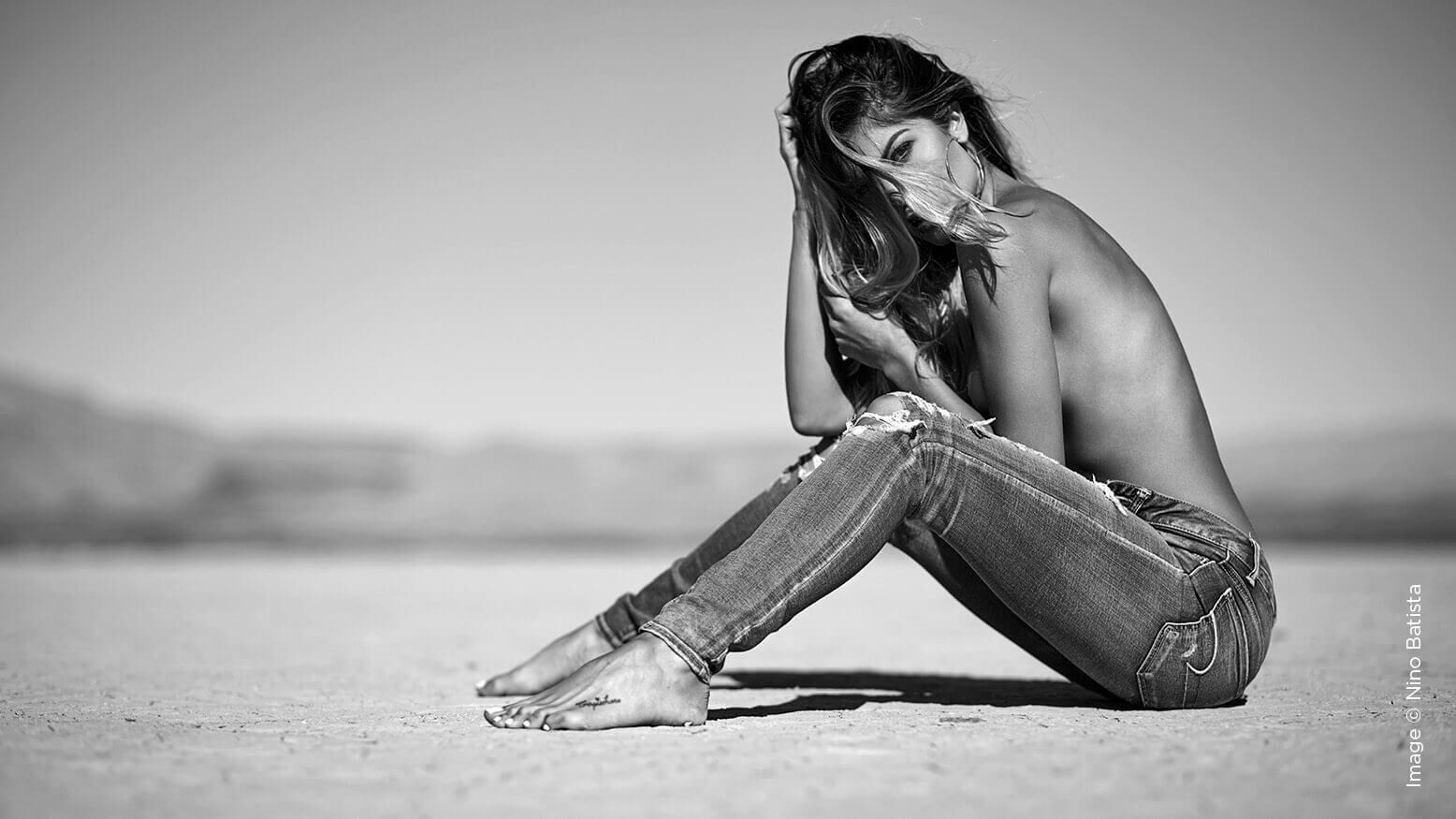
One of my favorite methods to achieve instant contrast is to use hard light. It can be totally bare, open sunlight or a strobe with no modifier. That’s not to say hard light is the only way go about getting a great monochrome image, but it’s one of my preferred ways.
Geometry
Shooting with geometry in mind makes a huge difference. Since color is removed from the equation, suddenly shape becomes even more important because the lack of color to distract the eye makes it more obvious. You should, ideally, be paying attention to geometry in your portraits on every shot, color or otherwise, but in monochrome it becomes even more of a priority.
Leading lines and posing of limbs, props and patterns in wardrobe—those are just a few examples of the geometry in a portrait. Pay attention to shape and contrast, and your black-and-white work will improve.
Texture
Texture is another integral element of black-and-white imagery. Whether it’s an abundance of texture or an utter lack of it, it’s especially important in the monochrome world. Texture can come from anything in your shot, but intentionally working with texture in mind is key to making your black-and-whites pop. Examples of great texture include dynamic hair (frizzy, curly, shiny or wet), highly textured wardrobe (denim, for one), and backgrounds or floors made of concrete, grass, cloth or satin.
A perfectly clean image with immaculate wardrobe, makeup, hair and scene can make for a powerful, angular type of contrast. A dirty scene, with dust, dirt, mud, stained clothing and a wrecked environment can evoke a gritty vibe. Both approaches play on contrast and geometry in very different ways.
My favorite texture is skin. I am obsessed with retouching skin in a way that preserves and perfects texture (note I didn’t say “smoothing”). A black-and-white conversion can bring out the failings in a bad skin retouch more than just about anything.
Mood
Mood is the most dominant factor when it comes to producing a black-and-white image. Yes, most people see black-and-white shots as dramatic, serious or perhaps sad in their tone. Obviously a monochrome image can be quite uplifting or even silly depending on the subject matter, but I would agree that black-and-white is reserved, at least in my book, mostly for dramatic impact. I find that a model’s performance on set, especially their ability to convey emotion, is far more crucial in a black-and-white set than in a color one. You can’t always nail this down, of course, but when I dive into a black-and-white set, I am almost always thinking about some heightened emotional themes.
Conclusion
I believe that these four elements can come together to benefit your black-and-white work, especially when you apply them up front. When you find yourself doing the black-and-white conversion in post-production because that was your plan all along, then you know you may be on to the next level of black-and-white photography portraits.


