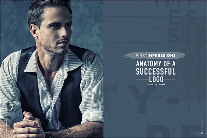
First Impressions: Anatomy of a Successful Logo with Craig LaMere
Perception really is reality. Branding is one of the most commonly talked about and most preached concepts in photography. Branding is about image, personality and awareness. There are far too many parts to branding to cover in one article. This month, I look at one of the most important: your logo.
What Is a Logo?
A logo is nothing more than a symbol, an iconic trigger for your business. It’s a symbol for what your business stands for, what your business is recognized for and what your business is perceived to be by your customers and prospective clients. It really is that simple.
If you look up photography company logos on the Internet, a million and two logos will pop up, and a vast majority of them will have a camera, a shutter or some element to let the viewer know the business has something to do with photography. A smaller percent of the logos will be a combination of a camera element and the shooter’s name. Another portion will be made of nothing more than the shooter’s name. The very smallest percent of photography logos have zero to do with the artist or photography at all.
Thank carefully about the symbol you choose to represent you and your business.
Some logos are intricate. Some are simple. Some have many colors and some are black and white. Some logos have hidden meanings and some have no meaning at all. I know some shooters who have paid thousands of dollars to have a logo created, while others have sketched their logo on a napkin. Some have photography elements, some have multiple parts with varying color schemes, and some consist only of words. In the end, I do not think there is a right or wrong way to come up with your logo, but there are some elements you should be mindful of when deciding on a logo.
The Black-and-White Test
The very first test of your logo is what I call the black-and-white test. If your logo is already black and white, this does not apply. But if your logo has any color elements—and especially if your logo is super detailed, with lots of intricate elements—then I would try this test. All you do is turn your colored logo black and white. If there are elements of your logo that become muddy or blend into the rest of the logo, or if your logo becomes unassuming, then I would start to rethink your design. There will be times, in advertising and promotion, when you will not be able to use color. If you have a logo that does not work in those instances, you might want to reconsider your choice.
Photography Element Icon
If you use an element of photography in your logo, like a camera body or shutter, the best benefit is instant recognition of your occupation. The downside is it’s redundant, and you might get lost in a sea of similar logos.
Using Only Your Name as Your Logo
There are a million ways to skin a cat in our business. Using only your name as your logo works for some. This type of logo is more fitting for an artist than a picture taker. What’s the difference? A picture taker is a shooter whose work is cookie-cutter, who produces a mass product with no distinctive characteristics. An artist is an individual whose work has a recognizable visual signature that is associated with the creator.
A name-only logo is powerful. The challenge is that your name had better fit a very clear and distinct style or have some other proprietary quality associated with it, or your name might not have enough market recognition to stand alone. When you see the names Vera Wang, Annie Leibovitz or Martha Stewart, you automatically know them, what they do and their brand. They do not need icons of a dress, a camera or a chef’s knife; their names are all they need. Name-only logos work far better as a rebrand once you have established yourself in your market.
Random-Image Logo
When I first started shooting, I didn’t want my name associated with my business or use any photography elements in my logo. I felt it wasn’t cool to use my name that way. And I did not want a photography element because I wanted to branch out into different genres.
The strategy I went with was to use a symbol that had nothing to do with photography or me. The advantage is latitude. You can diversify the scope of your business. You have the flexibility to decide to whom your brand will be speaking. The greatest advantage of this type of logo is the ability to be unique in a time of oversaturation of common elements.
The key to using this type of icon is to keep it simple. A simple symbol is recognizable and memorable. A complicated symbol can confuse consumers.