Experimenting With Light In Camera and In Photoshop with David Byrd
When I first started out in photography, I was trying to learn ALL the things at once. The best gear, the right way to use it. What the hell is a lighting ratio and this rule of thirds? Wait, I have to MATH to be an artist?!
The madness didn’t stop at cameras. I had to learn what to do with those images once I was through capturing them. Then I had to learn how to sell them. Suffice to say, those first steps into the photography world were incredibly daunting and I struggled constantly.
Thankfully, early in the experience I heard a wise person offer this sage advice: “What are you consistently struggling with? Identify that and focus on it until you have a grasp on it.” (That wise person, by the way, was me. Give me a second to pat myself on the back.)
This profound wisdom of mine (insert sarcasm here) gave me a chance to relax and focus and provided a systematic approach to solving my struggles. I started to focus on light and posing. I memorized basic poses that made sense for men and for women, then quickly attached the lighting patterns that worked with them. After a few sessions, I saw way better results in my images than I had when I just went feral photographer on my clients. Soon after that checkbox was marked, I moved on to Photoshop and began learning how to retouch and apply some early sense of artistic style to my digital images. The sales part of my journey? Let’s just not talk about those early days of CDs and “Sure, you can have all of the images!”
So, I had a handle on things. Each facet of the photography experience was being addressed with what I felt was passing grace and dignity. My clients found ways to give me cash (no thanks to the inverse square law) and I could proceed.
Innovate or Die
Then, I watched Sal Cincotta boldly state, “Innovate or die.” I believed him because the clients walking through my door were telling me the very same thing: “Yeah, that other photographer in town that’s been here for years? They are so boring and don’t do anything new.” So, I went back to the drawing board and started looking at each semi-shiny facet of my photography business gem and suddenly began to notice the tarnish. The tarnish looked an awful lot like the “other photographer in town’s” tarnish. The same poses, the same lighting, the same simple Photoshop gimmicks, and the sales room—we aren’t going there, remember?
So, I attempted to innovate. I learned more poses and more lighting patterns, and tried to mash them together but they sort of looked the same. I tried to do new things in Photoshop and it made no sense and the artwork looked silly. I couldn’t find more templates to follow. I couldn’t see my way forward unless someone showed me how to do it.
Then, one day I just decided to make my own rules and see what happened. I set my camera on a new group of settings simply to see what I could do with it. I took the lighting pattern that made the most sense and moved it around a little bit so shadows became more powerful. I didn’t care about the vanilla poses everyone else did; I tried something new. I gave myself a catchphrase, and it’s one I constantly teach today: “You have to learn why things work in Photoshop.”
All of that combined produced NEW artwork that was vastly different from the other photographer in town. And that, with a little bit of marketing, got my studio noticed and the rest (including the sales room) is history.
Light in Action
It has been many years since those days of discovery and the facets of my photography career have constantly been polished up over the years. Innovate or die, indeed. So, I want to show you a lighting pattern that you probably already know and how it can be tweaked into something you don’t know. Then, we’ll do the rest of the work in Photoshop.
In this first image you can see a typical three-light setup that is indicative of high-key dramatic imagery. It includes one main light with a decent-sized light modifier (in this case a 47-inch octabox) with two lights on either side of the camera, featuring strip boxes to shape the light into an even column that cuts the subject. The main light’s power setting is metered to be at an aperture of F-8, ISO 400 and a shutter speed of 1/160 of a second. The side lights are metered to be the same. All three lights have the same power, so they illuminate the subject evenly and sculpt their body with light.
Now for experimentation. What if the main light is lifted above the subject and brought down at a very strong angle? What if the two side lights are metered to now read at F11 and therefore let the main light have a little more impact?
Innovation: What if I put gel material on each light with a complimentary color pattern?
One of the constant compliments that I get (which I am thankful for) is that the viewer loves the lighting in an image. More often than not, that lighting pattern is brought about by experimentation on set, all centered on the feeling that I’m trying to create with the image. That was the idea that heralded my transition to innovation. I paid attention to the story of the image series and created lighting that matched it. The high-school senior wants to wear a light and airy outfit in a field of flowers? Wide open shallow depth of field with one main light as a gentle fill photographed with high-speed sync. The student wants an image that “I dunno, makes me look cool”? Then I put them against a wall in the studio, use one light at a high angle and set a Rembrandt lighting pattern. The gentleman in this image wanted the colors of the light to sculpt his body and let him show his range of emotions. I set up the lighting pattern that you see below.
Now It’s Time for Photoshop
There are so many ways to add or take away light in an image. I want to show you an easy one that can not only be a starting point, but also a finishing move for your image… because just like a video game, you need one final move. (Can you hear the voice? FINISH. THAT. IMAGE!)
Use Adobe Camera Raw as a filter and let’s visit the White/Highlights slider and the Black/Shadow slider. Each can let Photoshop reevaluate the available data based on a new black or white point in the image and then increase the intensity of it.
Let’s also drift down to the Color Mixer (if you are using the June 2020 Photoshop update) or the fourth tab in ACR, the HSL tab. Here we can access each color that Photoshop is able to render and adjust the luminosity of each. Every human being has the color orange in their skin tone, so that’s a great place to start. We can brighten that color within their skin, change its hue slightly to color correct the image or desaturate it to accompany the visual style we may be trying to create. In the case of gelled photography, this area is your greatest ally in saturating the colors in your image and increasing their luminosity.
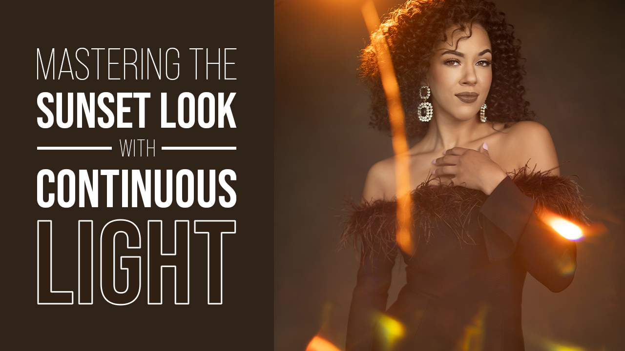
To put the finishing touches on your artwork, I highly recommend a new and very powerful plugin on the Photoshop scene: Oniric by Composite Nation. This plugin (available only for Photoshop 2018 or later) creates beautiful non-destructive glow and light streaks to your image. It utilizes a unique algorithm and the tools available in Photoshop to produce these results. The interface itself gives you a lot of creative options in how you create the light elements—their colors, intensity, and range.
You can learn more about Oniric by visiting the Composite Nation website and see the tutorial and testimonials there.
How Will You Innovate?
Sal said it best and it is the mantra that I have tried to live my young photography life by: “Innovate or die.” Innovation can always come from seeking education from others in our industry, but it must begin with you. Ask yourself a simple question: “What am I consistently struggling with?” Focus on that until you have a grasp on it.

