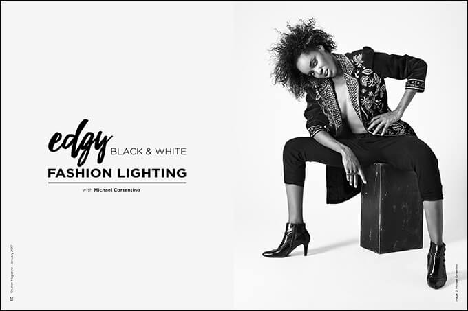
Edgy Black & White Fashion Lighting with Michael Corsentino
Want more information on this article? Get access to video content and additional supporting images. Launch the January issue of the magazine by logging in or signing up for a free account by clicking here. Shutter Magazine is the industry’s leading professional photography magazine.
Working With a Team
When you work as part of a team focused on a common goal, the results are almost always far better than those produced working alone. Collaborations are the de facto workflow for fashion, editorial and commercial shoots. Your team typically includes one or more models, assistants, a wardrobe stylist, a hairstylist, a makeup artist and the client.
When you’re tasked with producing images based on someone else’s concept (which is standard with fashion, editorial and commercial work), communication is key. Mood boards can help keep the team focused on the desired result. These are collections of images grouped together by category. You can use PDFs, Word documents, folders in Dropbox or a Pinterest board. It doesn’t really matter how you do it, as long as everyone is clear on the mission statement for the shoot and the expected deliverables. Make sure everyone on your team is in sync.
The Concept
The concept for this editorial fashion shoot for wardrobe stylist Rachel Nicole Velez was “androgyny.” Rachel emailed two mood boards to me, our model Audra Seay, and our hair and makeup artist Evelyn V. Ruiz Resto. One board was for the lighting and general mood, and one was for hair and makeup. The boards conveyed a strong, masculine look in the lighting, wardrobe, hair and makeup, and the model’s poses, movement and expressions.
We all agreed that to create visual tension, we needed to juxtapose Audra’s strong femininity with a more masculine styling. We also decided to use edgy lighting, contrast between black-and-white elements, and a strong use of patterns for the hard-edged look we wanted.
Light Design
Now that I knew the desired look for the images, choosing the tools and techniques to create that look was straightforward. This is the value of having a plan—you’re not flying blind. The look for the shoot called for black-and-white final images with a harder, contrasty quality of light. My plan was to shoot a variety of images, from tight to wide, of each of the two looks we’d be capturing. I needed to create a lighting plan that illuminated both the face and garments for head and shoulders, detail, three-quarter length and full-figure captures (see “Varying Poses for Layouts” below). These considerations helped me create a lighting roadmap to achieve these goals.
Choosing the Right Lighting Tools
I chose a Mola Softlights Sollo beauty dish for my keylight and an Elinchrom 20×51-inch Strip Softbox for fill. We placed this second light just below the keylight to help create even illumination from top to bottom, especially useful when capturing full-figure images.
The Mola has a highly reflective silver interior with a deep conical shape and a white opal glass diffusion disc in its center. This modifier creates beautiful, cool-toned, contrasty light with a slightly softer center core owing to the diffusion disc. It was the perfect tool for the edgy black-and-white fashion look we wanted.
When you use this kind of modifier, more light will be thrown onto the scene. This is known as the efficiency of the modifier. The more reflective the interior, the more efficient they are at delivering the light from the strobe inside.
I’d initially planned a separate lighting zone for the background comprising four 500WS strobes, but ended up not needing them. I call that a win. By keeping the model and lights relatively close to the background, I was able to achieve the look I wanted with a much easier-to-manage two-light setup that also required a lot less space to execute.
We placed the keylight and stripbox 7 to 8 feet away from the subject, who was 2 feet from the background cyclorama wall. This arrangement provided the coverage we needed to capture everything: full-figure movement shots, head and shoulders, and detail images.
Using a Meter
Readers of this column know I’m a big fan of handheld light meters. I use one on just about every shoot, especially if that shoot involves strobes. You can spend 15 minutes fiddling with your camera settings, repeatedly adjusting your lights and endlessly chimping. Or, you can use a handheld flash meter and capture a perfect exposure the first time you click the shutter. There’s no better way to inspire confidence in your clients, talent and team than showing them a prefect image the first time you step behind the camera.
Unlike your DSLR’s built-in light meter, handheld meters allow you to measure light in two ways: by taking an incident reading or a reflective reading. Your DSLR relies on less accurate reflective metering. What that means is your camera’s meter measures the light being reflected off whatever you’re photographing.
In the images in this feature, you see a tremendous amount of variation in the amount of light reflected from the white and black elements in the same picture. Here we have black fabric, dark skin, a white background, white clothes with black stripes—all of these elements reflect very different amounts of light.
With the incident readings possible with a handheld meter, all of this becomes immaterial. This is because incident readings measure the light falling on the scene rather than being reflected from it. Consequently, incident readings are far more accurate and less prone to error in high-contrast situations like this one.
Directing Models
When directing models, the photographer is like a film a director. You’re trying to create a mood, feeling or look. Learning to interact with and direct your models is essential to getting the expressions, poses, movement and attitude you’re after. You must be proactive. Being a wallflower simply won’t cut it. Take baby steps—it gets easier. Coach your models. Reassure and praise them throughout the shoot.
Varying Poses for Layouts
I’ve touched on this in previous articles, and it’s worth repeating. Regardless of the type of photography you’re doing, variety is king. If your end product is a magazine layout, a series of ads or spreads in an album, you want variety. By creating an assortment of images—some wide, some tight, some detail shots—you give yourself or your client the options needed to create much more interesting layouts. By pairing tight shots with wide ones, full-figure images with detail images, head shots with three-quarter images, you’ll create the contrast of scale between images you see constantly in editorial work. Your client wants options, the designer wants options, you want options—so shoot tight, shoot wide and shoot details.
Creating the Right Black-and-White Look
The great thing about applications like Capture One Pro and Lightroom is they allow you shoot tethered, which I always do. But it gets even better. Not only can you shoot tethered, you can also do it in black and white or anything else your heart desires.
These applications let you create or select a preexisting black-and-white recipe that’s applied to your images as you’re shooting them. This way, every image that pops up on your monitor or laptop is already being displayed as black and white. This is indispensable, saving a ton of back and forth when refining the final look of the images with your team, because you’re doing it on set in real time.
Using Capture One Pro, my team and I were able to select a black-and-white preset we loved from a variety of awesome styles, and have our processing look nailed down right out of the gate.
This is helpful for tweaking your lighting as well, because different black-and-white conversions impact the shadows and highlights very differently. If you know going in what the finals will look like, it makes dialing in your lighting that much easier.
Want more information on this article? Get access to video content and additional supporting images. Launch the January issue of the magazine by logging in or signing up for a free account by clicking here. Shutter Magazine is the industry’s leading professional photography magazine.

