Creating Images That Stand Out with Casey Dittmer
It’s easy for us to fall into grooves. We find what is easy, standard, inside our comfort zone, and we don’t deviate. It feels safe, especially when we want to be consistent in delivering high-quality imagery to our clients. But it’s also complacent, lazy, one note—boring.
Maternity portraits offer a perfect example. The majority of the industry approaches these sessions in nearly exactly the same way. Posing, lighting and scenery…trust me, scroll through your Facebook or Pinterest, and it all runs together.
But what if you challenged yourself to push boundaries? To not accept that there is a black-and-white answer for what is acceptable in your approach and technique? What if you created the new normal, set the bar, set it high, and never looked back?
You know me: I’m all about stopping the scroll, standing out and using dynamic maternity to build one’s brand and gain the audience’s attention. Changing things up isn’t that hard. It doesn’t require money or new equipment. It’s simply making small adjustments and mostly playing to find new ways to capture amazing images.
Here are some great ways to change the game and blaze your own path.
- Find inspiration in art, pop culture and other avenues of creativity. I love taking a photographic technique that is meant for sports, fashion or editorial and melding it with maternity. The pregnant form is beautiful and such an amazing shape. It works well with artsy approaches. I want my viewer to love the overall image and then notice that the subject is pregnant.
- Push yourself to use nontraditional poses. Maternity posing is tricky and you have to be conscious of flattering the belly at all times. That doesn’t mean you can’t play with it and push the boundaries. Look through fashion magazines and pay attention to placement of arms, hands and faces. Work those into your poses to give your images a more contemporary look. It’s ok to not have the hands on the belly.
- I love when my images look editorial and not so…here is my belly. Place the belly with more subtlety, secondary rather than front and center. Have your momma sit, stand, lie down, lean or twist. Some poses will work, others will not. It’s ok. It’s the best way to learn.
- Play with light. Mold with light. Make your own light. This can be the best part. There is no right or wrong way to do this. Experiment. Use harsh light, preexisting shadows and weird objects to cast unique shapes. Mix light sources to create different color casts. The sky is the limit. There are so many benefits to doing this. You will learn many new techniques that you can just add to your normal work. That doesn’t mean you should produce shit light and call it art. It means pay attention to flattering her body. Light her face properly, but in a unique way. Harness harsh light, use shapes to selectively light her body, create patterns that focus the attention of the viewer on all the right places—these are all great ways to manipulate the light and produce a professional image.
- Find new places to shoot or new ways to use existing locations. I shoot mostly outdoor goddesses, so I pushed myself to shoot only indoors for this article. I wanted to show that you can create multiple looks, styles and images in the same spot without several backgrounds or sets. Again, using the unexpected choice for your location could be the key to a high-impact image. When I get to my location, I get sucked into the obvious “sweet spot” shot and sometimes forget to look around at all the other possible choices. Shoot in your first choice of locations and then look around at different angles. Many times, you don’t even have to move your model; just changing your position can yield a completely different look. Get on the ground, climb a ladder, go behind a bush—trust me, getting dirty and making it a little awkward can produce gold.
Let’s look at a few of these tricks in action. I went outside the box for all the images in this article to show something completely new.
White Series
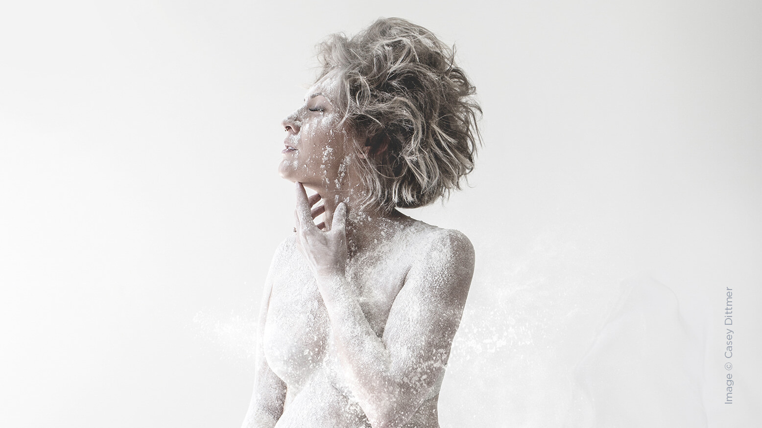
I have done flour shoots before with dancers. I love how moody yet soft they can be. (I don’t love the cleanup, but it’s so worth it.) I wanted my model to look pale so that the image was about shape and defining features. Covering her in flour gave us that look. We kept the styling simple: white piece of chiffon, a nude bra…and a 5-pound bag of flour. This was about her shape, simplicity and purity.
I shot in all natural light and played with her pose for an editorial feel that still flattered the belly. We were careful in posing her fingers and wrists. We wanted her hands free from the body on some shots, and for others we used them to tastefully cover her body. It helped that we chose a momma who was not as far along as we typically shoot for. Otherwise, there’s less ability to bend, lean and twist. She had more flexibility and a more forgiving figure when we broke normal posing rules. Since we didn’t have any props or choice of backgrounds, it was key to create variety through her body shape. By simply shooting her sitting, standing and lying down, we were able to create multiple unique shots. But these would hang as a solid set on the client’s wall.
For light, I went on an adventure to Home Depot. There are so many things you can get there to create your own light modifiers. Next time you go, look through your photographer eyes, not your “gotta fix the shitter” eyes. Buy at least one thing and challenge yourself to use it in a session. It gets those creative juices going. I bought a roll of screen door mesh and a roll of HVAC insulation. Using silver duct tape, I made a large three-sided “photo booth” type box with the silver insulation. I loosely unwound the screen mesh and clamped it randomly on the front side of the silver box. I used two lights with grids to create dynamic shadows and light her face.
Shooting through the screen gave me the most dynamic results. The reflections and layers produced something totally different than what you would normally see. In other images, I used baskets to create shapes on my subject. I strategically placed shadows and highlights where I wanted them. Color gels, directional light and heating vent covers all played parts in creating new and exciting lighting for these sessions.
Many of the images you see here are a product of altered posing, simple fabrics and light to create unique and bold images. Experimentation leads to great things. I used lighting to change the look of our location, even though all these images were shot in our studio. Each one began with a planned concept, many finishing with totally different results than expected.
It’s an adventure. No matter what, I know that when I start putting these images on social media and my website, they will not look like a million other images in rotation, and they will pique my audience’s interest. So get out there, don’t be lazy. Push. Hustle. Join me. I broke the mold. I said no to the black-and-white approach. I love living in the gray.


