Creating Fantastical Worlds for Your Clients with Laura Schumpert
Want more information on this article? Get access to video content and additional supporting images. Launch the June issue of the magazine by logging in or signing up for a free account by clicking here. Shutter Magazine is the industry’s leading professional photography magazine.
On the night before Easter, at five years old, I remember lying in my bed so excited that I could not sleep. I was told the Easter Bunny was coming, and I was ready. I stared at an object outside that I swore was the Easter Bunny until I passed out; when I awoke, I looked outside to discover the object wasn’t a magical bunny at all, but just a gasoline can.
Why tell this embarrassing childhood story? Because as adults, piece by piece we lose that speculative grasp on reality, and learn to accept the mundane rhythm of everyday life. For photographers who shoot children, it’s important to remember the excitement and magic of those days.
Now that you are ready to create from a place of whimsy, we can talk technical. With a camera you can create anything you dream up, but it is more than likely going to involve compositing, and that can be intimidating. Like everything in photography, if it is photographed correctly in camera, your editing time will be simple and quick. Below are five basics you must master for compositing.
- Same lens. This means if you photograph the background with a 200mm lens, the subject and every other element is photographed at the same focal length. This helps you put together your pieces effortlessly rather than trying to play with transform and perspective tools in Photoshop to get everything to match.
- Same position. Once you start photographing, do not move. Put your camera on a tripod and do not move again. This will make everything being put together flow more easily during the editing stage.
- Same settings. Do not photograph your background at f 8 but your subject at f 9. If your background is soft and painterly, you want your subject to match. Look up your exif data and make sure you are photographing with intention.
- Use body language and action. You want your compositing to look as realistic as possible, so if you are making an image with a child flying through the air carried by a balloon, their body language must match. Make them jump (if old enough). Get garments that flow and have movement to them. Make everything look as if they are truly being pulled through the air.
- Stock photography is okay to use. I get this question often: Can I use stock? Yes, but there are rules. If you use stock, pay for it. Read the licensing on the website. If you’re creating for personal clients, the basic license is enough. You will need to research other license types for bigger projects to make sure you are covered. For our Peter Pan concept photo, instead of getting a stock image, I had my sister draw me a Peter Pan shadow. If you have those skills, put them to use.
Now that we have our basic rules down, how can we sell composites? This is where the beauty of this type of imagery shines. Not only are parents going to be astonished by the one-of-a-kind art you have created starring their very own child, but the child is going to grow up imagining themselves in this magical world you have placed them in. You have already created an emotional connection (the key to selling anything) with two people and just one image.
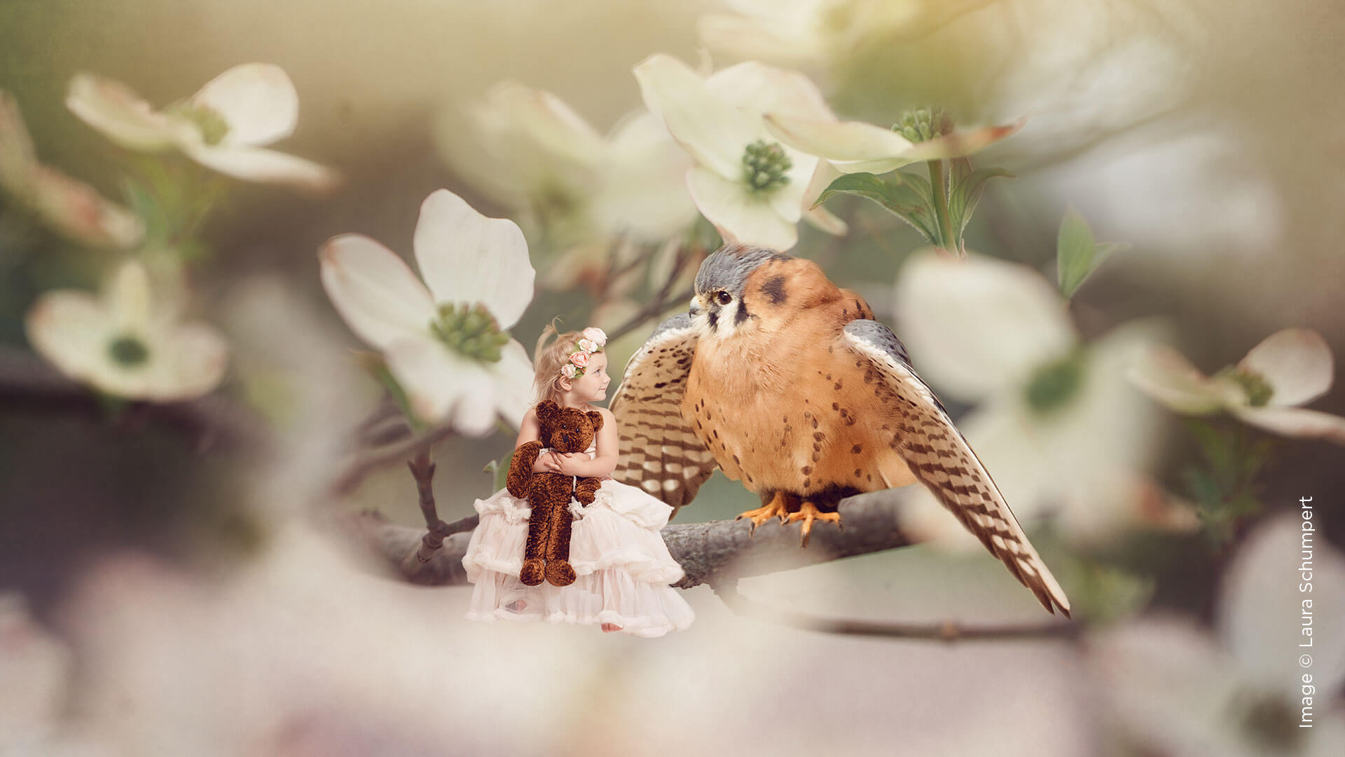
Take it up a notch and do some planning before the shoot. If the child is very young, find out what the parents’ childhood favorites were. Alice and Wonderland? Peter Pan? The song “Somewhere Over the Rainbow?” Whatever they loved in their youth, I am positive you can make imagery out of it. When they get to be two or three and start forming opinions and interests, ask the parents what they love. If a little girl is obsessed with Thumbelina, place her in a scene from the book. She can be perched on a branch with a songbird.
What about when they reach eight or older and are getting a bit too cool for pictures? You can still use this. We had a girl who loved the Harry Potter series. After we showed her our concept, she showed up in full character, robes and wands ready to go. The best part came when her mother called to tell me her daughter requested a huge print of that on her wall. No selling required. Seeing her face light up was all they needed. Parents will pay a lot of money to watch their child experience something beautiful and magical. They will have your art on their wall and in their home to cherish and start conversations with for a lifetime.
Now that we know we can sell it for all ages, we have to be profitable. Composites can’t make up the entire session. Compositing, no matter how well you have photographed it, can be time intensive. It’s just not feasible to create 20-plus composites. This should be an add-on to your regular sessions, which is a sure way to boost your sales. Parents need the must-have pictures for friends and family, but this piece will be so wildly different, they will not be able to live without it. I would market and sell these as wall art images, and start them at a minimum size. Do not sell the digital release to this image. Distinguish composites from the rest as the special pieces they are. Convey the idea that this is art in their home, and the digital file is too precious to sell.
Now for marketing. Just because I do not believe you should sell the digital image does not mean they should not be marketed on social media. These images get major traction because they demand attention. This boosts your social media presence and makes people remember your name and brand. You’ll be seen as a photographer creating one-of-a-kind work, which will distinguish you from the masses. Make your client a small web-size digital with your watermark on it, and let them share away.
From birth to teens, this imagery will please both parents and children, and fuel your own artistic creativity.
Want more information on this article? Get access to video content and additional supporting images. Launch the June issue of the magazine by logging in or signing up for a free account by clicking here. Shutter Magazine is the industry’s leading professional photography magazine.


