Composition Tips for Better Photos with Scott Detweiler
We pass many milestones in our lives, and when each new door opens, we grow in what we do. In photography, some of those moments include understanding how to use our cameras, the exposure triangle, and maybe even Bayer filters and circles of confusion. Eventually, manual mode becomes a method for freedom of expression rather than an artificial barrier to being a “professional photographer.” Another one is, of course, lighting, but as soon as we learn how to manipulate it for people, we find that trying to work with products unlocks even more challenges and that little “level-up” icon appears over our heads. Basically, there is a lot to know to “master” photography.
There is so much to learn on the technical side that little of a photographer’s education revolves around composition. Most stop learning about composition pretty early on by just shoving the subject into one of those magical “rule of thirds” lines and calling it done. When cameras were first created, the planning of each shot was much more meticulous, and composition took a much more prominent role. It is still pretty strong in some areas like landscape photography, but again many of us fall back to that compositional plateau, the rule of thirds, and today few look beyond it.
The study of visual composition has been around for literally thousands of years. Many great painters and sculptors have had to discover these things and pass them down to their apprentices from generation to generation. Did you know there are even dedicated branches of psychology devoted to learning how the human mind consumes visual art? It turns out we can be manipulated by colors, patterns, shapes and other highly complex concepts. If you think about it, we as photographers appear to have the kindergarten equivalent of this enormous well of information because we get stuck in the technical understandings and rarely move past them.
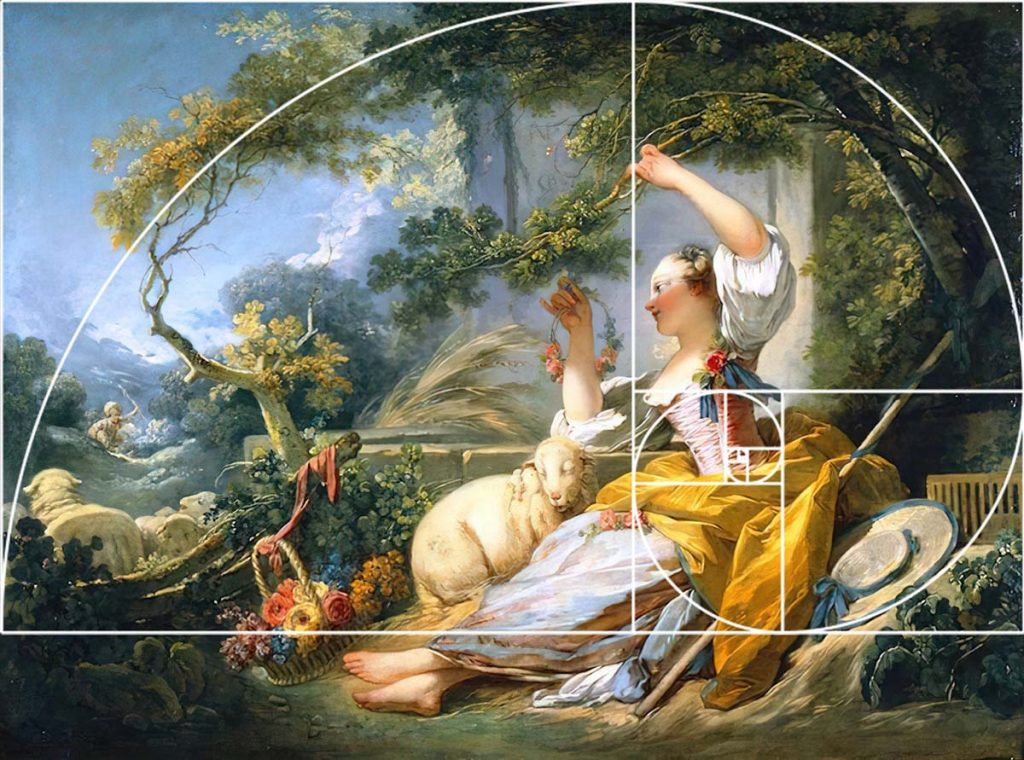
Composition is incredibly vast, and I am sure what I know just scratches the surface of many concepts. But I thought it would be great to show you a few doors I have cracked open, and you can start on this adventure with me. To do this, I thought it best to start with a few key concepts and demonstrate them using a specific work of art.
We are all familiar with the golden ratio and that famous drawing by da Vinci known as “Vitruvian Man.” It shows us just a hint of how much nature loves to use this mathematical concept, and it appears in leaves, snail shells, finger joints and even the placement of our naughty bits. Basically, if nature made it, it probably has some of this magical ratio built in. It is so pervasive that once you start looking for it, you will find it all over the place—even in the structure of our galaxy!
As humans, we find this shape and repetition quite pleasing. However, if it is slightly off, we instantly notice it. So perhaps this is a survival thing hardwired into our brains? In reality, artists have been using this for millennia to create a pleasing composition or create discomfort in certain instances. The placement of key elements in drawings and paintings is purposeful because each component needs to be made with an actual brush stroke. As photographers, we often get lazy with details in a scene because it is what “the world handed us,” and we focus on the human pose. After all, we know we can just remove that tree or dumpster later in Photoshop.


