Choosing the Right Light with Michael Corsentino
Want more information on this article? Get access to video content and additional supporting images. Launch the April issue of the magazine by logging in or signing up for a free account by clicking here. Shutter Magazine is the industry’s leading professional photography magazine.
Choosing the Right Tools
With so many sources of artificial light at your fingertips and numerous ways these sources can be modified, choosing the best tool for the task can be confusing. HMI with focusable Fresnels, strobes, fluorescent lights, tungsten, beauty dishes, softboxes, barn doors—each has different characteristics and produces different effects. Developing a working knowledge of the differences between these tools and their results is the first step in choosing the right light.
Fresnels are for Hollywood glamour, fluorescents for soft beauty light, tungsten when it’s all you’ve got, strobe for everything. Each artificial light source brings something different to the table, and that’s before we even get to modifiers and the different ways they impact the shape and quality of the light.
The second step in choosing the right tools is to determine the effect you’re after. Planning is key. This way, even if you don’t have a working knowledge of every light source and modifier out there, you at least know the kind of light you want to create. Then it’s simply a matter of reverse engineering how to produce that kind of light in the best, most effective way possible. Within each lighting category you also have additional choices regarding which tool is best for creating the effect you want. In other words, a strobe isn’t always just a strobe.
There’s a ton of strobe configurations, shapes and reasons one is more suited for specific uses than another. Let’s look at the ring flash.
Right Flash
This specialty light, also known as ring light, is the perfect tool for a few essential but very niche applications, and not much else owing to its signature look. There’s no slight intended in the previous sentence because, when it comes to lighting glamour and fashion and creating a hard-edged rock and roll look, nothing beats a ring flash.
They’re used all time for shoots for magazines like Rolling Stone and FHM. This is one of those lights that can easily sit on your shelf collecting dust. But when you need it, you’re instantly reminded why you’d never want to be without it. Unlike a traditional strobe, a ring flash has a circular flash tube situated inside a donut-shaped housing that fits over your camera’s lens. It approximates the “flashy” look of on-camera flash, only much cooler looking.
The signature tells of a ring flash are circular catchlights in the eyes and a shadow cast around the edge of subjects. Bare ring flash can cause red eye in subjects’ eyes. Be on the lookout for this and be ready to correct it in post as needed.
Most leading manufacturers offer some version of a ring flash, and there are adapters that can turn a speedlight into an ad-hoc ring flash. One of the reasons my preferred ring flash is the Profoto is the availability of two soft light reflectors, one silver and one white, that can be used to soften and modify the quality of light in varying degrees. This isn’t an option I’ve seen offered by any other manufacturer. I didn’t end up using either of these modifiers for this shoot, but they’ve been very useful on past shoots. In addition, the Profoto Ring Flash can be used with one of their companion high-power-output 1200ws battery packs, making sure there’s plenty of juice.
Ring flash isn’t a stationary light source like most traditional strobes, but one that travels with you and your camera. This creates a very different set of considerations with respect to exposure. Because it’s a manual source (at least mine is), maintaining a consistent exposure takes practice and an awareness that any change in your distance from the subject will affect the exposure, either adding more light as you get closer or less as you move farther away. But once you’ve nailed down a solid exposure, as long as your distance from the subject remains constant, your exposure will remain the same.
Because ring flash is mounted on your camera, taking meter readings can be tricky. You’ll need an assistant to take the readings for you or a tripod to hold your camera as you take readings; or you can simply work intuitively. I do a little of both, having an assistant pull a reading and then adjusting power as I move closer and farther away from subjects.
The same rules apply, when balancing ambient light and ring flash, as they do with other types of flash units. Aperture and strobe power settings control the amount of light contributed to the exposure, while shutter speed controls the amount of ambient light contributed.
With ring flash, you also have to be comfortable working with a source that doesn’t afford you much in the way of control. There’s nothing subtle about a ring flash, and that’s kind of the point. Like an umbrella, it puts light everywhere. Unlike an umbrella, it creates a unique, harsh quality of light with specularity for miles.
Turning Challenges Into Opportunities
Every location presents a different set of challenges that need to be overcome. It’s overcoming these challenges—cracking the code of each location, finding the visual hidden gems, making magic with what you’ve been given—that’s the fun, creative part of working on location. Everything else is just lots of heavy lifting, packing, unpacking and packing again.
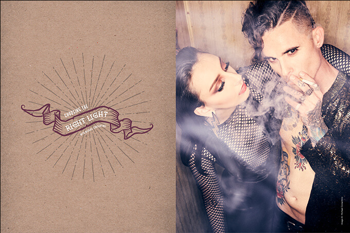
The run-down motel that my producer and HMUA Audra Seay scouted for our Trashy Rocker shoot was perfect in every way, like it was right out of central casting. Add to that two of the most amazing models we’ve ever worked with, Sam and Christina, Audra’s dramatic makeup, a vintage phone, a bitchin’ electric guitar and the perfectly styled wardrobe pieces pulled by our stylist Rachel Nicole Velez, and we were ready to rock.
The tiny biohazard of a room was covered in mirrors. Every single wall had mirrors on it; hell, even the ceiling had mirrors. Very classy. After my initial shock, somehow I’d conveniently forgotten about the mirrors after seeing Audra’s location pictures. I tried to wrap my head around how to shoot without being seen in the pictures and how to work with a ring flash blasting light everywhere in such a confined space with wall-to-wall mirrors.
Working around mirrors can seem challenging at first, but it’s also an opportunity to be creative. Every obstacle is actually a chance to not only problem-solve but to be creative doing it. Once you flip things around mentally and look at challenges as opportunities to flex your creative muscles, you start to see all sorts of interesting options.
Mirrors can be used to create a variety of unique and otherwise impossible-to-capture images and perspectives—from mirror images to capturing reflections, or in our case shooting up into the mirrors on the ceiling to capture the subjects below. To avoid being in the pictures, I shot from angles that kept me and my ring light out of line of sight of the mirrors. When that wasn’t practical—when shooting straight on at the models—I relied on height and the models to block my reflection. With this many mirrors and a team of people in the room, there is a lot of shifting of people back and forth to keep everyone but the models out of the images. You need to be extra vigilant and constantly check the reflections as you change shooting positions. That meant not only shifting people but also gear, cases and stands.
Shooting Editorially
Shooting for editorials has more in common with wedding shooting than you might think. Both are about telling a story. Both lead to a series of images destined for layouts. Both benefit from a variety of standalone as well as supporting images. Just like weddings, when I’m shooting an editorial, I’m thinking about the eventual spreads, so I’m mindful to shoot wide, tight, horizontal, vertical, portrait, 3/4 length, full figure and details to tell the story in the most visually diverse and compelling way possible.
Color and tone also play an important role in the emotional impact and success of the final product. Color grading that supports the creative mission of the images rather than intrudes on it in an obvious effects-driven way is my guiding principle. I want my post-processing choices to work in the background creating mood and texture without calling attention to themselves.
When I’m creating complementary color grading, like the black-and-white and cross-processed styles in this editorial, I choose effects that add to the creative direction of the project, in this case a grungy rocker motel, and I think in terms of what colors will work well next to each other in spreads.
Want more information on this article? Get access to video content and additional supporting images. Launch the April issue of the magazine by logging in or signing up for a free account by clicking here. Shutter Magazine is the industry’s leading professional photography magazine.

