Advanced Posing for Wedding Photographers, Part II: Posing Men and Couples with Michael Anthony
For Part II of my series on posing for wedding photographers, we split the discussion between posing men and posing couples. The wedding industry often forgets about the groom. Grooms are used as no more than a prop in photos on wedding websites, Pinterest galleries and in magazines.
I joke with couples when going through album spreads during a consultation that we do, in fact, make sure the groom is featured in the book. For those of you who are just getting started in your wedding business, consider this: A bride wants nothing more than the approval from her other half when making important financial decisions regarding their wedding. Countless brides have told us that of all the photographers they met with, we were his favorite.
Another attribute that sits well with our male clients is that our style of photography is edgy, dark and dramatic, which typically fits our male clients’ taste. It’s important to most brides that their husband looks amazing in their wedding photos, so it is important to make sure that both of them are in line with your style of shooting.
Problem Areas
With women, photographers need to focus on every body part when posing them. The legs, belly, chest, arms, chin and face can all be considered “problem areas.”
The areas that men are often self-conscious about are much more limited. The waist-to-chest ratio, the double chin and the hairline are typically the main problem areas to look out for.
We want to make women look slender and petite, while we want to make men look strong. Strength can be emotional or physical, and we have a lot more leeway in achieving this.
The Foundation
Legs
With men, our posing foundation is the same as with women: We want to point one toe at the camera and shift the weight away from the camera. However, it isn’t necessary to turn the knee over to decrease the area visible to the camera when posing men. The stance can be wide or narrow, but the foot position is very important. I often have men position their front foot toward the camera and the back foot at a 45-degree angle away from the camera, with the weight on the back foot.
Waist
This is where the magic starts happening with guys. Remember, we want to make a man look strong, and men are often self-conscious about their waist-to-chest ratio. The modern embodiment of manliness is a chest and shoulder area that is broader than the waist. Therefore, we want to minimize the size of the waist and emphasize the size of the chest. In order to maximize the chest while turning attention away from the waist, simply turn the waist away from the camera slightly in order to decrease the visible area. Be careful not to overaccentuate this, or your subject will look and feel uncomfortable.
Chest and Shoulders
Step two of making men look great in photos is to focus on the chest and shoulders. We have already made the waist smaller by turning it away from the camera; now ask your subject to lean forward with his chest. This pushes the waist farther away, making it look smaller, and brings the chest closer to the camera, making it look broader.
This is the point where many posing instructors teach photographers to have the man bring his shoulders forward to make them look larger. I usually ask my subject to bring his shoulders back. While I do want the shoulders to look broader, pushing them back emphasizes his posture and brings the face closer to the camera, which is what we want to be most prominent in portrait and wedding photography.
The last step in this equation is to turn the shoulders back toward the camera. This allows the waist-to-chest ratio to look much more appealing in the modern image of the ideal male figure. This is a powerful step, so do not forget to do it.
Hands and Fingers
Men have much more leeway with hands than women do. When nonmodels pose for photos, they can be tense and uncomfortable. When we pose women, we try to relieve that tension so their hands appear petite and feminine. With men, that tension is what we are looking for—it makes them appear strong.
The same rules apply. We do not want a man’s hands to be doing nothing. People often place the man’s hands in his pockets. I cringe when I hear photographers tell a man to leave his thumbs out. Our eyes are attracted to skin tones and leading lines. When a man’s thumbs are hanging out of his pockets, it actually creates a skin-toned leading line right to his groin area, which is not what we are trying to feature in wedding photography. Just remember to tuck in the thumbs.
Face and Direction of Light
My wife, Jennifer, often tells me, “Men have it so much easier than women.” In regards to posing and lighting the face, she is correct. You can use almost any type of light on a man’s face in any given situation. As long as we remember to match the light to the situation, almost anything goes. Broad light (lighting the side of the face closest to the camera) works well to emphasize strength, while short light (lighting the side farthest from the camera) can create drama. Split lighting (lighting the face directly from the side to cast one side of the face completely in shadow) is an effective tool that is used in Hollywood to accentuate drama.
Define the jawline by asking the subject to push his forehead toward the camera. This allows you to see more of the jaw and avoid a double chin. Also, mind your crop lines. Crop the top of the image either in the hair or just above the brow. Be careful about where you crop his head, because if you can’t see the top of the hairline, it will appear to be receding. If his hairline is in fact receding, I keep the crop just above the brow. (This applies to close portraits of the face.)
Posing Couples
Now we get into what I consider my biggest priority of the wedding day: posing my couples for creatives shots. In our style of shooting, which is art-focused, this is the part of the day that will make or break our sales numbers and customer satisfaction.
The rest of this article focuses on the most important part of posing for wedding photographers: communication and storytelling. I just have one last piece of advice on the technical part. When you have to choose who gets the good light in a pose, it’s always ladies first.
Poses in wedding photography should communicate three things: romance, story and connection. Every single pose you create should feature one of these elements, and your signature images of the day should feature all three. When you incorporate all three of these elements, you create an emotional connection between the couple and their images. We know that will lead to happy clients and better sales.
Remember that clients feed off your energy during a shoot. If you want them to appear natural and connected in their images, give them an experience they will never forget.
Romance
Romance means different things to different people. Your personal style dictates how you photograph romance. You can shoot romantic portraits bright and airy, or dark and dramatic. In order to communicate romance, develop a connection with your couple and earn their trust.
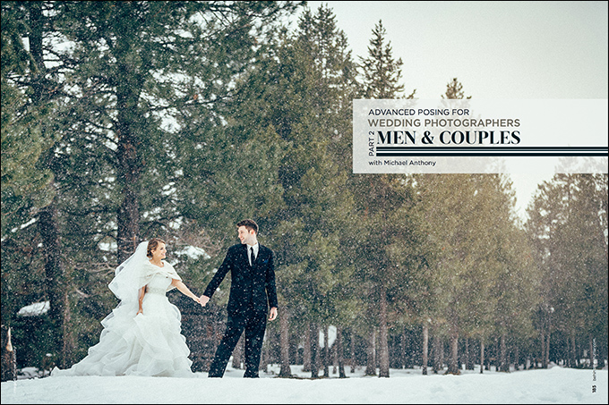
To communicate romance, I recommend shooting candid-style portraiture. This means that you have the couple interacting with each other, rather than looking directly at the camera. Focus on shooting tight, middle and wide. Shoot through elements to develop a candid feel and create a composition that focuses only on the couple together. In our signature images, we often photograph a couple in a dramatic environment with dramatic lighting. We place the focus of our imagery directly on the couple, as if it’s them against the world.
I am not completely opposed to kissing shots of the couple, but don’t overdo it in their gallery. It’s often best to have the groom kiss the bride’s temple or the top of her shoulder. You can go for a more intimate pose and have her kiss the corner of his mouth. I ask a couple to “almost kiss,” which shows anticipation in the image that is even more romantic than a kiss.
Connectedness
Connectedness is something that we strive to show in every photograph of a couple. Unfortunately, many technical flaws can keep an inexperienced photographer from communicating connectedness. Remember, posing is about communication. In order to communicate connectedness efficiently, your communication must be consistent throughout the entire image.
Let me give you an example of a problem I see all too often when critiquing images. A bride and a groom are in a field, and the lighting and composition are perfect. The couple has a closed stance, facing each other, and are kissing. Her hand closest to the camera is on his chest, and the hand farthest from the camera is around the back of his head. Both his hands are in his pockets.
The communication that the image-maker is sharing with the viewer is that the bride loves the groom, but the groom could care less about kissing her back. When a couple is in love, and are embraced in a moment together, their pose needs to communicate that throughout the entire image.
Hand placement is often the culprit of images that don’t effectively communicate connectedness, but another issue can be expression. Have you ever seen or taken images where the couple is kissing and one or both of them have their eyes open? It’s creepy.
Another mistake I see is that couples are posed too far apart. The distance between a couple should be minimal, except in the case of silhouettes, where we want to show the body shape.
Get to know your couple to better understand how to showcase their love for each other.
Story and Motion Posing
Telling a story is an often forgotten aspect of wedding portraits. Of course it’s easier to tell a story that is happening on its own as you would during a ceremony, but when photographing portraits, creating the story is on us. Telling a story in a series of photographs can help with album and wall art sales, and gives you ammunition in a sales session when trying to convince a client to purchase multiple pieces of wall art to display as a cluster.
One technique I love in storytelling is motion posing. Motion posing looks natural because it involves fluid movement. It also inspires the couple to have fun with each other, which breeds connectedness and romance in a single series of photographs.
Motion posing can be as simple as directing a couple to walk toward you holding hands and looking at each other. Then, as they are walking, ask the groom to spin her around like he is dancing with her. Ask him to dip her. Ask him to lift her and spin her. Do a walking shot and tell her to walk like a model on the runway (ask him to do it too if you want to get a laugh out of them).
You can do this multiple times to get the shot right, but I guarantee if you have a couple that is stiff and hard to put at ease, this is the remedy. I use this technique on every shoot, and it is always a hit.
When your couple arrives for their sales session, you can show them album spreads that are film-stripped (continuous images from the sequence of motion posing). You will impress them with your ability to tell a story and foresight to shoot for the final product. The story is the most important part of the three elements of communication.
Putting It All Together
Posing can be the hardest thing to learn for a portrait photographer. It is the difference between your clients loving their images and just being satisfied with them. In order to be effective at posing, you need to first understand the foundations. Once you have a grasp of the foundations, you can experiment with different ideas. You’ll never run out of posing ideas when you understand how to communicate with viewers.
When you combine all of the elements of effective communication, you will create images that define your style and ultimately create a steady stream of clients for years to come.


This Post Has 5 Comments
NIce post – always good to hear people talking about the groom! 🙂
Glad you like it Paul! The groom is important on the wedding day!
Great post!
Thanks Geert!
Great tips here, thanks so much, Alan from http://www.wedding-photographers-ireland.com