5 Ingredients for a Creative Stylized Shoot with Brandon S. Hunter
There is a recipe in everything we do as human beings, one that incites some type of emotional response no matter where we are and what we are doing. It involves the senses—whether a single one or multiple at the same time.
In the artistic realm, part of the goal is to generate a response based on a recipe that engages sight. This requires a process that will make your vision come to life—from formulation to actualization in creating images that inspire and elicit joy when viewed.
The creative process and the steps we take to achieve a goal are similar across many genres. In this case, they are similar to the process of a chef who specializes in a specific set of culinary delights. This is how I approach creating my images, whether in studio or out on location.
There is more than one recipe, of course, but I will go over the five key steps that structure how I approach creating my own imagery.
There are several factors to take into account: Location, Lighting, Color, Material, Makeup, Subject, Editing, and most of all, Mood. For me, the approach is fairly simple, and relatively organic. It’s organic because I do not particularly use measurements or the classic light patterns as we understand them. What motivates you? What inspires you to create? For me, the biggest influencers are Color and Material.
With those as a base, let’s take a look at a common recipe for creating the imagery I produce:
1. The Base – Subject and Location
It’s important to know the subject before you start to put your vision together. Why? Because it is the foundation to creating your image, much like a chef whose dish begins with poultry, beef or fish. You need to understand what you are working with in order to begin. I like a dramatically elegant feel, so it is important for me to know first whether I will be shooting outside or inside. If inside, will it be in studio, where I will have to build creativity from a blank canvas, or at a location, where I will have to play off the environment provided? I start by deciding whether this will be a beauty image, a portrait, or an editorial set—whether I will focus on details, on a specific subject, or on trying to tell a story.
2. Ingredients – Items, Materials and Props
Once you have your base, it’s time to enhance. This can be as simple as a scarf, a piece of jewelry, or a makeup concept for beauty. In portraiture, it is the environment and subject matter. What is your focus in the portrait? I focus on making the person look regal, so paying attention to the outfits and dresses is key. With bridals, I showcase the dress or a fashion image. With editorials on location, you look at the environment to guide your vision. Sometimes, this has to be done on the fly.
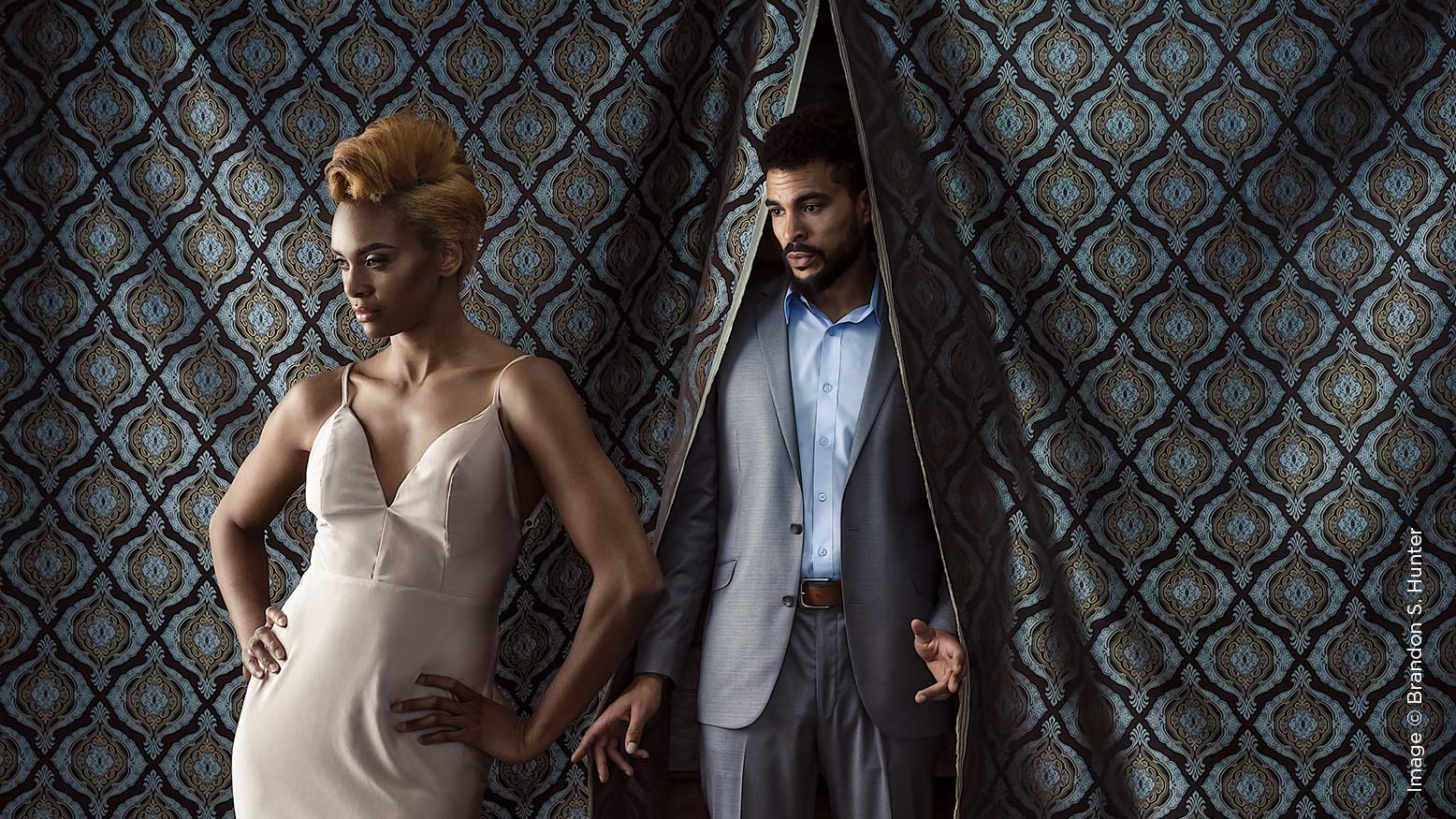
After driving into an abandoned nursery for a photowalk, some people left, because all they saw was junk. What I saw was this lone doorway standing there with shredded plastic. I knew I had a male model with pants and a jacket, and a female model, along with a vintage wedding dress that was part of the available wardrobe.
Next came the placement of the models and the light. Thinking about the angle and distance of the shot can change the whole scene. By shooting low and through tall grass, you kind of get a Gone with the Wind feel. In the studio, it’s a bit different—you need to add ingredients. Last year, I conducted a two-day workshop on lighting. The first day focused on studio lighting, and the last segment involved building a set from a few pieces of fabric and some wooden barrels. Some of the attendees didn’t understand what I was doing. As I was setting up the shot, one attendee told me, “I ain’t shooting that crap.” When everything was set and I took the sample shot, you bet your ass he picked up that camera.
3. The Spice – Mood, Expression and Color
With the main parts of your vision beginning to bring it all together, here is where you can start to enhance it, where it elevates to that next level. The expression has to work with the concept. For me, I want to convey sensuality, power, and elegance, and not necessarily intense, but passionate emotions in my imagery. When I started, the common theme was that you have to see the eyes. Why? Because that’s the only way to express connection? Not always—a model looking away or with their eyes covered can show expression with proper and intentional posing. Hand placement, facial expression and body angles can all convey something different with a subtle change. Especially in beauty photography, a slight parting of the lips can turn a pouting look into a sensual, powerful one. A model looking down one side of her body gives a sense of self-awareness, peace and tranquility. I look at bone structure—angles can be powerful. The collar bone, shoulders, chin and cheekbones all play a part. The sharper the angle, the more impact in the final image. In my portraiture and editorials, I will find a way to add movement. Whether it is small or grand, on the subject or part of the background, that is a much-required touch. Without that in the previous image, we’d have a whole different feel.
4. Temperature – Lighting
Lighting—it is key. Do me a favor: repeat that, and then repeat it again, about 10 more times. No matter how well planned or thought through the vision is, lighting will make or break your image. There are so many ways to light a photograph, and nowadays, you are not reinventing the wheel but rather tweaking it to suit your style and vision. From loop light, to Rembrandt, split, broad, short, feathered, or hard light, it’s all a starting point for how you want to light your image, and then you can tweak it from there.
I generally like to feather no matter the setup or base technique. I tend to stick with a darker color pallet, one that is contrasty, yet soft. I like to open up the shadows in a multiple-light setup, which generally means I’m using three lights and sometimes a v-flat or bounce card. This is where the feathering comes in. My favorite tool is a three-foot-deep octa pointed straight down in front of the subject with a white bounce card or reflector underneath for my creative beauty. The reflector will be flat, with a slight angle at best. The idea is that I am lighting with all fall off. If you don’t understand what I mean by fall off, consider it using the edge of the light instead of the light being dead on. Better yet, think of fanning yourself. The farther away your hand is from your face, the softer the breeze.
I will then add some fill and rim light to the image, though not too strong. I am just trying to create some separation using a strip box as a backlight and a large white umbrella for fill to achieve dimension in the shadows.
When it comes to both portraiture and editorials in studio, I will use the same setup the majority of the time. And I use this thought process in my portraiture as well. One will be directional, one will be fill, and one will highlight or edge the subject. I use the term directional because I believe that describes more of what I am using the key light for. Most photographers put the light source at a 45-degree angle left or right in an octa or umbrella and just throw it at the subject, and that’s their key light. I want to carve out the face using shadows that are deep, not hard. The key here is subject placement. It is a game of inches, and you have to direct them to get the desired effect. One inch in the wrong direction with this approach could make the image useless.
5. Presentation – Final Edit
The final edit ties it all together like a garnishment, a finishing touch. Let me just say—I hate to edit. I am by no means a Photoshop expert, and I always want to do the least amount of editing possible. This is why the first four steps are critical, and especially lighting. With that being said, editing is what takes your image to that final level. The edit is a mark of your brand as well. I tend to do subtle edits, building them up to create a major impact. I use both Lightroom and Photoshop to complete my images.
I’m going to close with a favorite quote of mine from Sal, one that I think helps wrap this all up: “You have to have the bones to begin with.”


