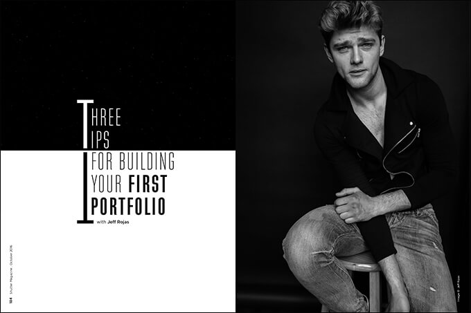
3 Tips for Building Your First Portfolio with Jeff Rojas
Putting together your first portfolio can be intimidating. What photographs should I choose? What type of paper should I use? Should I bind my portfolio? Should I stick to digital instead of print? Things will start to feel a bit overwhelming. I encourage you to stop, breathe and think, because it’s really not as complicated as it seems. In fact, there’s a really practical way to think about building your first portfolio.
1. Research Your Market & Photograph What You Want to Be Hired For
Your portfolio is like an artist’s résumé. It’s a visual representation of your work, your experience and the services you provide. When you think about it that way, you should start constructing a portfolio that fits your ideal “job.” Doing the opposite is like heading into a job interview for a marketing position and presenting the interviewer with a résumé that outlines your qualifications as a chef. It just doesn’t make sense.
Remember that your potential client is deciding whether or not they’re going to hire you based on whether your work fulfills their needs. Photographers have a mindset that they should “shoot the work that they want to be hired for.” More often than not, photographers misunderstand that statement and fail to land assignments. So, let me be extremely clear: Figure out what genre of photography you love (and one that has a market), and shoot content that a client expects to see in that marketplace.
Think about it this way. If you love fine art photography but you live in Amboy, Indiana (Population 378), you could have the greatest fine art portfolio in the world and not land a single client. Maybe you could sell prints online or move to a bigger city, but chances are that creating a portfolio in that city isn’t the wisest decision. Think about what you like to shoot, and research to see if there’s a market for it long before you start to put your first portfolio together.
Get to know what that market expects from a photographer. You may be interested in photographing stylized portrait sessions, but maybe there’s simply not a market for that in your area. Maybe your market is slightly more traditional and prefers classically styled portraits. If that is the case, you’re going to have to spend more time trying to convince potential clients to take up your idea. Focus on creating work that gets your foot in the door.
2. Showcase Your Best Work
Nothing is more enticing for a client to see than a portfolio of draw-dropping images. The easiest way to make that happen is to showcase only your best work. Remember that you have only one chance to make a first impression. Showcasing only your best work shows consistency in your portfolio. The client feels that it reflects your capabilities. They’ll assume you are the best at what you do.
On a professional résumé, you leave out irrelevant work experience. In photography, you leave out less than subpar work. No one cares about your summer job in college as the school mascot, and no one wants to see your crappy work. You could have had a blast doing it, but no one cares, and it looks terrible in your portfolio. Always show your best work and update your portfolio consistently to reflect that. Include a variety of different images. You won’t show off your versatility by showing multiple photos from the same shoot.
3. Digital or Physical Print?
Digital portfolios can be easily updated to reflect your best work, but physical prints reflect your work in a tangible way. Think about it this way: You’re out at a restaurant you found online. You’re greeted by the hostess, who walks you to your table. The waiter hands you a couple of iPads to order with. Or worse, the server advises you to check on your own personal phone to access their menu. Where’s the magic? Where’s the romance? It’s gone.
If you would never go to a job interview without a physical résumé, don’t greet a client without a physical portfolio, especially if you specialize in print work. A physical portfolio allows your client to see your final product. You’re not at the mercy of an electronic device. You can manage the final output and quality of your print, from paper type to luster and exposure, things you can’t always control with a digital portfolio.
Don’t misunderstand my point. I love my digital portfolio. With great SEO and branding, your digital portfolio can quickly turn into a great source of lead generation, but it should not be the only way you showcase your work.
Size, style and design are subjective among photographers and industries. As a rule of thumb, I recommend that photographers stay between 8×10 and 11×14. Your work should be large enough so that your audience can appreciate your work, but not so big that it’s too cumbersome to travel with. My personal custom-bound portfolio by The House of Portfolios, seen in Figure 1.6, holds 11×14 prints.
Portfolios can get expensive. Mine was around $600. They can run twice that much for a similar bind. Of course, you don’t need to spend that much. You can easily pick up a print portfolio book for under $100 online.
Size, design and style depend on your industry. In commercial photography, most creative directors expect you to have a portfolio with printed images. Plastic sleeves are viewed as cheap, and most commercial photographers stray away from them. Buy what fits your budget, and know the pros and cons for each option. Plastic sleeves are less expensive, but they’re also more fragile, retain dirt, leave fingerprints and can harden due to temperature changes, but the prints can be easily interchanged. On the other hand, on-demand printed portfolios are more forgiving, but the prints are bound within the portfolio and can’t be removed. Another option is a screwpost book, which can be slightly easier to change, but you have to spend the time to score and punch the pages.
Whichever route you decide should ultimately reflect how you want to be perceived by your client, but you should always keep your budget in mind.


