The images:
Click to enlarge
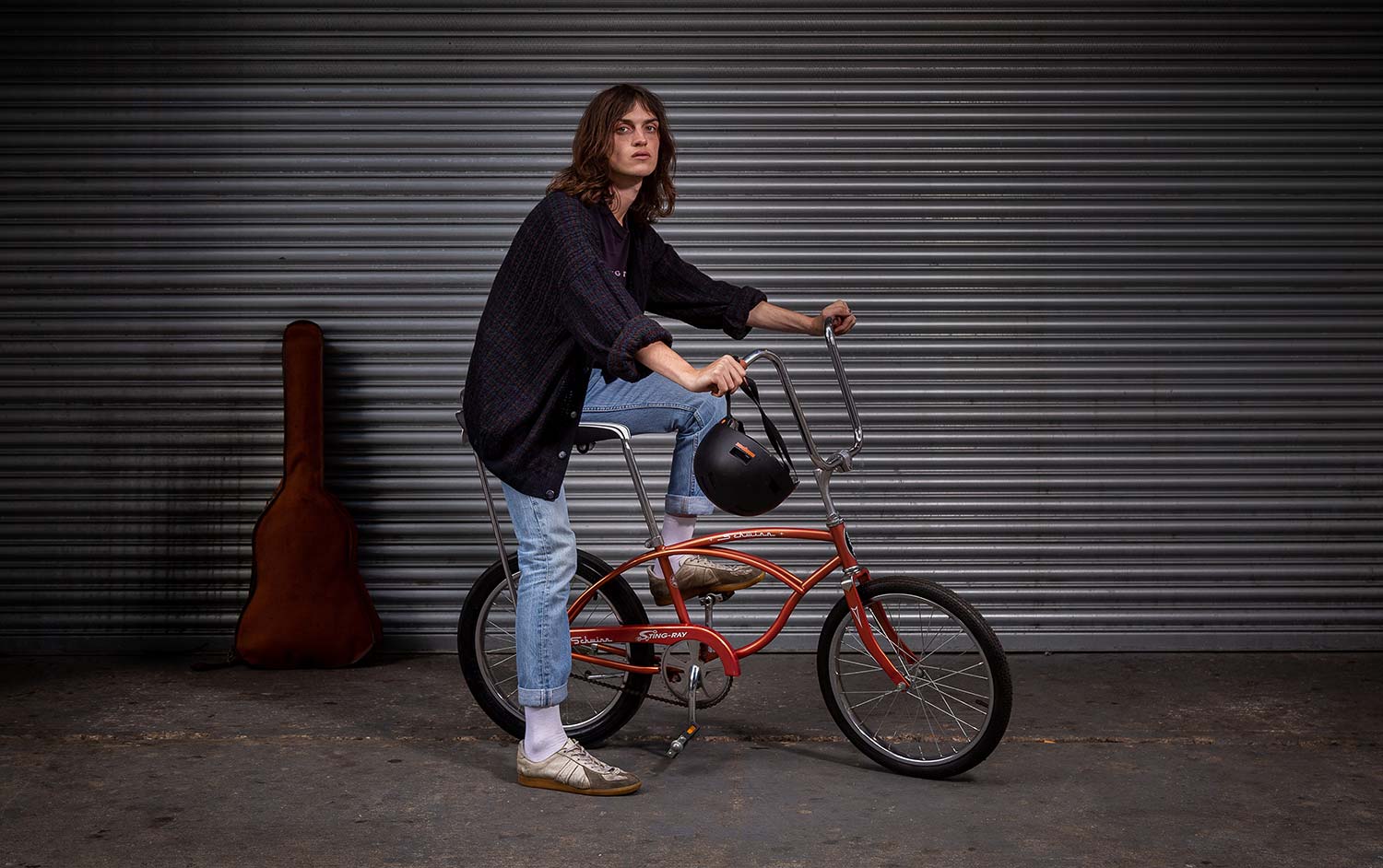
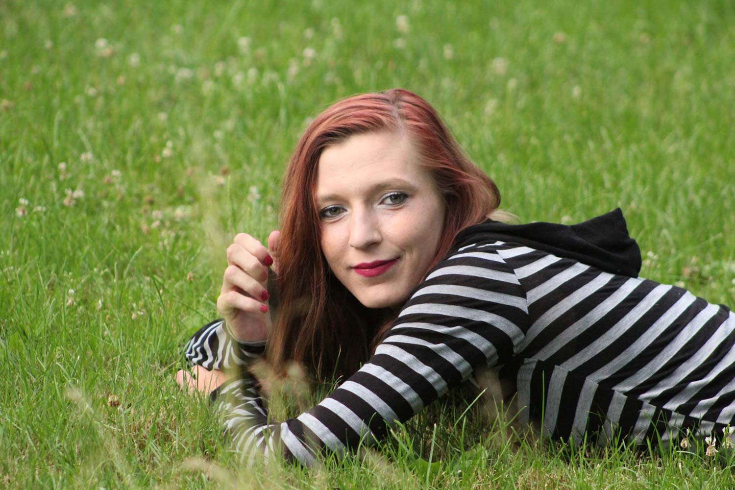
Image #1
Connection
I feel the image is lacking expression, emotion, connection. Sometimes, as we’re doing critiques, we’re looking at the obvious. We’re looking at lighting, we’re looking at posing. Here, I’m just struggling with the connection of our subject. Maybe that’s the goal, but these are things you want to be looking at. He looks completely annoyed, completely disinterested, and just honestly like he wants to go tell you to F yourself, “Hey dude, what are you doing with that camera?” If that were the goal, that’s fine. But as a portrait, thinking about it as something I’d want to put on my wall perhaps, this, to me, is just not resonating.
What’s jumping out most to me is this instrument case right in the background. I’m assuming this is a senior portrait of some sort. He’s a musician of some sort. I don’t know because it’s not there, it’s not released, we haven’t revealed it. There’s so much mystery, but it’s not needed mystery here; just take it out of the case. Maybe it’s not even in the frame. It doesn’t really seem to be adding to the frame. I know a lot of times when we’re doing senior work, we want to have that stuff in the frame to tell the story of who they are, but this just doesn’t particularly work for me.
Lighting
I can’t tell if we are indoors or outdoors. We’ve got some spill on the ground below the bike, but lighting does look like it’s coming from the top down. I don’t know if you bounced it, but I can see that there’s spill on the ground area that we can do some better light control with.
I’d rather see a little bit more mood, grunge, directional light, make it a little bit more dramatic, especially with his expression. I think that would have fit this portrait better.
Image #2
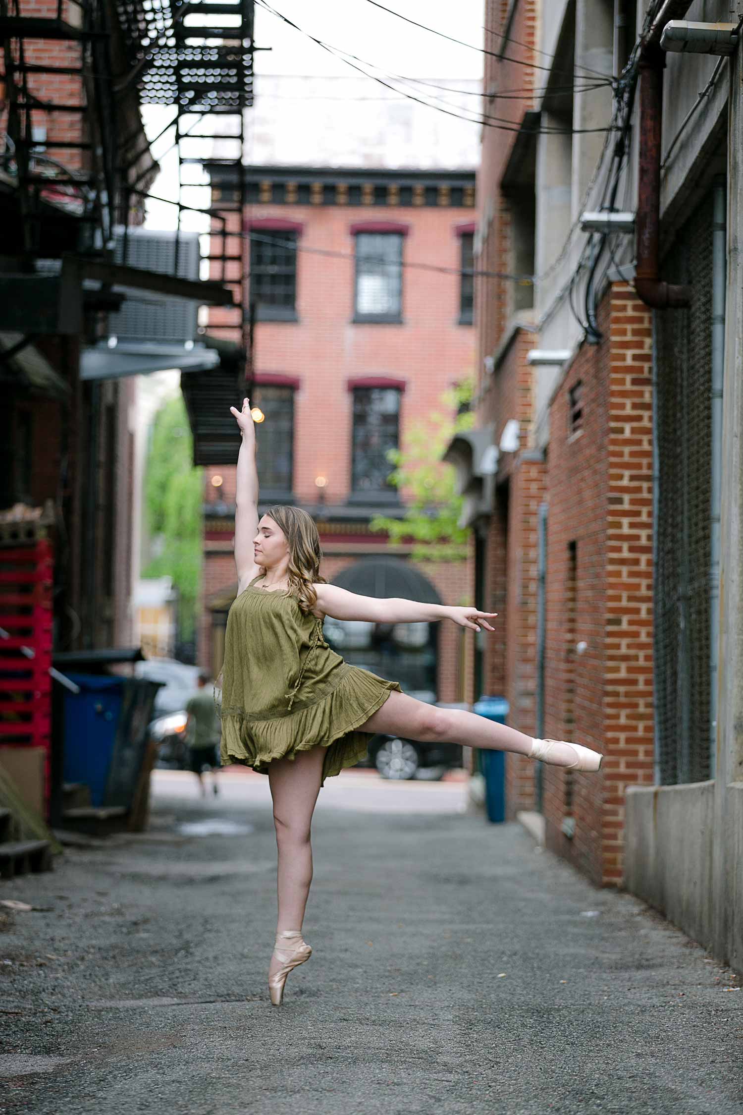
Remove things that don’t belong in the frame
Right, we’ve got a problem. What parent is going to want to put a portrait like this up on a wall with a giant dumpster that’s right there in the frame? There is also a car tire right behind her. Remember, you’re always going to be drawn to the brightest part of an image. Well, that car tire is a bright part of the image. The sky, also a bright part of the image, and so we start having a really hard time getting into this image because of all these distracting elements.
If you just crop down, you to get a sense of how that changes the image a little bit and starts getting our attention back to her.
Look what else we see in the frame…Who’s this dude? Like, we couldn’t wait three seconds later to get this dude out of the frame and shoot it? There are choices you’re making as a photographer that you do have control over. You can move on, flip, shoot the other way, change your angles, move garbage pails. These are things that don’t belong in the frame.
Image #3
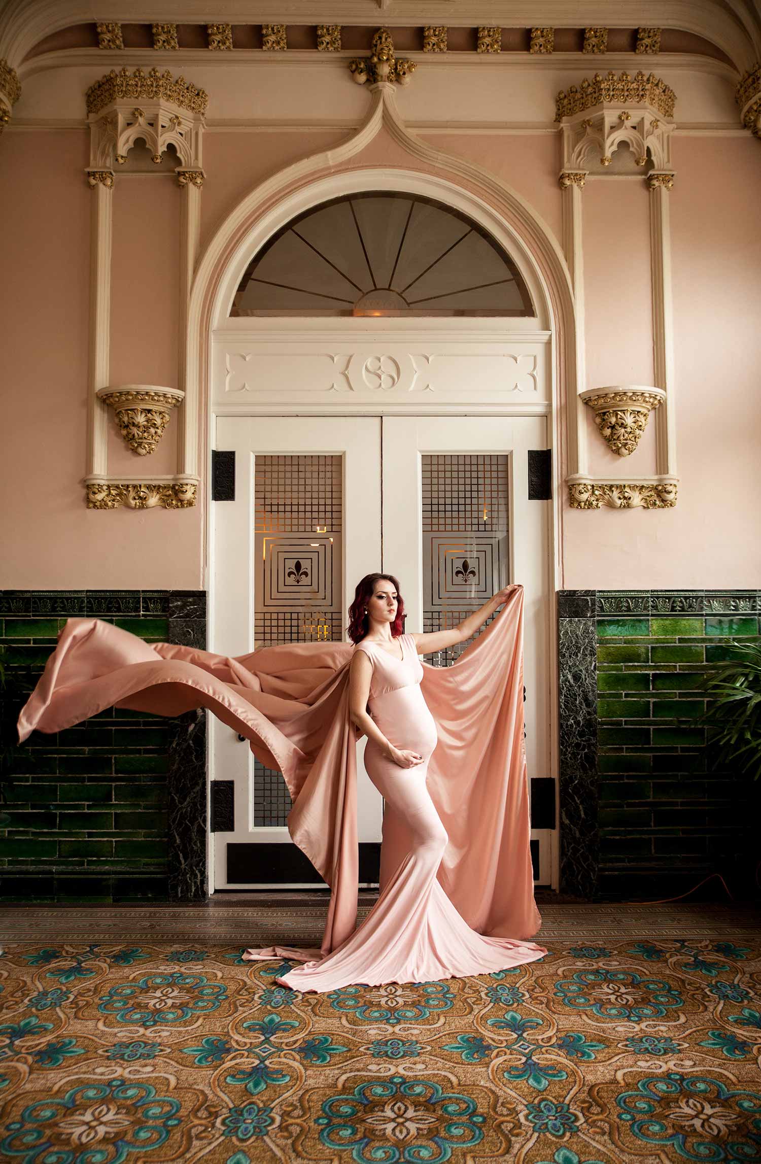
Get down on one knee
There are a couple of things that are really jumping out at me. One is your angle of attack on this. I can tell by looking at this, you’re standing up taking this shot, you’re not down on one knee. That’s a problem. You should be down shooting up, making her powerful, as she’s a powerful pregnant woman. Whether she’s a model, it doesn’t matter. She’s supposed to be a powerful pregnant woman and that’s being lost because you’re shooting down on your subject. Bring her closer to frame.
Move the subject
Foreground is absolutely useless in the shot. Instead, she should be closer to camera. What that’ll do is bring her away from the door, creating separation, making the door go a little bit soft, a little bit blurry. Having her at the same distance as the door, for the most part, ensures that the door, the walls, everything is screaming at us at the same focus. By putting her closer to the camera, you getting down on one knee and shooting up, you’d’ve had an amazing, stronger pose for this powerful woman.
Posing
As we zoom in, this hand is a mess. Her arm, it doesn’t look right, doesn’t feel right. The trick is to bend that wrist just a little bit. Bring that elbow down just a little bit. Also, look how annoyed she is. Man, she is not happy to be pregnant or fake pregnant. You’ve got to work on that.
Create dimension
The light coming in from the right is hitting all the same part of her. So, she’s being lit the same all through her body. And I think if we just turned her face from looking at the light and just bring her chin at camera, you start creating dimension to accentuate the curves in her body.
Image #4
Don’t cut at the joint
I feel like it’s one of those magic tricks where the magician comes around and spins the box and then separates the body into two parts. Where’s the rest of her body? I just feel like she’s floating out of the frame. You have control over that. Rule of thumb, never cut at a joint. Maybe you could argue with me and say, “Well, I’m not really at the joints now.” That’s great, but it still looks like she is just a floating half of a body.
Posing the hands
Again, something you are in complete control over, the claw. Look at that hand, it’s like a claw. We could Photoshop a phone in there and she’d be on that phone. Is she laying? What is she doing?
Crop
All of the head room up top is unneeded. It’s not helping the frame. If you crop down into that space a little bit more, the other parts of the issue don’t go away, but you can see it is going to help your framing.
Get critiqued!
Have you ever wanted PERSONAL feedback on YOUR photography from Sal Cincotta?
Enter your images for a chance to see your work being critiqued by Sal! Need some guidance? Want to show off some of your best work? Submit your images here for a chance to see them critiqued.