The images:
Click to enlarge
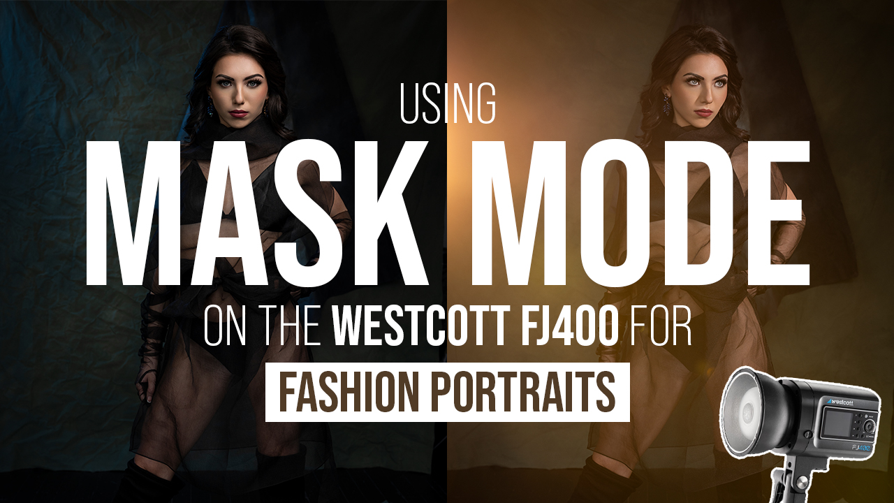
Image #1
This feels like a snapshot. I’m not looking at it through the eyes of, “I have my iPhone out.” I’m looking at it through the eyes of a professional. What could we do to be better here? It’s a lovely picture, I’m assuming of a mother and her child, and that’s all fine. But we do have some issues. The hair is a mess, you’ve got to fix that. These are the little details that make the difference between a good image and a great image. When we’re first starting out, we’re looking at things like exposure and composition, and then eventually when you start figuring those things out, you’ve got to start looking at what’s else is wrong. The trick I have for all of you is after you take that image, look at the back of your camera and be your worst critic. What could be better? That’s the question you should be asking yourself. How can I make this image better? Hair: this is a perfect example of how we can make it better.
Compositionally, I don’t love this image. It’s all this weird negative space. And don’t get me wrong, I love negative space when it makes the image stronger. This is not making the image stronger.
Mom is pushing her hip in the camera, it’s going to make her look a little bit more heavy. Change her stance. I know she’s got the baby, but you’re a professional, these are the things we have to do to make it a little bit better.
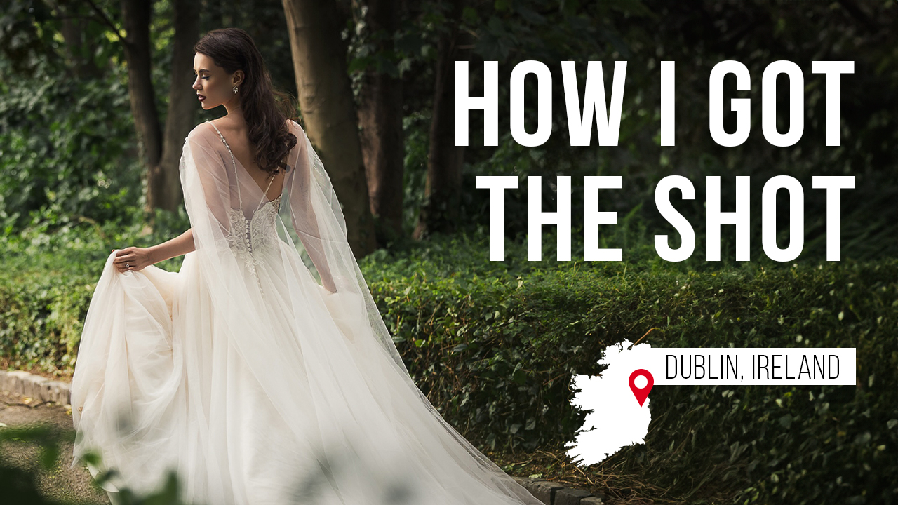
Image #2
Love the image, beautiful editing and toning. If you close your eyes and open it, it’s a balance between going to the bright spot in the top left-hand corner and making my way to the couple. There is a little bit of an issue getting to the subject.
Okay, we’ve got this tree branch driving us kind of down and into them, and then in a sense, a really strong object driving you out of frame, and they’re looking out of frame. We you could have had them look the other way, maybe that would have been better?
They’re falling away from camera. They’re up high, you’re down low. The trick to that is to get them to lean in a little bit more, or you elevate yourself. I know you probably didn’t have a ladder, or maybe you did because for fuck sake, how’d you get them up in the tree? But regardless, get them to lean down so we’re not shooting up their nostrils.
Our groom: I’m missing half his face. I would’ve liked to have seen his face open, right? I would have liked to have seen him open up to camera a little bit more and showed a little bit more connection. She’s on the wrong hip. She’s on the hip away, so she’s leaning away from him instead of switching her hip and leaning back into him.
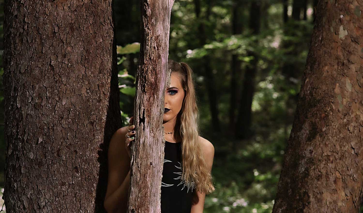
Image #3
It doesn’t matter if it’s a senior image, a portrait image, an artsy image, here’s the problem I have with this image right out of the gate. Three strong vertical lines that are cutting this image up three different ways. We’ve got three hard vertical lines, and you’ve got to remember when you’re making an image, you’ve already got in a sense, compositionally, a vertical on your left and a vertical on your right. It’s the end of frame, right? The minute you put a vertical somewhere in the middle of the frame you’re cutting this image into two.
Light control. Guys, this image just looks like we are slamming light into the scene and where it’s really distracting is here on this tree to the left, and on this tree in the middle. These trees are actually a little bit brighter, this middle tree is a little bit brighter than our subject, so it’s making it harder to get to her. This is an easy fix with some dodging and burning techniques to really burn that down.
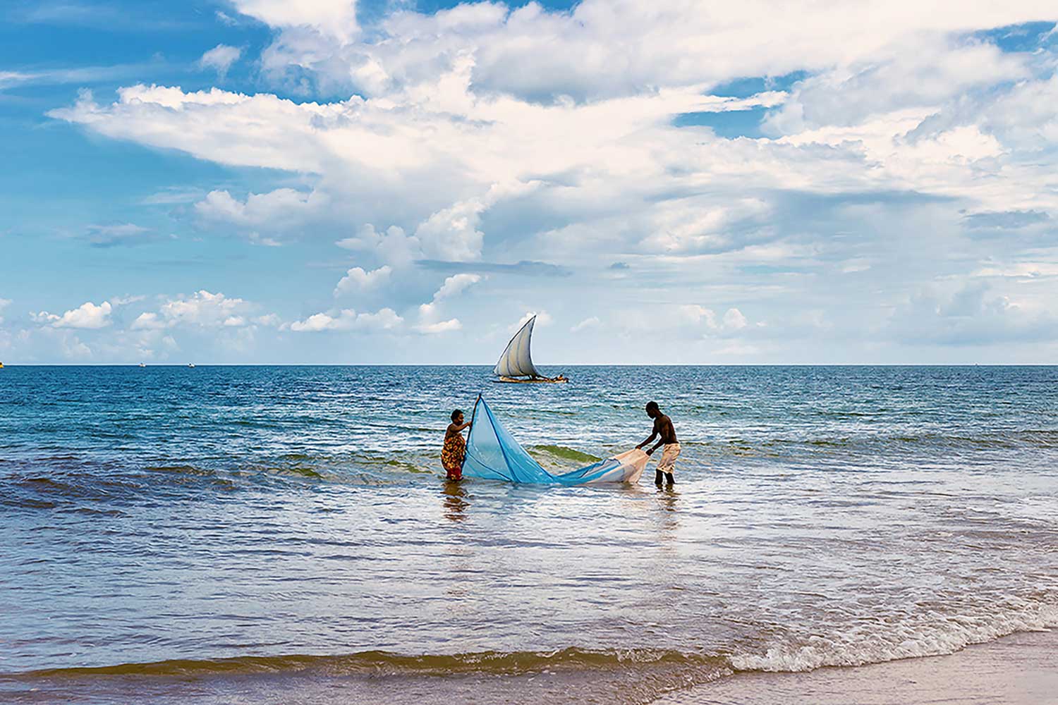
Image #4
The problem with this image for me is everything is compressed to the center. Everything is what we would call “bulls-eye.” We’ve got it all right here in the center, and we have nothing on either side really compositionally leading us to the subject. We’ve got horizontal horizon line, but that’s about it. What I’d rather see is, do a little Photoshop editing. If we move the people in this image over to the right, you can see how now compositionally we’ve got a boat in the left hand, part of the frame. Now there’s more of a story there. I would have liked to see more foreground here with the ocean. That would give us more waves in that foreground, give me a little bit less sky. Compositionally you could have moved just a little and gotten a much better shot.
Get critiqued!
Have you ever wanted PERSONAL feedback on YOUR photography from Sal Cincotta?
Enter your images for a chance to see your work being critiqued by Sal! Need some guidance? Want to show off some of your best work? Submit your images here for a chance to see them critiqued.