Image #1
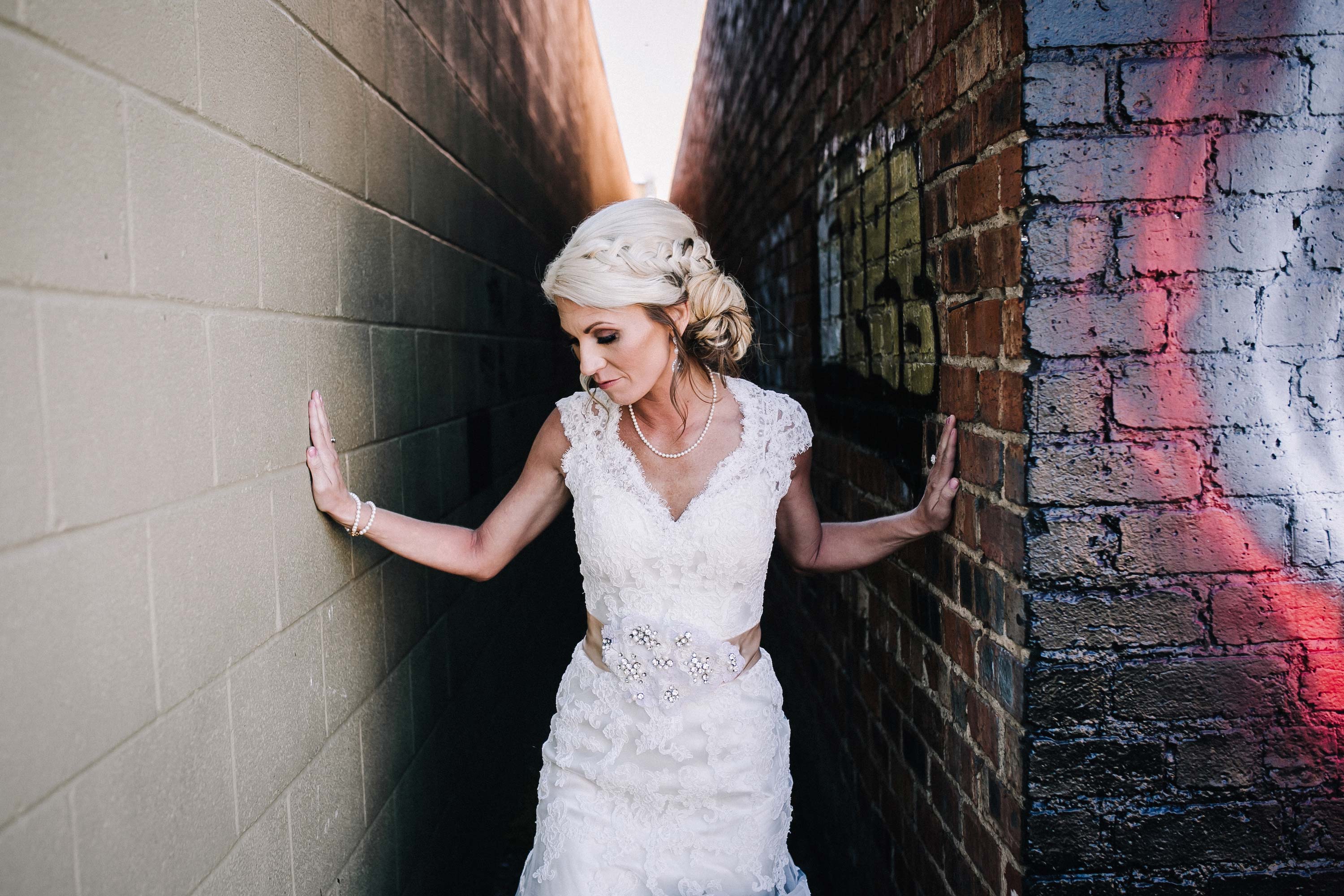
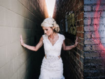
First image up. I kind of like this urban flair. Composition doesn’t bother me in this particular shot, I kind of like her arms on the wall. There are different layers, but I think the maker’s got some mistakes right out of the gate.
That hand on the left-hand side, it looks a little fake. It’s too stiff. She’s got to loosen up those fingers a little bit. Get them on the wall. I always tell them to feel like there’s an egg in between there, in the palm of their hand so they don’t go flat with it, they just feel like there’s an egg there, and they gently put it on the wall. That’s a good tip or trick to guide them.
Color
Here’s the thing, as cool as this alley is, you’ve got a color problem. Color is also part of your shot. The problem in this particular shot is you’ve got dark black on the right hand side and stark tan. They don’t match. That’s a problem in this shot. Visually, my eye is having a problem. Look at this image for a second. Close your eyes and then open them. You keep wanting to gravitate towards that white wall. You keep getting drawn in there. I just wouldn’t have taken the shot here, or I would have found a way to work on just one wall or the other.
Cropping out the excess
Cropping is also driving me bat shit crazy. Look at that spot up in the sky, very distracting. Of course, it’s the brightest spot and that’s not where I want to be. So, something as simple as just cropping down closer to her head, that now gets you to her and it’s less distracting.
Image #2
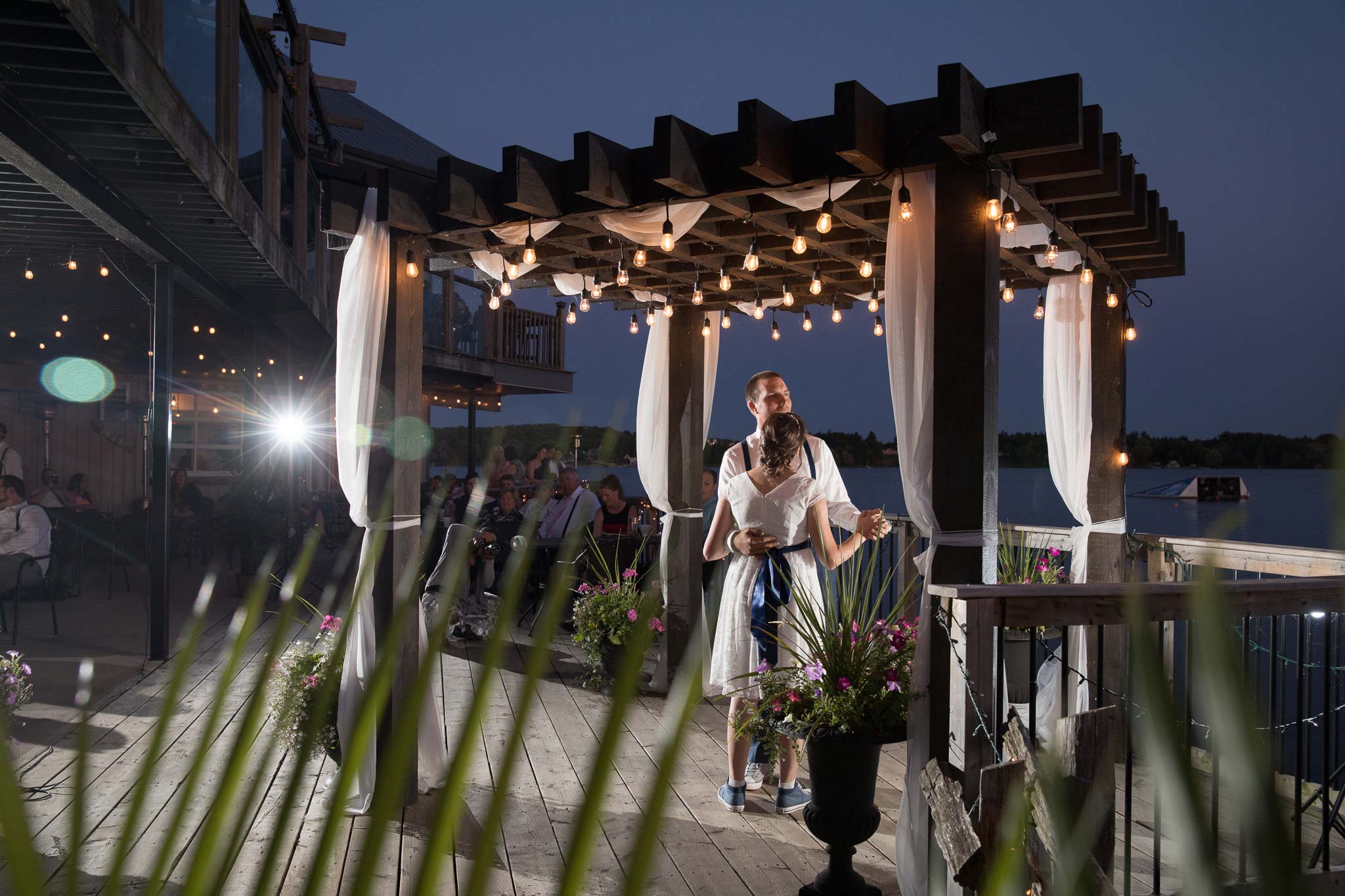
Guys, sometimes I just feel like I’m being Punk’d. This is not a portrait. This is very bad. And I mean it with the nicest of sincerity. It’s just not a portrait. If you are the maker, and you submitted this, and you really want feedback, I’m going to give you feedback, okay?
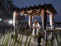
When we’re making a portrait, you’re trying to tell a story. From that perspective, I get it. There’s a story here. They’re dancing, but that’s where the story begins and ends. I could have done this, and probably done a better job, with my iPhone.
That flash is not helping your shot. It might be illuminating the couple, but it’s not helping the shot. You’d almost be better off cropping the left. What’s this guy doing over on the left? How’s he helping the shot? It’s just some dude in a chair, very sloppily in that chair. What if we crop in to the left? Now we’re getting the couple into the center of that frame.
Who is this a portrait of?
Here’s the problem. Who is this a portrait of? The back of the bride’s head? We don’t want the back of the bride’s head. That’s not the portrait. Why is there a flower plant growing out of her butt? That’s not the goal of this shot. There’s no way that’s the goal of this shot. There’s no way they’re putting this up on their wall.
Where’s our groom’s expression? Is he interested? Is he looking off into the future? Is he looking lovingly at her? Surely during this dance, there was that moment. You would have been better off maybe getting a zoom lens and zooming in there with a really tight lens, getting rid of all these distractions. And then just trying to tell that story somewhere in there with a shallow depth of field. The planter, you can move your feet. The spot on the left, you can change your focal length. These dead lights that are here, not adding to the frame. I want you to get better. You have got to make better decisions when you’re making this image.
Image #3
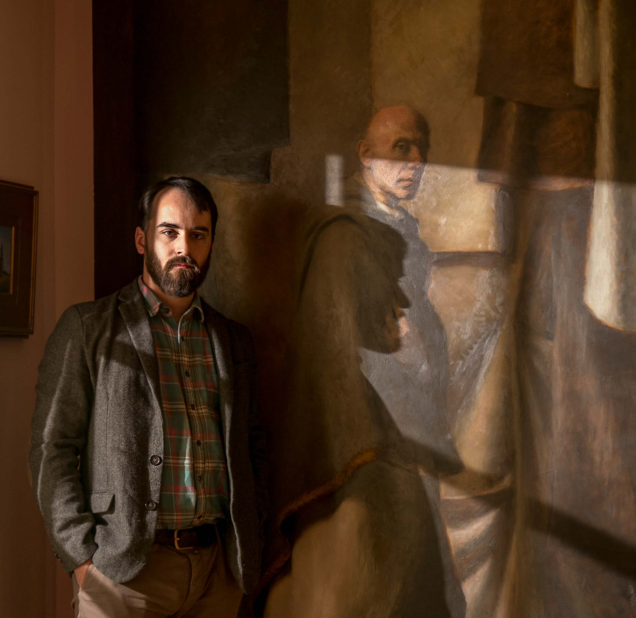
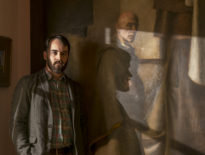
This to me is an environmental portrait. For all I know, it’s forcing me to think. If you’re the maker of this image, or you’re watching along with me, is it getting you to think about the same thing that it’s getting me to think about? When I look at this, I’m looking at the guy in the background. Is he a monk? Is he a priest? What’s the story there? Now I go to the gentleman who’s standing there in a plaid shirt, and it’s making me think there’s connection, I hope, between him and this portrait, this painted portrait, that’s behind him. Is it a relative? Is it something he painted? What’s the connection to that? It’s at least making me think. So if this is an environmental portrait to that point, I think you’re telling a story, and you’re getting me to at least think about it.
Details
I think there’s room for improvement here. The frame on the left is not helping the shot, useless in the frame, either crop in, edited it out. It’s on the wall. It’s easy to edit out. I do like what’s happening on his face. I do like the hard shadow. I feel like that was a good thing you were trying to do. But here’s the problem. I’m going to the light on the wall instead of going to the face of the painting. I’m not getting there. That shadow cutting across his face and the hotspots are actually not helping this frame whatsoever. Again, close your eyes. That’s the trick I always use. Open them. Where are you going? Dammit if you’re not going right to the hotspots. You’ve got to learn how to control light. You’ve got to learn how to use fill, and you’ve got to learn how to do some editing behind the scenes to alleviate that.
Image #4
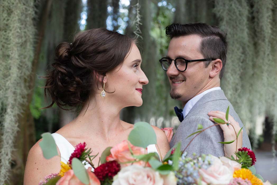
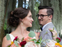
I like that we’re getting closer and intimate, but I am distracted by a few things that I think could be better. First, the flower coming down from the top. That little flower looks like it’s growing. It looks like it’s hanging from the trees. You can see how that’s kind of distracting all of a sudden. With Photoshop, get rid of this and make this a little bit stronger. That would be something I would remove from this.
The next problem I’m having with this is up in the foreground. What’s happening is this here is kind of a distraction. Now we can’t crop in on this, so this is one of those things in post, we can’t just crop up. I like to have my couples drop those flowers just a little bit and allow me to focus.
Dodging and burning
This is another one of those images where everything is so evenly lit. I really want to see some dodging and burning on this so that we don’t have to see everything is bright. I want to burn that down and get to their faces.
Get critiqued!
Have you ever wanted PERSONAL feedback on YOUR photography from Sal Cincotta?
Enter your images for a chance to see your work being critiqued by Sal! Need some guidance? Want to show off some of your best work? Submit your images here for a chance to see them critiqued.

